

30 Intricate Monoline Logo Designs Will Make You Inspire. What’s in a Font? How Fonts Can Define Your Design. You’ve been asked to design something.
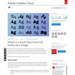
Maybe it’s a flyer advertising your company’s next seminar. Maybe it’s the invitations to your friend’s wedding. Creative Concepts: July 2014. For this week's exercise you may use a ruler.
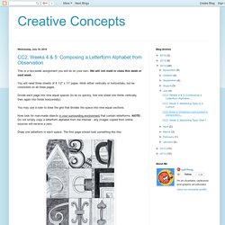
I recommend you download the jpegs in this post, print them out and place a thin sheet of paper over them and trace each of the three exercises. Complete all the pages at home and bring them to class to hand in at 11 a.m. on Wed. July 9th. If you don't have tracing paper, just use regular printer paper. History's most famous posters - Designer Blog. The internet’s capability to turn striking visual images into widely circulating memes has forever changed the status of poster design.
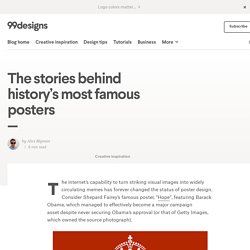
Consider Shepard Fairey’s famous poster, “Hope“, featuring Barack Obama, which managed to effectively become a major campaign asset despite never securing Obama’s approval (or that of Getty Images, which owned the source photograph). It was the “Keep Calm and Carry On” poster, however, that inspired this blog post. Untitled. Throughout history, there have been countless amazing poster designs, whether they be political posters, movie posters, or event posters.

I’m going to count down my top 15 poster designs from history, based on how influential and how aesthetically pleasing they were. Along the way, I'll also toss in some Creative Market products that will help you achieve a similar look. Unfortunately I couldn’t include any magazine covers, editorial spreads, brochures, etc… strictly poster designs here folks. Metropolis. Anatomy of a Character - Fonts.com - Fonts.com. By Ilene Strizver How do you tell one typeface from another?
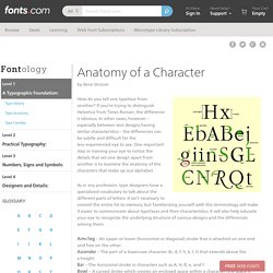
If you’re trying to distinguish Helvetica from Times Roman, the difference is obvious. In other cases, however – especially between text designs having similar characteristics – the differences can be subtle and difficult for the less–experienced eye to see. One important step in training your eye to notice the details that set one design apart from another is to examine the anatomy of the characters that make up our alphabet.
As in any profession, type designers have a specialized vocabulary to talk about the different parts of letters. Type Glossary - Typography Deconstructed. Ampersand A stylized character of the Latin et used to represent the word and.
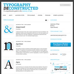
Definition: The typographic symbol used to designate the word and (& ) is the Latin symbol for et which means and. The name, ampersand , is believed to be derived from the phrase “and per se and.” On a standard English layout... Aperture The partially enclosed, somewhat rounded negative space in some characters. A Brief History of Typography. Back to blogBy Sarah Skrilloff, Business Development Assistant Type is everywhere – street signs, magazines, the web.
Every typeface you see around you has been painstakingly and carefully planned out, and each has its own personality and vibe. The Evolution of Typography: A Brief History. By John Siebert “Illustrious” Origins Writing is one of the most fundamental forms of communication, and it traces its roots back to hieroglyphs or pictograms.
Used by ancient civilizations of the world to represent ideas, these images soon evolved into alphabets and phonographic writing, which led to the development of various typographic systems. Typography has an “illustrious” history and is obviously a crucial aspect of graphic design. Sure enough, typeface designers need to have a thorough understanding of typography—especially its evolution over the centuries—in order to incorporate or revive older or even extinct typefaces, depending upon their requirements, and give the letters a modern touch.
A brief history of type. As designers, over time we tend to become experts on typography.
We get to know the typefaces we use intimately, learning about the shapes, nuances and character - no pun - of each one. We might fall in love with fonts in certain weights or styles, or even individual letters. Letters, numbers, & glyphs. Fonts, typefaces and all things typographical — I love Typography (ILT) 15 top typography resources. If you are looking for help with fonts or type, these typography resources are for you.
The web is a wonderful thing, brimming with resources and tutorials for people wanting to learn about the discipline and see some examples of beautiful and innovative typography to inspire. But, sometimes, too much choice can be confusing, so we've picked some top sites that will really help you get to grips with it. A Crash Course in Typography: The Basics of Type. Typography could be considered the most important part of any design. It’s definitely among the most important elements of any design project. A Beautifully Illustrated Glossary Of Typographic Terms You Should Know. The world of typography often seems like it has its very own language, full of serifs, strokes, and swashes. Sorting out all those terms can be confusing in itself, so we’ve compiled a visual glossary that will guide you through the lingo — whether you’re an aspiring typeface designer or just a general typography enthusiast.
Learning the building blocks of typography will help you better understand how to pick a suitable font and apply it effectively within your design projects. The Basics: Typefaces Categories & Styles 01. Font/Typeface: Back in the days of metal type and printing presses, fonts and typefaces were two different things — the typeface was the specific design of the letters, say Times New Roman or Baskerville; while the font referred to the particular size or style of that typeface, say 10 point regular or 24 point italic (each created as its own collection of cast metal letters and other characters).
Typography rules and terms that every designer must know. Typography is, quite simply, the art and technique of arranging type. A Beautifully Illustrated Glossary Of Typographic Terms You Should Know. Typography - Scripps Ranch High School Graphic Design. Typography projects high school. Typography Tutorial for Beginners: Everything You Need to Learn Typography Basics. 20 Typography Mistakes Every Beginner Makes – And How You Can Avoid Them.
Much more than just arranging pretty fonts on a nice background, typography is an essential part of most designs — one that can make or break a whole project. Unfortunately, typography errors tend to make a bigger statement than good typography. Mistakes stick out like a sore thumb, while thoughtful typographic choices blend so nicely with the overall design that you might overlook them. So if you want to get your message across without distracting typographic errors, learn to recognize some of the most common mistakes below, and use this article as a final checklist before wrapping up your design. 01. The Ultimate Guide to Font Pairing. Great fonts are essential to great design. Magazine columns and their layout options. Columns are essential tools to standardize your layout.
Graphic Design Lessons. How to teach yearbook » School Yearbooks. Yearbook Lessons – Paul Apolinario – Bishop Alemany High School. Font Free, Fonts and Graphic design. A 20 Minute Intro to Typography Basics. Search Results. <div class='alert alert--flash alert--warning'><div class='container'><h2 class='h9'>You have JavaScript disabled</h2> For the best experience, please turn JavaScript on. <a href=' how</a></div></div>
Abstract Letter Design. The 15+ Best Magazines For Print Designers. Learn Typography. Learn Typography: Alignment. Flush Left. C.R.A.P. Design Principals.