

18 templates d’interfaces (UI) pour Adobe XD à télécharger gratuitement. Ahhh, les templates : rien de tel pour vous faire la main sur un logiciel ou gagner du temps sur la création d’un prototype.
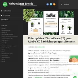
Depuis la création du blog, je constate un retour en force des templates gratuits. Plus que jamais, la communauté design à travers le monde partage du contenu de qualité, très fortement renouvelé. Souvent mis à disposition pour montrer son savoir-faire ou vendre des templates plus complets, ils vous permettront de gagner du temps sur des projets bien précis. Beautiful CSS box-shadow examples - CSS Scan. JSONPlaceholder - Fake online REST API for developers. Adobe XD : de nouvelles fonctionnalités pour faciliter la vie des designers. La nouvelle version d’Adobe XD (30) vient tout juste d’être lancée sur Creative Cloud dans le monde entier.
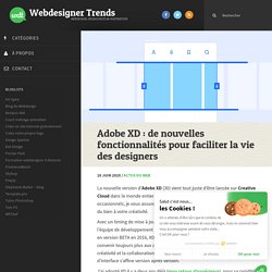
Aficionado du logiciel ou simples testeurs occasionnels, je vous assure que les nouveautés de ce mois de juin vont faire du bien à votre créativité. 47 Key Lessons for UI & UX Designers - UX Collective. Aarron Walter, MailChimp’s director of user experience, says — “We’ve discovered that humor laced into copy, the personality of Freddie the MailChimp, and many easter eggs tucked into the workflow can transform an otherwise mundane task into an experience that people look forward to, and sometimes even miss.”

Injecting life into copy is the difference between saying “Loading…” and “Our team of highly trained monkeys is working on it.” It’s unexpected and provides a bit of entertainment for your user. Good copy doesn’t necessarily mean it has to be humorous, either. It just means writing engaging and worth-reading text. Humor can also be excessive, and in some applications or industries, it just downright is not appropriate. Alexis Ohanian, the co-founder of Reddit, said something in Tools of Titans that I loved — “Invest that little bit of time to make it a little bit more human or — depending on your brand — a little funnier, a little more different, or a little more whatever.
Shape Divider App. Grabient. RoughNotation. ScrollTrigger - Plugins - GreenSock. 7 Ways to Define a Component Template in Vue.js - Vue.js Developers. There’s plenty of choice when it comes to defining component templates in Vue.
By my count there are at least seven different ways: String Template literal X-Templates Inline Render functions JSX Single page components And maybe more! In this article we’ll go through examples of each and address the pros and cons so you know which one is the best to use in any particular situation. 1. By default a template will be defined as a string in your JS file. 2. ES6 template literals (“backticks”) allow you to define your template across multiple lines, something you can’t do in a regular Javascript string.
This method isn’t perfect, though; I find that most IDEs still give you grief with syntax highlighting, and formatting the tabs, newlines etc can still be a pain. Spinners React. Pattern.css - Background Patterns in CSS. Examples in documentation are built using shorthand framework but this library works with most of the frameworks including bootstrap.
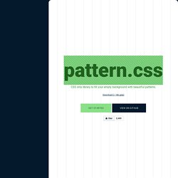
There are many possible designs that can be built with css to use as patterns but I have made only few styles that are commonly seen in many award winning website. Any background pattern works with two or more colors. I made with library with considering two color patterns only. Colors pattern.css is built with two colors only transparent and currentColor. currentColor is the current active text color inside a element. To change the another color just change the background color, and background color will be visible through transparent color Example. Cooltipz.css - Cool tooltips made from pure CSS. Immersive Section Transition Effect in CSS and JavaScript. Dependencies CodyFrame (CodyHouse front-end framework) Tutorial We can start creating two block elements, one used for a media item (e.g., video/image) and the other for generic content.
During the scrolling, the media element should get fixed once it reaches the center of the viewport. From that point on, it should scale up to animate in a full-screen element. To make the media element fixed during scrolling, we can use the sticky value of the CSS position property. Once the element gets fixed, we need to update its scale value based on the window scroll position. First: the scale animation happens while the user is scrolling; that means, during the animation, part of the .immerse-section-tr__content element (generic content block) was already visible. Second: since we are scaling up the asset, we need to apply an overflow hidden to make sure a horizontal scrollbar is not visible during the animation. . ⚠️ Because of the restrictions explained above, the effect is disabled if:
How to Build Vue Components in a WordPress Theme. Learn Development at Frontend Masters Intrigued by the title and just wanna see some code?
Skip ahead. A few months ago, I was building a WordPress website that required a form with a bunch of fancy conditional fields. Different options and info were required for different choices you could make on the form, and our client needed complete control over all fields 1. In addition, the form needed to appear in multiple places in each page, with slightly different configs. .js - Open Source JavaScript Charts for your website. GIT.WTF!?! SimpleParallax - a JavaScript library for parallax effects.