
Tokyo 2020 unveils first ever animated pictograms used in Olympics’ history. The Tokyo 2020 Organising Committee of the Paralympic and Olympic Games has unveiled the first animated pictograms to be used in the history of the event.

The expansive bank of 73 pictograms created by Japanese designer Masaaki Hiromura have been animated by Japanese motion designer Kota Iguchi to show each sport in full action mode, appearing from a white background as fragments, showing a small sequence of that sport in motion, freezing for a moment, then disappearing back to a blank frame. It’s another first for the Japanese city’s Olympic heritage, as static pictograms were first introduced at the Tokyo 1964 Olympic Games. Paralympic Games pictograms first appeared at the Barcelona 1992 Summer Games. There are 23 pictograms representing 22 Paralympic sports and 50 representing 33 Olympic sports, each designed to “subtly communicate the characteristics and athleticism of each sport, as well as artistically highlight the dynamism of the athletes,” say the organisers in a statement. Tokyo 2020 unveils first ever animated pictograms used in Olympics’ history. Web Design Conference Tokyo - Digital Thinkers - UX / UI Event - Awwwards.
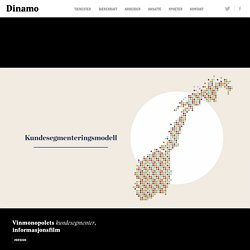
Vinmonopolet kundesegmenter - Dinamo. Vinmonopolets samfunnsoppdrag er å være et virkemiddel for ansvarlig salg av alkohol, og på den måten minske skadevirkninger.

Selv om de prinsipielt har monopol, opplever de økende handelslekkasje til det som i praksis er store konkurrenter: Tax-free på flyplasser og ferge, samt grensehandel. Vinmonopolet har ikke som mål å selge mer alkohol, men de ønsker å stå for så mye som mulig av det salget som faktisk finner sted – hvis ikke kan de ikke oppfylle sitt oppdrag. For å ruste seg mot konkurransen vedtok derfor Vinmonopolet i 2018 en ny strategi som bl.a. handler om å bli mer kundeorientert. Kundens ønsker og behov skal i større grad reflekteres gjennom produktutvalg, tjenester, produkter og service. På oppdrag fra Vinmonopolet kartla Kantar TNS Norges alkoholkjøpende befolkning. Gunner on Instagram: “Butts on butts on butts! Made a buncha booties w our buds @lyft for earth day □□□ Get yo butt on a bike!” Aescripts + aeplugins on Instagram: “Made with Joysticks 'n Sliders by @matt_jedrzejewski:⠀ ...⠀ "Fully 3d rigg created in After Effects and Duik.⠀ ⠀ Check out my Instagram…”
Brightening up a Financial Brand – Putnam Studio. Bringing empathy, humanity, and joy through Illustration A few years ago, the fine folks at Credit Karma decided it was time to launch an internal branding project as their current brand needed a refresh and realignment.

They decided to kick off a comprehensive project and revisit all of their brand assets: logo, colors, and website to name a few. During this process they decided to move forward with a unique and own-able illustration style. With a subject as sensitive as personal finance, Credit Karma knew that a strong illustration style and strategy would give their users a sense of empowerment and optimism as they plan for the future.
With this in mind, Credit Karma reached out to us for this portion of their rebrand and we kicked off our introductory research phase: the brand audit (to learn more about this and other phases, check out this article). After we spent some time collecting feedback, we grouped the feedback by theme. Heartfelt and Competent Piece by Piece. Studio Snasen. Dribbble. Markus Magnusson. Markus. Dutch Uncle - Satoshi Hashimoto. The portfolio of Jon Arne Berg. Maya Ish Shalom. The Power of Illustration in Brand Story and Identity. Agent Pekka. Hi.
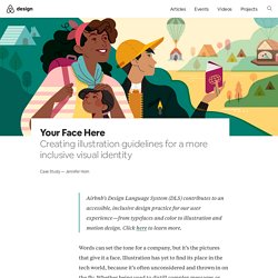
Merijn Hos – Portfolio – Represented by Hugo & Marie, NYC. Women Who Draw - An open directory of female* illustrators. THE POSTER CLUB - High quality posters and art prints. Art Prints. Alex Trochut. ByHands Webshop – byHands - Webshop. Your Face Here. Airbnb’s Design Language System (DLS) contributes to an accessible, inclusive design practice for our user experience—from typefaces and color to illustration and motion design.

Click here to learn more. Words can set the tone for a company, but it’s the pictures that give it a face. Illustration has yet to find its place in the tech world, because it’s often unconsidered and thrown in on the fly. Whether being used to distill complex messages or add a touch of whimsy, illustration is one piece that makes up a company’s visual brand identity. With nearly a decade-long career as an illustrator in Silicon Valley, I’m just now seeing illustration pique interest in the tech industry. One of my career goals is to elevate the quality of illustration in tech. The Awkward Teen My first step was research. Three stages of illustration at Airbnb One thing became clear in my research: no one had ever stepped back and thought of illustration as a major reflection of the Airbnb community. 1. 2. 3. An escalator is convenient, but then we have to go and run because we are too fat.