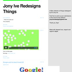

Joe Webb's post on Vine. Jony Ive Redesigns Things. Jony Ive redesigns cereals.

Credit: ink8yte How Jony Ive created iOS in Microsoft Word. Credit: Vaclav Krejci Hi guys, Here’re some notes on iOS7 — I know it’s kind of late, but still, I think it can make a decent Monday-morning-design-read. Check this out and hey, thank you for this wonderful blog you created. :)
Geek. Quotes. 10 things your IT guy wants you to know. 20 Horrible Habits of Clients at You the Designer - Graphic Desi. Articles November 30, 2007 Below is a common list of issues designers have to deal with while working with clients on projects and how to avoid or solve those issues in a professional manner. 1.

Wanting Great Designs for Cheap Prices Because everyone seems to have Photoshop and know a designer nowadays, many clients tend to have a bad idea of what design is worth. While it can be ok to have low prices when you are starting out, when you are confident enough and your work is good enough you should come up with prices that make it worth your time. Many clients also try to outsource their projects to India and other places where designers work for rock bottom prices, but you need to stick behind your work and hold out for those clients who know what you are worth. 2.
This is when clients want to see a finished design before they pay. 3. Some clients are notorious for paying slowly or not at all. 4. I find it extremely important to plan out a project as much as possible before starting work. Fashion tips for women from a guy who knows dick about fashion. Before I begin, I should warn you that I know dick about fashion. It's not just a clever title to get your attention, though it's admittedly clever (I'm honest enough to admit when something is brilliant, even when it's my own writing).
You shouldn't read this article if you're a woman with low self-esteem. I don't need my inbox filled with emails from teary-eyed women reaffirming how astute my observations are by shrieking at me for ruining their lives. Women get away with murder in our society, especially when it comes to the visual pollution they call fashion. So I'm going to do what few people—few men—have ever done by criticizing you. Crocs look like shit and they make your feet smell. When I see people wearing Crocs, I know immediately that we have nothing in common, and that we could never be friends or have any meaningful kind of relationship. To their credit though, Crocs serve as an excellent idiot barometer; you can tell a lot about people wearing them. Funny Names. Funny Names Most of the names on this page are original, but some are from the "Credits" page at the Car Talk web site and a few others were submitted by site visitors.

You are welcome to send me funny names to add to this list, but note that I post only names that could be real. So please don't be the hundredth person to send me Amanda Huginkiss, since that is not a real last name. And I have enough "Dick" names and other bawdy names. Please, no more! I recently made an exception to my "must be real" rule. Eric Oliver sent a boat-load of funny names, and they're in a group farther down the page.
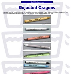
Fight For Kisses //// Wilkinson. Cowabduction.com. Programming Language Inventor or Serial Killer? Table of Condiments. Monopoly Cards We'd Like to See. The Web 2.0 Bullshit Generator. Rejected Crayons. Each year, hundreds of new color names are considered for inclusion in boxes of crayon.

As you might expect, most potential color names never make the cut. Gathered here are some proposed crayons that weren't quite up to snuff. © Scott Roeben, 2005 Pictures || Jokes || Trivia || Fallacies || Articles || Strange || Cards || Mixed Bag || Links || New || Contact || Subscribe Please be advised: The crayons satirized here should in no way be mistaken for actual crayons, or construed to be even remotely related to Crayola brand crayons.
(Note: "Crayon" is a generic term meaning "stick of colored wax or chalk or other material for drawing. ") The crayons pictured above absolutely do not bear the "federally-registered serpentine design trademark" of Crayola brand crayons. Funny. Funny Design reference tips. Posted by Josiah on Feb 14, 2007 in Web Design | 23 comments I’ve compiled a small list (or rant) of some very basic and fundamental rules that all webmasters must learn and respect when developing a website that needs to make actual money. This list can also be used by companies looking to hire a web development firm or to evaluate an already deployed website project. I’ll start off slow and easy… 1. DO NOT resize the user’s browser window, EVER. 2. 3. Girls r evil.