

Da Button Factory: web button maker. Favicon Generator for all platforms: iOS, Android, PC/Mac... Color schemes. Logo Design and Name Generator. Color - Style - Google design guidelines. Material Design Color Palette Generator - Material Palette.
Projetos - Agile DMAIC. Creating a link without an underline in HTML. All browsers that support style's that allow all underlines to be removed from a web page.
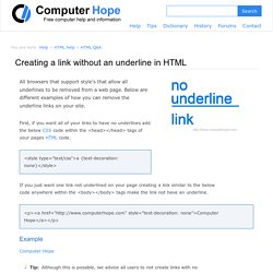
Below are different examples of how you can remove the underline links on your site. First, if you want all of your links to have no underlines add the below CSS code within the <head></head> tags of your pages HTML code. If you just want one link not underlined on your page creating a link similar to the below code anywhere within the <body></body> tags make the link not have an underline. Website thumbnails and website screenshots - PagePeeker. Material Design Color Palette Generator - Material Palette. Material palette More Material Design chevron_right Palette preview.
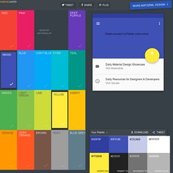
Google Sites Developers (Intranet & Public sites) - Community. Win an invitation for #SPAN15 London. ColorCombo27 with Hex Colors #FFD800 #587058 #587498 #E86850. Marsha Collier's Cool eBay Tools. Minimalist Color Palettes of 2015 by Dumma Branding. View your optimized image. Original Image 841 x 561 2045 KB.

100 Brilliant Color Combinations: And How to Apply Them to Your Designs. Color makes a design come alive.
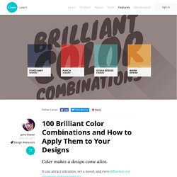
It can attract attention, set a mood, and even influence our emotions and perceptions. Color in Web Design: Color Symbolism - Addicott Web, Raleigh Web Designer & Raleigh Wordpress Website Designer. Color is an important element web designers need to think about when creating the look of a website.
Different colors have different meanings – cultural, instinctual, universal, and more – and can stimulate different people in different ways. Visitors might not notice the impact that using the right colors can have (although they might if the colors break the mold, so to speak), but trust me when I say that they will definitely notice when the wrong ones are used. Choosing colors for a website is more than just a matter of personal preference – the choices really do matter. TinyPNG – Compress PNG images while preserving transparency.
Megapixel calculator. Compare.
RGB color converter. HTML color list. JS Bin - Collaborative JavaScript Debugging. How Colors Affect Your Website. Since the beginning of website design, there has been a well-known debate about how colors affect a website.
When it comes down to it, there is proof that colors affect a website in many ways. Many factors are influences by color including conversion rates, branding, usability, and even search engine ranking. Once you examine all of the different elements of your website that color plays a factor in, you will pay closer attention in choosing the colors you use in your design. Color and Website Conversions When you create a website with the purpose of selling your products and services being the main goal, it is important to consider the color scheme and each individual color because studies have shown that they have a huge impact on conversions. 93% of shoppers put visual appearance and color over all other factors when buying.85% of consumers cite color as the primary reason they buy a particular product.
Color can also help you target certain types of customers. Type Genius. Fontface Ninja. The psychology of visual UX. Storytelling in Web design guides the user experience, incorporating all types of media to craft a logical and emotional narrative out of thin air.
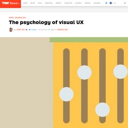
Since the beginning of human history, stories have played an important part in how we connect with one another. Just because we now tell our stories on the screen rather than around a campfire does not lessen their ability to captivate people emotionally. The tricky part, of course, is creating a cohesive narrative when the story is not always told linearly since the “listener” (in this case, the user) can control the flow and pace of the experience through multiple avenues of navigation. “Cave Painting”. Artotem. Before you know your story, know your user. Conduct user research, create supporting UX documentation (personas, storyboards, experience maps), then dive into the psychology and behavior of your users. The Web is now certainly a visual medium, though in its early days it was largely text-based. Photo credit: “brain picture.” How do you change the color of bullets and numbers OL and UL tags? Blog Book Tour: Visual Design Solutions.
SumoMe My new book, Visual Design Solutions, has been published.

I was inspired to write this book when I realized there were no visual design books specifically for people in the learning industry, even though we create in highly visual mediums. I also have an undergrad degree in Art Education, so I am keenly interested in this topic. Why UX design patterns work and how to use them. The web's been around for more than 20 years, giving us ample time to discover user experience problems — in fact, to discover "user experience" at all — and invent solutions.
Some solutions worked so well that designers everywhere began to use them repeatedly. And through familiarity, users came to expect them. This was the beginning of web design patterns: a common visual language that both designers and end users understand. It wasn't hard to do. 56 Tools for Visual Improvement of Your Website Content. By Dmitry Molchanov on Sep 03 2015 Visual elements of a web page play key role in capturing attention of readers.
Image perception happens instantly and effortlessly, our brain process visual information much faster than text. Sometimes visuals are simply the most effective and creative way to present information, data, or concepts that are difficult to understand. You don't have to be a graphic designer to create professional and engaging visual elements for your website, you just need to use the right tools. DesignTAXI - Interstital Advertisement. Great Use Of Colors In Web Design. By Bogdan Sandu in Web Design Research has it that a majority of all the product assessments made by customers are primarily based on color and of that percentage, most of the time is the sole reason an individual purchased a certain product. This fact holds for both material and non-material goods. The use of color psychology in this case is used to effect conversions. There are numerous established companies that have put time and their resources in creating a specific image and building their brand using specific colors.
10 Interesting Color Tools. No matter if you’re designing a website, creating a brochure, writing a game or just messing around in creative apps, the key to attracting your audience’s imagination is choosing the right set of colors. Key Differences: E-learning vs. M-learning. Many organizations are converting existing e-learning courses into m-learning by making the interface responsive and by publishing them in the HTML file.
The reason behind this is to provide the most meaningful learning experience through the use of mobile devices. In fact, most of them consider e-learning and m-learning are the same. But in reality, e-learning is completely different from m-learning in various aspects such as variable screen size, GUI, access, scrolling, interface, and compatibility. Why Design a Simple User Interface for Mobile Learning? Ten things you need to know about responsive design. Type is not one size fits all. That 24-point Helvetica that renders beautifully on a desktop may be impossible to read on a much slimmer mobile device.
Good Design - Form and Function - Art versus Design - Design - User Experience - UX Design. Art vs. How to design if you suck at design. In Western culture, the “copy” has a negative connotation, it is seen as something lesser than an original which it can never surpass. Japanese culture, however, actually accepts and appreciates reproductions when they improve on or adapt their original. Every Designer Should Know Dieter Rams' Design Principles. Dieter Rams’ design motto, “Weniger, aber besser” (“Less, but better”), has inspired many industrial designers in the past 50 years. Among them is Jonathan “Jony” Ive, Apple’s Senior Vice President of Design, who gave the world the simplistic yet refined designs of Macs, iPods, iPads, and iPhones.
Rams believed that understanding people is the key to a good design. He also encouraged designers and everyone else to be responsible for the world around them. He advocated against wastefulness and urges the earth’s inhabitants to make good use of its limited natural resources. Needless to say, these carried over into his design philosophy. Image source. UX Myths. 20 Design Rules You Should Never Break. Just like with any profession or discipline, design comes with some rules.
While breaking design rules is allowed and even (in some circumstances) encouraged, it’s important to at least be aware of the rules you are breaking so you can break them the right way. From typography to layout, right through to colour and special effects, this list runs through a few basic rules, tips, tricks and guides to some common errors and how to banish them from your design. 01. UI Colors - Get Awesome UI Colors for Your Website.