

(Sketch) 9 Tips For Designing Faster and More Efficiently So You Don’t Go Insane. Sketch Tutorials Author Note and Shameless Plug: These are techniques I picked up while building UX Power Tools design system.
I am an active designer and I use this system for 10 hours a day, along with every technique mentioned in this article. If I didn’t believe in it, I wouldn’t be writing about it 😌 1. A Practical Guide To Invisible Design. Ecommerce Web Form Design Best Practices: 12 Tricks for Making Your Forms Less Tiresome. Hands up who actively enjoys filling out webforms? Oh, so nobody then. Do you know these web design principles? You Should. Nowadays almost everyone will have a website to promote themselves whether they are a business or freelance worker, some people even make sites to promote their hobbies or interests.
With many new websites being added everyday the web is becoming a more crowded and competitive place. Not everyone has the skills and expertise to know what it takes to create a really successful website, which creates high demand for the services of website designers. Successful website design requires a fine balance of creative talent and technical ability making a it a highly skilled process. What Is UX Design And Why It's Important. Have you ever wondered at what point within the literal universe we actually manage to process the incredible amount of data found online?
Well, the answer is nowhere, and it is precisely why the online universe is such an innovative environment. It also explains why UX has always been so essential for the design of appealing and attractive online platforms. In fact, UX (or user experience) seems to be something which is wholly necessary for the creation of a top quality website, but also something which very few users understand. Yet, every internet user has had at least one bad encounter online, so they do know what it feels like. Website navigation and user experience. Website navigation usability is the most crucial element in design.
It makes the difference between a website where users find what they are looking for and one which causes so much frustration that users want to abandon it. The whole point of designing a website is to allow access the content, so the success of the design depends entirely on the quality of navigation user experience. It has the same as the navigation of a ship out at sea, which can mean life or death to the sailors on board. A website that provides a poor navigation loses conversions and can kill the business.
Unlike content, which has to be unique, the navigation should be entirely predictable. 7 unbreakable laws of user interface design. Are you a web designer?
If yes, then you are also a user interface designer, and in the near future, this role will become even more important for you. While web pages today have simple user interfaces with no more than navigation and contact forms, the rise of new technologies and standards will create a demand for more dynamic and customized experiences. This, inevitably, means more user interface work. Responsive Web Design: 50 Examples and Best Practices. Responsive web design term is related to the concept of developing a website design in a manner that helps the lay out to get changed according to the user’s computer screen resolution.
More precisely, the concept allows for an advanced 4 column layout 1292 pixels wide, on a 1025 pixel width screen, that auto-simplifies into 2 columns. Also, it suitably fixes on the smartphone and computer tablet screen. This particular designing technique we call “responsive design”. Now you can test your website using the Responsive Design Tool. 10 Must Know Image Optimization Tips - Image SEO. If you run an online store, image optimization is an art that you want to master.

From attracting shoppers perusing Google images to reducing site load time, image optimization is an important part of building a successful ecommerce website. What is image optimization? Image optimization is about reducing the file size of your images as much as possible without sacrificing quality so that your page load times remain low. It’s also about image SEO. That is, getting your product images and decorative images to rank on Google and other image search engines. EyeQuant — The 3W's eBook. EyeQuant — How Carousel Banners Influence First Impressions in eCommerce eBook. EyeQuant — Data Shows Most Websites Are Too Cluttered eBook. 2017 EyeQuant Accuracy Study. How to Optimize Images for Web and Performance. Trust us, you don’t want Google to hate your website. Fortunately, you can reduce your image’s file sizes to help improve your website’s performance.
One problem with formatting them is that modifications often reduce their quality (which in turn might make the visitor hate your website). That’s not a bad thing as long as you don’t make them ugly. There are some tricks and techniques that let you reduce the image’s file size and still keep them pretty enough to proudly display them on your website. JPG, PNG and SVG on the web: A beginner's guide. Nowadays, images are an indispensable part of the web.
However it wasn’t always like that. Only in 1993 the Mosaic browser would introduce images along with content in web pages. Some formats, like GIF and JPEG, already existed in that time and others like PNG and SVG, would only appear in the 90s. Images are used for multiple purposes, like showing pictures, branding, illustrations, charts and many other things. Love (and hate) at first sight: how carousel banners influence first impressions in eCommerce. Carousels.
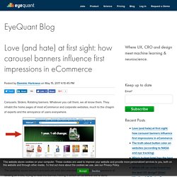
Sliders. Rotating banners. How to Create a Perfect Color Scheme [Infographic] - Designmodo. Nothing can make a project stand out or identify your brand or business like color.
![How to Create a Perfect Color Scheme [Infographic] - Designmodo](http://cdn.pearltrees.com/s/pic/th/perfect-infographic-designmodo-145401374)
Just think: What would the “Golden Arches” of McDonald’s be without the signature red and gold? When it comes to creating the perfect color scheme, there are plenty of things to consider. Established branding is important and should be honored if colors already exist. But if not, the world of color is open for you to explore. Much of the design theory involved in creating a great color palette starts with the color wheel. There are plenty of ways beyond theory to create great color schemes as well. How To Create a Web Design Style Guide - Designmodo. How to successfully design for the confusing way people buy. 7 Design Mistakes That Can Ruin Your Content. 7 Design Mistakes That Can Ruin Your Content Design mistakes can happen to anyone.
Maybe you’re trying to finish a project too quickly, or you’re working on a complex site design where something simply gets overlooked. But, when they happen, you have to fix them… immediately! Some design mistakes can ruin your content, cause users to abandon your site, or lose trust in the information you provide. It can be tough to recover from if you don’t make corrections. 1. The biggest typography offender is space. For most blocks of heavy copy – think paragraphs of body text – common line spacing for the web is about 120 percent to 150 percent of the size of lettering. The trick is in that happy medium, where text is easy to read and has a natural flow, but does not become tiring on the eyes. When it comes to text wraps, follow that same general rule. Best Practices For Website Header Design.
Everyone knows: there is not the second chance to make the first impression. In the sphere of digital products, this eternal truth works in terms of high competition and incredible diversity. No doubt, some zones of the webpage or mobile screen are particularly important and effective in this aspect. Bonnes pratiques emailing. Email Newsletter Design Best Practices. Email marketing design has never been more important than today. In order to expand their reach to new audiences, and keep current users satisfied, businesses nowadays rely on email newsletters to promote their events and upcoming projects, share company info, or any additional news relevant to their followers. Great Alternatives to Hamburger Menus – UX Planet. UX Myths. Limitations of HTML Email Design - Email Width and Size. It was already almost 10 years ago when I first had to deal with editing an HTML email. Back then, I had no idea what it was exactly and what could go wrong if I changed some parts of the code.
Your Body Text Is Too Small – Medium. Optimizing Bigger Body Text. Well Designed CTA Buttons. Charte de référence pour résolution iOS. Astuces pour design mobile iPhone 6 (EN) Apple updated its iPhone a bit ago making the form factor much bigger. The iPhone 6 screen size is both wider and taller and the iPhone 6 Plus also has a higher pixel density. 7 bonnes pratiques pour le design d'UX mobile (EN) In the last 3 years desktop Internet usage has fallen from 90% to 60%, while mobile usage has increased to 40%.Following this trend, mobile devices are set to upstage desktop Internet access soon. Very soon. 7 éléments d'un processus de redesign (EN) Shopify Plus, the enterprise version of our hosted ecommerce platform, launched in February 2014 and was still in its first iteration when I asked if it was time for a redesign.
It’d been just over a year, but we had a better understanding of our customers and who we were. The old brand just didn’t fit anymore. We didn’t follow any particular process, but doing the following 7 things in tandem helped us get where we wanted to be. 6 éléments essentiels d'une bonne page d'accueil (EN) Have we forgotten about homepages?
It seems as if every article on web design, content marketing, or CRO focuses on landing pages. While these pages are certainly important, your homepage is essentially the flagship of your website. 8 bons exemples de newsletters (EN) Newsletters are a staple in the email marketing world because they simply work. When business owners were asked what kinds of emails they send, newsletters topped the charts, followed by promotional and welcome emails. Web Designers Checklist — Liste à cocher pour un bon design (EN) Guide sur l'optimisation de la performance web (EN) Why Every Artist Should be a Great Storyteller. How Creativity Can Kill a Good Website Design - Rafal Tomal.