

On Trouser Pockets. UX Myths. How Technology Hijacks People’s Minds — from a Magician and Google’s Design Ethicist. How Technology Hijacks People’s Minds — from a Magician and Google’s Design Ethicist Estimated reading time: 12 minutes.
Kano model. The Kano model is a theory of product development and customer satisfaction developed in the 1980s by Professor Noriaki Kano, which classifies customer preferences into five categories.

Categories[edit] These categories have been translated into English using various names (delighters/exciters, satisfiers, dissatisfiers, etc.), but all refer to the original articles written by Kano. Colors. Color Palette Generator. Understand color theory with these 7 facts - = Designer Blog. Color is everywhere – in nature, in cities, in stores, online.

The Smashing Book 2 Is Available: Get Yours Now! - Smashing Magazine. The Smashing Book 2 is here.
It’s printed (+ free eBook). It’s available. And it’s being delivered worldwide at this very moment as you are reading this. All pre-ordered books have been sent out from our warehouse via air mail and should reach all countries soon. In fact, some readers have already received a copy of the book. How to Get a Professional Look With Color. What makes a design look coordinated, planned and professional?

The answer is: ‘color’. Not every project needs bland corporate blue to look professional. Planning color means creating a framework that describes which colors to use and how to use them.
Whatsapp lance son app web : Chrome only ! GoodUI. The End Of Apps As We Know Them. The experience of our primary mobile screen being a bank of app icons that lead to independent destinations is dying.
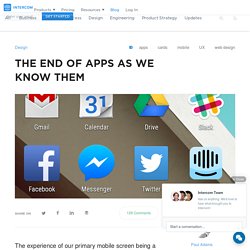
And that changes what we need to design and build. How we experience content via connected devices – laptops, phones, tablets, wearables – is undergoing a dramatic change. The idea of an app as an independent destination is becoming less important, and the idea of an app as a publishing tool, with related notifications that contain content and actions, is becoming more important. This will change what we design, and change our product strategy. No more screens full of app icons This is such a paradigm shift it requires plenty of explaining. The idea of having a screen full of icons, representing independent apps, that need to be opened to experience them, is making less and less sense. The primary design pattern here is cards. Designing systems not destinations I covered this topic in detail in a previous post, so I’ll quickly summarise here.
But that is changing fast. Octalysis: Complete Gamification Framework - Yu-kai Chou. (This is the Gamification Framework that I am most known for.
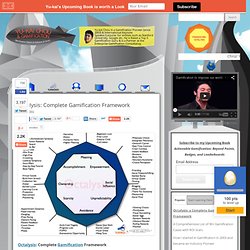
Within a year, it was translated into 9 different languages and became classic teaching literature in the gamification space in the US, Europe, Australia and South America.) Octalysis: Complete Gamification Framework. Why cards are the future of the web. Cards are fast becoming the best design pattern for mobile devices.
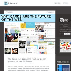
We are currently witnessing a re-architecture of the web, away from pages and destinations, towards completely personalised experiences built on an aggregation of many individual pieces of content. Content being broken down into individual components and re-aggregated is the result of the rise of mobile technologies, billions of screens of all shapes and sizes, and unprecedented access to data from all kinds of sources through APIs and SDKs.
This is driving the web away from many pages of content linked together, towards individual pieces of content aggregated together into one experience. The aggregation depends on: The person consuming the content and their interests, preferences, behaviour.Their location and environmental context.Their friends’ interests, preferences and behaviour.The targeting advertising eco-system. Twitter is moving to cards. Fonts have feelings too — ooomf labs. I’ve noticed how seemingly small things like font and the spacing between letters can impact how I feel when reading online.
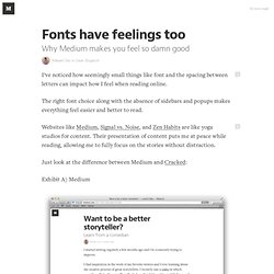
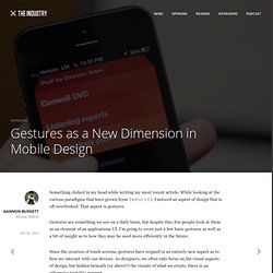
The right font choice along with the absence of sidebars and popups makes everything feel easier and better to read. Websites like Medium, Signal vs. Facebook "Home" and "HTC First" phone - Conference (Full Length) Barackobama.com. Gestures as a New Dimension in Mobile Design. Something clicked in my head while writing my most recent article.
Instagram Finally Breaks Free Of Its Mobile-Only Confines. Instagram is slowly shedding the "mobile-only" label it gained when it launched almost exactly two years ago. Users of the wildly popular, Facebook-owned photo app are getting Web-based profiles, it was announced on Monday. This sensible, overdue move for Instagram stands to benefits its users, but it doesn't quite go all the way. Instagram has been moving toward Web app territory for several months, but this is the service's biggest step in that direction. In July, the Instagram added the ability to like and comment on photos from the Web version that gets pushed out via Twitter and Facebook. That update also included the ability to follow users when logged into your existing Instagram account in a Web browser. How Instagram Users Will Benefit Starting this week, users will start getting Facebook Timeline-style profiles that display their entire photo stream in the browser.
Predictably Irrational. Predictably Irrational: The Hidden Forces That Shape Our Decisions is a 2008 book by Dan Ariely, in which he challenges readers' assumptions about making decisions based on rational thought. Ariely explains, "My goal, by the end of this book, is to help you fundamentally rethink what makes you and the people around you tick. I hope to lead you there by presenting a wide range of scientific experiments, findings, and anecdotes that are in many cases quite amusing. Once you see how systematic certain mistakes are--how we repeat them again and again--I think you will begin to learn how to avoid some of them".[1] The book is unique in that it offers a down-to-earth descriptions of rigorous academic research that is described in a very appealing and accessible manner.
Chapter summary[edit] Screw the Power Users. I designed HomeSite and TopStyle for power users. Only power users would want to edit HTML & CSS by hand, so I made sure to cater to them. Those products were filled with features and tool buttons, and their settings dialogs contained dozens of geeky options. Startups, This Is How Design Works – by Wells Riley. 25 User Experience Videos That Are Worth Your Time - Smashing UX Design. Advertisement. Good artists copy. Great artists steal.