

UX i Norge: Anbefalte bøker, alle år. / Okse. InVision DesignTalks. Join four UX experts as they talk process, inclusive UX copy, how UX writers and designers can better collaborate, and how to improve forms with great copy.
No long, drawn-out presentations—just 30-minute talks with actionable advice you can apply to your work today. Biz Sanford Biz has spent the last three years building products and tools that help more than 600,000 Shopify entrepreneurs grow their businesses. She manages Shopify’s voice and tone, sets content standards, and teaches the entire organization how to write their own great content. Words and the design process When it comes to building products, some people might think of content as a final flourish, words on a page or screen that can be written just before launch. Sketching with wordsWireframing the right amount of contentPolishing content in high-fidelity mockupsUnlock Now Ada Powers. InVision DesignTalks. “Learn More” Links: You Can Do Better. Some trends are subtler than others.
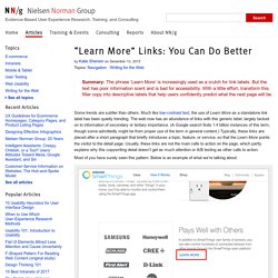
Much like low-contrast text, the use of Learn More as a standalone link label has been quietly trending. The web now has an abundance of links with this generic label, largely tacked on to information of secondary or tertiary importance. (A Google search finds 1.4 billion instances of this term, though some admittedly might be from proper use of the term in general content.) Typically, these links are placed after a short paragraph that briefly introduces a topic, feature, or service, so that the Learn More points the visitor to the detail page.
Usually, these links are not the main calls to action on the page, which partly explains why this copywriting detail doesn’t get as much attention or A/B testing as other calls to action. Most of you have surely seen this pattern. The proliferation of Learn More links is likely mobile driven: mobile-optimized sites are getting better at deferring secondary content. Why Learn More Is a Problem Option 2. Toggle-Switch Guidelines. Every morning, I wake up, pour water into my tea kettle, and flip the switch on.
Once the water is boiling, I turn the kettle off and pour myself a cup. The switch on my kettle is an example of a toggle. Design better data tables. How to make usability testing a habit. A Primer to Web Accessibility for Designers. Logo. 15 Professional Brand Guidelines Templates Bundle. Creating Personas. A guide, not a template The first thing a good UX Designer should tell you about creating a persona is that if you just blindly follow a template, you have missed the point.
User research should inform the layout — don’t let the layout constrain the research. What Does a UX Designer Actually Do? Laws of UX. 4 Ways Animation Can Actually Improve User Experience. 14 of the Best Product Page Design Examples We've Ever Seen. If you look at how product pages take shape across different companies, it's clear that they run the gamut.
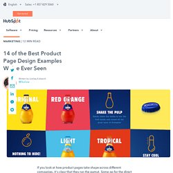
Some go for the direct approach, displaying an image of a product and explaining why someone should buy it. Other companies create elaborate pages with moving parts and fancy coded elements. Of course, some companies fare better than others at creating delightful product pages. But since we prefer to focus on the positive, we scouted out 14 examples that we find truly admirable. From messaging, to value propositions, to general product promotions, these brands nail these features in a persona-friendly way. And after checking out these pages, you might want to buy their products, too. 14 Remarkable Product Landing Page Designs 1) Bellroy Bellroy sells thinner-than-typical wallets. To answer those questions, Bellroy divided its product page into three stages of the buyer's journey -- understanding the problem, how to fix the problem, and how Bellroy can resolve the problem. 2) Wistia. The ultimate guide to web content accessibility. Websites with standards-compliant code all follow the typical W3C standards.
But there’s a whole different level of compliance when it comes to WCAG, also known as the Web Content Accessibility Guidelines. The same people who produce the HTML5/CSS3 specs organize and officiate these guidelines, so it’s truly an international system of coding standards. Most web developers never bother with WCAG accessibility, but it’s becoming a huge aspect of the internet. This post was originally published on Vandelay Design. If you’re looking to understand accessibility or just want to delve a bit deeper into the subject, then this guide is for you. Intro to WCAG The Web Content Accessibility Guidelines follow the current v2.0 spec requirements for accessible websites. “Give all users the best experience possible regardless of limitations or disabilities.” I’d also like to clarify that there are levels of compatibility when it comes to content accessibility.
WCAG conformance Navigation and consumption. 52 Weeks of UX. The user experience is made up of all the interactions a person has with your brand, company, or organization.
This may include interactions with your software, your web site, your call center, an advertisement, with a sticker on someone else’s computer, with a mobile application, with your Twitter account, with you over email, maybe even face-to-face. The sum total of these interactions over time is the user experience. The interaction designer plans for these moments. UX Myths.