

5 usages innovants de Whatsapp. Pourquoi ?
Avec 700 millions d'utilisateurs et 30 milliards de messages échangés chaque jour, Whatsapp est loin d'être anecdotique. Pourtant, les marques et les entreprises sont encore peu nombreuses sur la plateforme, dédiée uniquement à un usage personnel. Et si tout cela changeait ? S'il n'y aura jamais de place pour la publicité sur Whatsapp - Mark Zuckerberg l'a juré lors du rachat de l'application - les possibilités pour les entreprises et les marques restent nombreuses. En voici quelques exemples, du Brésil au Nigéria en passant par l'Espagne et l'Inde. Comment ? 1/ Pour faire sa pub Et oui... les agences aiment trouver les failles : si les conditions générales de Whatsapp interdisent tout usage non personnel de l'application, cela n'a pas empêché des marques de s'y faire une place, à l'image de Toyota et de Pringles en Espagne - l'un des marchés phares de la messagerie. 2/ Pour améliorer son service client 3/ Comme nouveau canal d'information 4/ Pour vendre !
It's Time to Treat Content as Part of the User Experience. Forget content marketing, SEO content, and whatever else as you know them.
We need to fundamentally change our approach to content. It's not an add-on or a separate thing. It's an inseparable part of the user experience. Building your design portfolio? Here are 8 things I wish I’d known. — Doing the Work. Two years ago, I was finishing my last semester of college, and preparing for the seminal moment in a design student’s life: portfolio reviews, and finding a job.
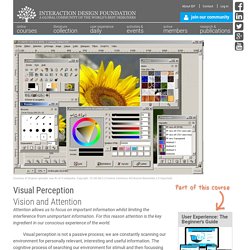
And even though I was finishing a degree in graphic design, I was looking for a full-time job as a UX/UI Designer. My hard work paid off. I landed a job at Bloc, and it’s been a magical time. Visual Perception. User Experience: The Beginner's Guide Course starts: Jun 24th, 2015 Course ends: Sep 9th, 2015 Self-paced online course: Each week throughout the course you get access to a new lesson but you can move through the lessons at your own pace.
Limited availability. UxDInsights. UX Lessons Learned from Android’s Top Mobile Games. Every Tuesday, UserTesting’s Research Team studies a different product to share here on the blog.

We hope you’ll learn some nifty research techniques and get inspired to run some insightful tests of your own. Enjoy, and check back in next Tuesday! More than ever, people who don’t consider themselves “gamers” are pulling out their smartphones to play mobile games in their spare time. In fact, a study projected 16.5% growth in the mobile gaming field for 2015, far surpassing that of other mobile areas. Design Kit. 7 future web design trends. Too many articles will tell you what is cool in web design.

I’m going to take you past the obvious to make some real predictions. 1. Gestures are the new clicks We forget how hard scrolling webpages used to be. Most users would painstakingly move their mouse to the right edge of the screen, to use something ancient called a ‘scrollbar’: As a pro, you probably used a mouse wheel, cursor keys, or trackpad, but you were way ahead of most users.
UX Tools — UXdesign.cc. Redesigning Hype. A revamped User Interface Pretty early on in the process of making Hype 3, we decided we wanted to focus on the interface.
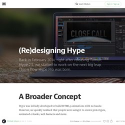
Version 1 looked very ‘Native’ in the initial release, but we realized it was time for an update. The overall idea for the redesign was to keep a strong Mac OS X look and feel. We wanted to make the app as intuitive as possible and move beyond the Keynote-like interface to give the UI a much stronger personality. Solving the Brain Fitness Puzzle Is the Key to Self-Empowered Aging. What works to preserve cognitive abilities?
Much like the human brain, the answer is complicated, individual and nuanced. As the concept of brain fitness (or, the brain’s ability to function efficiently and effectively in personal and professional life) goes mainstream, the proliferation of scientific findings, media reports, and commercial claims is generating much noise and confusion. Knowing what to believe and what to do presents a real-life puzzle, leading many people to either inaction or toward a focus on the wrong priorities.
Click to view and download article as a PDF document. The 22 Rules of UX — ThoughtWorks. The 22 Rules of UX By Valeria Spirovski Pixar’s 22 rules of storytelling adapted for UX — because both are about creating great experiences.
In 2011 Emma Coats, a former storyboard artist at Pixar, tweeted the “22 rules of storytelling”. The post has become well known and was recently re-done as image macros. As I was reading each of the 22 rules, I felt drawn to the message Emma was trying to convey. UX vs. SEO: Web Design Battle Royale? There are two unassailably important considerations when designing an effective web presence.
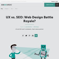
Namely: UX and SEO. While these two fields have the common goal of providing a service, the conventional wisdom says that they cater to two distinctly different crowds. The Expert Review is More Than a Second-Rate Usability Test: MeasuringU. Jeff Sauro • May 19, 2015 Usability testing is an essential method to measure the user experience. I write a lot about the value of having actual users attempt tasks in an interface...for good reason. Observing just a few participants attempt actual tasks can reveal a great deal about interaction problems and generate ideas on what to fix. But if you conduct enough usability tests and observe enough users, you notice patterns in behavior. That is, despite the many variations in websites, software products, and hardware products, we see patterns across all interfaces.
» Conférence : UX et objets connectés. Why White Space Is Crucial To UX Design. All good visual artists understand the importance of negative space, the empty area that draws attention to, and accentuates, the actual subject. Negative space (the artistic equivalent of a designer’s white space) is like the supporting cast whose duty is to make the star of the show stand out more by not standing out so much themselves. If you don’t think any part of your design should be intentionally blank, take a look at the World’s Worst Website Ever for an extreme example of the damage caused by too many objects competing for attention. In interaction design, white space isn’t just an aesthetic choice— it serves three essential functions. 1. Improving Comprehension If cluttering your interface overloads your user with too much information, then reducing the clutter will improve comprehension.
Medium is a great example of striking a nice balance with all four elements of white space. Designing For Virtual Reality. Virtual reality. It’s an experience that’s been around since the mid 80’s, but technology always seemed to hold it back. The advances in smartphones and related technologies has finally brought the incredible potential of VR within reach. Now, we’re in the midst of a virtual reality revolution. From high-end platforms that cost thousands of dollars to smartphone-run systems, the surface of designing for VR has just barely been scratched. Essentially, it’s a wild west, ripe for exploration and new ideas, and Google’s kicking off the conversation. UX search patterns - An Accidental Encyclopedia. From the Web and UX Design Accidental Encyclopedia – BUY IT HERE I was doing some research into search patterns and I thought I would share… 1: UX search pattern: Basic Search Search results based on keywords in-putted into the search field.
UI elements - An Accidental Encyclopedia. From the Web and UX Design Accidental Encyclopedia – BUY IT HERE Here is an overview of some of the graphic UI elements that can be used on a website to enhance a user experience. Remember, less is more! UI elements overview graphic – click to enlarge. 1: Browser title bar: Depending on the browser, the user will be confronted with additional navigational elements 2: Breadcrumbs: Useful in allowing the user to find his way back to the previous section, or the home page. 3: Main Navigation: The main navigation is the most important aspect of the entire sites taxonomy. Where do you put all the stuff on the site and how does the user find it.
User is the king (part 2) — User Experience Design (UX) “Your homescreen is the castle while the apps are the paintings” The current Operating System for mobile applications separate every services. The users see on the home screen every apps he downloaded, without any connections between each others. I like to imagine each application as its own world, as a complete experience. The home screen is Super Mario 64 castle while the apps are the paintings, leading to the levels. Full disclosure, I am not a big fan of this system, but those are the rules of the OS builders, so we have to stick to them. Just like the cinematics starting a new level to reveal the new environment, when a user first launch an app, he has to be introduced to your service, your rules and quickly understand why he will love it.
Introduction to your World Nowadays, there are so many new digital products coming out everyday that yours need to stand out during the first minutes the user will try it. Intro pages. In. Apple iPhone 6s Force Touch sensor to give revolutionary user experience, but at the expense of the Home Button? Apple is designing the iOS 9 to support Force Touch sensors in the upcoming iPhone 6s. Design user research explained for everyone with animated gifs. The most relevant source of inspiration and considerations when designing things are people. Why White Space Is Crucial To UX Design. All good visual artists understand the importance of negative space, the empty area that draws attention to, and accentuates, the actual subject. Negative space (the artistic equivalent of a designer’s white space) is like the supporting cast whose duty is to make the star of the show stand out more by not standing out so much themselves.
18 Web Growth Hacks You’ve Never Seen. 1. 8 Must-Answer Questions for an User Centered Design.
Maquettes / Mockups. Divers. Icons. The science behind Netflix’s first major redesign in four years. Back in March, a developer named Renan Cakirerk wrote a small piece of code that made a big impact on Netflix. Cheekily named "god mode," it addressed one of the most annoying aspects of trying to use Netflix in your browser: scrolling through the company's ever-growing list of movies. Once enabled, it would simply give you one, big list. Instead of sitting there, holding your mouse in anticipation, you could simply find the title you wanted and get on with watching.
This Door is the Epitome of User Experience Design — My User Experience Journey. How to ask for design feedback. Coder's Block Blog / Iconifying Content. This tutorial will walk you through the concept of iconification — taking content on a page and applying CSS to transform it into a simplified, icon-sized preview of itself. Crafting Easing Curves for User Interfaces. Photo Collage by Maxime Lefévre. No Bottom Line? No Experience: Finding the balance between user needs and business needs.
How the Apple Watch is opening up new ways to communicate. Sign Up. The Cost of Performance. Not Your Parent's Mobile Phone: UX Design Guidelines For Smartphones. Responsive Web Design. 8 RWD problems (and how to avoid them) Tips, Resources and Patterns for Responsive Web Design. This Explains Everything » Lesson 4: How Scarcity & Impatience Drive Irrational User Behavior. Web Design: How Element Spacing Works. How to find freelance design work.
10 UX Design Mistakes to Avoid - Free Web Design Tutorials. How do people become convinced of something, beyond all doubt? How to align user experience strategy with business? Online User eXperience Institute - Home. 19 UX Influencers You Should Definitely Be Talking To. How to Create Successful Mobile Experiences. Choosing performance. Inside Design: Netflix « Thoughts on users, experience, and design from the folks at InVision. Apple Watch UI Kit. Paper - Think with Pen & Paper (Parody) Designing for Disappearing Interfaces. User is the king — User Experience Design (UX) Home - Work & Co.
The Future of Design in Technology — The Year of the Looking Glass. Important Elements of Web Design. GroupQuality market research software plans & pricing. What is an online market research community discussion board and how can I benefit from it? - GroupQuality. Make Your Own Website - Free Step by Step Tutorials. Actualité UX, retour d'expérience - News LudoTIC. Acr_vol32_34.pdf. Will UX connect the dots of IoT? Toscani: Payment Info Experiment. Learn to Create Forms That Improve User Experience. 5 Research Based Tips for a Better Contact Form. Grid Forms · Data entry made beautiful. How to Improve Retention With Design: 3 UX Laws to Retain Users. Card Generator. Creating Next Generation User Experiences.
Are you looking for a UX Designer, really? Conversion Rate Optimization Tips List. [Infographic] The Average Checkout Experience » Conversion Optimization Blog - A/B Testing Software. AndCo_VirginAmerica2014.pdf. Showcasing UI Interaction Design with Animated GIFs. 3 ways friction can improve your UX. WorkAndCo_VirginAmerica2014.pdf. 10 Great UX/UI Design Cheat Sheets. The Typographic Details Behind My 10 Favorite Sites of April 2015. Firefox OS TV User Interface & Animation Design. This Explains Everything » Lesson 2: Emotional Engagement – Designing with the Heart in Mind. UX Designers: Why are we Wasting Time? Brain Sparks. "Top 10 Hiring Mistakes Made By Mobile Start-up's" A List Apart: For People Who Make Websites. User Experience Professionals Association. Boxes and Arrows. Nielsen Norman Group: UX Training, Consulting, & Research.
Interaction Design Association - Homepage. Insights and inspiration for the user experience community. Defining and Informing the Complex Field of User Experience (UX) A User Experience Design Publication. Awwwards - Website Awards - Best Web Design Trends.