

Tableau Desktop Specialist vs Certified Associate Exam - Take This Course. Tableau desktop has three exams and among these three, the first two are tableau desktop specialist and tableau desktop certified associate.
Both these exams are different in nature to one another and have many dissimilarities and a few similarities with each other. So let us take a look at the differences between the two exams. Tableau Desktop Specialist Certification Exam Dumps. 21 Must-Read Data Visualization Books, According to Experts. The best data visualizations books have (pardon the pun) a long shelf life.
While new tools emerge and old ones evolve, so many core best practices in data visualization remain evergreen — be they color selection, axis orientation, the appropriateness (or gratuitousness) of animation or interactivity in a given context, and far beyond. “A lot of what changes is just software, [but] a lot of the concepts remain very constant,” said Alli Torban, a Washington, D.C. Mastering Shiny. Infográficos, martillos, cebollas y ecuaciones >> Periodismo con futuro. 15 Stunning Data Visualizations (And What You Can Learn From Them) We’re literally drowning in data.
Everyday, 2.5 quintillion bytes of data are created. This is the equivalent of 90% of the world’s information--created in the last two years alone. Now this is what we call “big data.” But where does it come from? Infographics Design and Data Visualization Agency. Data Visualization & Storytelling. The Difference Between Teaching and Doing Data Visualization—and Why One Helps the Other. Dataviz: Making Smarter, More Persuasive Data Visualizations. Data Visualization with R.
3 Data visualisation. Introduction “The simple graph has brought more information to the data analyst’s mind than any other device.” — John Tukey This chapter will teach you how to visualise your data using ggplot2.
R has several systems for making graphs, but ggplot2 is one of the most elegant and most versatile. ggplot2 implements the grammar of graphics, a coherent system for describing and building graphs. Data Visualization for Storytelling and Discovery - Journalism Courses Knight Center. Choose from the options below This resource page features course content from the Knight Center for Journalism in the America's massive open online course (MOOC), titled "Data Visualization for Storytelling and Discovery.
" The four-week course, which was powered by Google, took place from June 11 to July 8, 2018. We are now making the content free and available to students who took the course and anyone else who is interested in learning how to create data visualizations to improve their reporting and storytelling. The course was taught by Alberto Cairo, He created and curated the content for the course, which includes video classes and tutorials, readings, exercises, and more.
Youtube. Youtube. Fundamentals of Data Visualization. This is the website for the book “Fundamentals of Data Visualization,” published by O’Reilly Media, Inc.
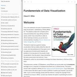
The website contains the complete author manuscript before final copy-editing and other quality control. If you would like to order an official hardcopy or ebook, you can do so at various resellers, including Amazon, Barnes and Noble, Google Play, or Powells. The book is meant as a guide to making visualizations that accurately reflect the data, tell a story, and look professional. It has grown out of my experience of working with students and postdocs in my laboratory on thousands of data visualizations. Over the years, I have noticed that the same issues arise over and over. Data Visualization. Data Visulization Course Materials. This resource page features course content from the Knight Center for Journalism in the America's massive open online course (MOOC), titled "Data Visualization for Storytelling and Discovery. " The four-week course, which was powered by Google, took place from June 11 to July 8, 2018.
We are now making the content free and available to students who took the course and anyone else who is interested in learning how to create data visualizations to improve their reporting and storytelling. The course was taught by Alberto Cairo, He created and curated the content for the course, which includes video classes and tutorials, readings, exercises, and more. The course materials are broken up into four modules: Module 1: Offers an introduction to visualization: what it is, how it works, and what ethical considerations are involved in its design.
Dataviz and the 20th Anniversary of R, an Interview With Hadley Wickham. Data Viz in 60 Secs: Books. Tableau. R Graphics Cookbook. Hands-On Data Visualization.