

Light: Emotion in Painting. How Artists use Colour. Colour is often one of the most exciting components of a painting.
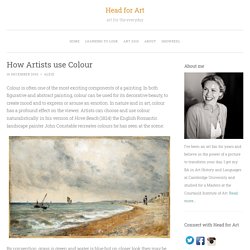
In both figurative and abstract painting, colour can be used for its decorative beauty, to create mood and to express or arouse an emotion. In nature and in art, colour has a profound effect on the viewer. Artists can choose and use colour naturalistically: in his version of Hove Beach (1824) the English Romantic landscape painter John Constable recreates colours he has seen at the scene: By convention, grass is green and water is blue but on closer look they may be made up of many different colours and artists do not have to imitate the colours they see in the physical world. Henri Matisse (1869-1954) is the man credited with revolutionising attitudes towards colour in art. Before Matisse there was Monet who began to question descriptive colours. Here Monet uses Chevreul’s discoveries.
Another way an artist can use colour is to create an illusion of space on a canvas. How Artists use Colour.
COLOUR AS LIGHT. COLOUR AS SYMBOL. COLOUR PALETTES. Color Theory for Painting Reds. Red is an extremely dominant color and even a small piece in a painting will draw in your eye.
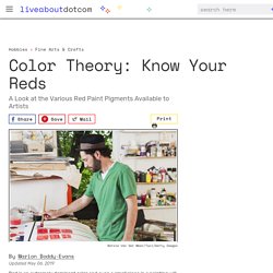
It's the color associated with love, passion, anger, heat, fire, and blood. The various red pigments available to artists each have their own characteristics and degrees of permanency. The Many Shades of Red The first two reds were introduced by ancient Egyptians artists—one made from cinnabar (vermilion) and one from madder root. Art Glossary: Primary Colors. In painting and other fine arts, there are three primary colors: red, blue, and yellow.
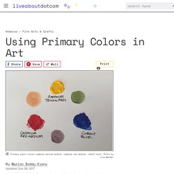
They are called primary colors because they cannot be created by mixing any other colors. Primary colors form the basis for color theory or color mixing, as these three colors are the basic building blocks of color from which it is possible to mix most other colors. A primary color can be any of the red, blue, or yellow pigments available to a painter. Each combination will give you a different result, and that's part of what makes color mixing with paints so interesting.
You can also use the primaries used in printing (magazines, newspapers etc.) which are magenta, cyan, and yellow (plus black), but limiting yourself to these means you never explore the rich potential of paint color mixing and the subtle differences between pigments. Primary Colors and the Color Wheel The triad of primary colors form the points of an equilateral triangle within the color wheel.
Subtractive vs. Tertiary Colors and Color Mixing. Tertiary colors are intermediate colors that are made by mixing equal concentrations of a primary color with a secondary color adjacent to it on the color wheel.
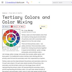
There are three primary colors - red, yellow, and blue; three secondary colors (made from mixing two primaries together in equal concentrations) - green, orange, and purple; and six tertiary colors - red-orange, yellow-orange, red-purple, blue-purple, yellow-green, and blue-green. It is traditional to name a tertiary color starting with the primary color first and the secondary color next, separated by a hyphen. Tertiary colors are the steps between the primary and secondary colors in a 12-part color wheel. Mixing Colors: What You Need to Know About Tints, Tones, and Shades. Glossary of terms. Formal Qualities of Art. Some possible observations in an art critique Line Has weight: thin, heavy, bold, delicate, varied etc.Has action: dynamic, static, restfulHas character: straight, curved, organicIt can construct, render, describe, divide, be impliedMay imply direction or movement, define figures, measure, fill, shade etc.
Shape. Color matching game. Test how well you can analyze colors for their primary components!
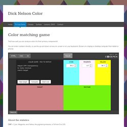
You can enter numbers directly, or use the up and down arrows on-screen or on your keyboard. (Easier on a laptop or desktop computer than tablet or phone). CMY = Cyan, Magenta, and Yellow, the pigment primaries, in % from 0 to 100. HSL = Hue, Saturation, and Lightness. These terms relate to the 3-D color wheel.Hue is the color in degrees (0-360) around the color wheel. 0/360=red; 60=yellow; 120=green; 180=cyan; 240=blue-violet; 300=magenta. Luminance = Overall value; how light or dark. Contrast = How different are the two colors.
Dick Nelson Color.
Meet the artist: JMW Turner. Colour: Delineating shapes and capturing atmosphere. The power of color in animation. Have you asked yourself before about the color magic?
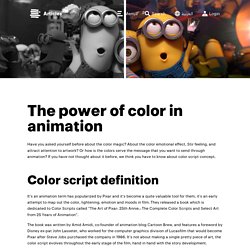
About the color emotional effect, Stir feeling, and attract attention to artwork? Or how is the colors serve the message that you want to send through animation? If you have not thought about it before, we think you have to know about color script concept. It’s an animation term has popularized by Pixar and it’s become a quite valuable tool for them, it’s an early attempt to map out the color, lightening, emotion and moods in film. They released a book which is dedicated to Color Scripts called “The Art of Pixar: 25th Annie.: The Complete Color Scripts and Select Art from 25 Years of Animation”.
The book was written by Amid Amidi, co-founder of animation blog Cartoon Brew, and features a foreword by Disney ex-pat John Lasseter, who worked for the computer graphics division of Lucasfilm that would become Pixar after Steve Jobs purchased the company in 1986. The importance of the color scripts How to create a color script? Colors value 1. How to colour comics. Colouring comics is the best job in the art world, as far as I’m concerned, because it leans heavily towards the fun part of art: the storytelling.

In this article, I’m going to take you through my top tips for adding colour to black and white drawings to bring your scenery and character designs to life. Colour can help expand the scope of a comic, turning each panel from a two-dimensional drawing into a window to a rich, nuanced world. The colour in those panels can flow together to set the pace, like a song. I’ll start by answering some key questions, before sharing some tips for getting the most from colour. If you’re after drawing tips, take a look at our article on how to create a comic page. Why use colour in comic art? This might seem like an inane question, but it’s worth thinking about what benefits colour can bring to an illustration that black and white can’t. What software should I use? That said, I still prefer the brushes available in Photoshop for rendering. 01. 02. 03. 04.
Guide to Creating Color Schemes. Introduction.

Colour and Shape – Teaching Resource. Introduction All art makes use of shape and colour in some way.

Your eyes can be drawn to certain parts of an artwork when shape and colour is used correctly. Artists use colour to express themselves and aim to make you feel something when you look at it. Start discussions about shape and colour with your students by looking at and creating art. This resource is most suitable for KS1 students. Colour How is colour used in art? In his painting Whose Afraid of Barney Newman Bowling uses bright colours and blurred edges. Arthur Hughes, who was part of the Pre-Raphaelite Brotherhood, used colour in a different way to Bowling. Let's explore the different ways colour is used. Can you pass a color blind test? Last updated May 26th, 2018 This is the third article in Color Theory: a complete set of lessons for Art students.
It is estimated that 40% of those who are color blind remain undiagnosed by the time they leave high school.