

Adobe Muse Tutorials, widgets, templates and more. Get pro Muse tools today. Why some projects just go right. Like many web designers, I have spent a lot of time worrying about why projects go wrong.
Perhaps we should be asking what makes a project successful. Headscape recently launched a website for the RAF Benevolent Fund. I am really chuffed with the result. It came in on budget, was turned around really fast and the client seems happy. Best of all, I love the final design produced by Chris Sanderson. My aim is not to massage Chris’ already over inflated ego, but rather to ask why that project went so well.
Of course, every project will be different and what worked for the RAFBF might not work elsewhere. For this project there were 5 key elements of success: The client.Efficient planning.A focus on content.The use of wireframes.A different approach to design. Let’s look at each in turn beginning with the most important element in any project… the client. The client Without a doubt, the single biggest thing that will make or break a web project is the client. Compressor.io - optimize and compress your images and photos. Collection.
Follow @iconmonstr Support me ads via Carbon Basic Business Commerce Equipment Interface Miscellaneous Multimedia Network Security.
Other Resources. A list of other fantastic websites to help you build Web Utilities Web based tools to improve your workflow The place to buy domain names.
Easy to connect domains to your existing host. Launch GoDaddy The great, affordable web hosting that brings MuseResources.com to you today. JustHost Cyberduck. Other Resources. HTML5 UP! Responsive HTML5 and CSS3 Site Templates. Optimizing UI icons for faster recognition. What makes an icon a valuable addition to the interface, rather than a mere decorative element?
Intuitiveness, aesthetic value, memorability, intercultural perception? While an effective icon would combine many of those characteristics, I’d like to focus on one measure–speed of recognition, or how fast a specific icon can be discovered and identified. In a simple leisure app, the difference in speed of recognition may be too subtle to have any noticeable effect on the overall experience. This may be different for a complex trading application: The requirements for iconography here are more likely to prioritize speed, since every second spent on processing individual elements can have a significant impact on the effectiveness of the overall interface.
Semiotic theory and structure of signs User interface, like any language or other communication system, is a construct, made using series of signs. Rail crossing signs. Optimizing UI icons for faster recognition. 8 Universal Web Design Principles You Should Know. The design of your website is more important for conversions than you think.

You can implement any conversion boosting tactic in the world, but if it looks like crap, it won’t do you much good. Design is not just something designers do. Design is marketing. Design is your product and how it works. The more I’ve learned about design, the better results I’ve gotten. Here are 8 effective web design principles you should know and follow. Effective Web Design Principle #1: Visual Hierarchy Squeaky wheels get the grease and prominent visuals get the attention. Exercise. Without knowing ANYTHING about these circles, you were easily able to rank them. Certain parts of your website are more important than others (forms, calls to action, value proposition etc), and you want those to get more attention than the less important parts. Hierarchy does not only come from size. Start with the business objective. Fundação Bradesco. Adobe Muse - The Complete Guide to Embedding a Twitter Feed. Written and tested by Darian Kanius Sometimes you just want more out of your Twitter widget.
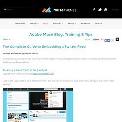
This guide explains how to create, customize, and embed a twitter feed into your Muse website. Creating a basic Twitter feed widget Login to your Twitter account at Look to the upper right of your dashboard menu bar and click on the options drop down menu (the gear icon) then select ‘settings’. Once you are on the settings page select the 'Widgets' option at the bottom of the left sidebar menu. Click 'Create new' to create a new widget Within the widget creator you're presented with a few basic configuration options to customize your widget. Here is a list of the basic design features with a brief description of what they do. Username - Enter your Twitter username. Once you have customized the basic design of your twitter feed you can copy the embed code directly underneath the preview window and add it into an Object > HTML widget in your Muse website.
Advanced customization options. Adobe Muse Widget Directory by Muse-Themes. Cart (0) Adobe Muse Embed HTML Directory Browse our entire library of widgets - Click an icon below The websites in this list feature embeddable apps or widgets that have been tested with Adobe Muse.
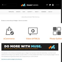
Use them to add additional functionality to your website, outside of what is currently available within Muse. To use a 3rd party widget in this list, visit the website and "generate embed code". Click here to submit a widget to the directory Blogs & Commenting Nabble - DISQUS - (Resource or sample: Contact Forms Wufoo - (Example / Resource: JotForm - (Resource or sample: Freedback - (Resource or sample: