

Dean Attali's Shiny Server. EdxTheAnalyticsEdge/kaggleCompetition/post-study at master · gdwangh/edxTheAnalyticsEdge. Визуализация статических и динамических сетей на R, часть 4 / Блог компании Инфопульс Украина / Хабрахабр. В первой части:визуализация сетей: зачем?
Каким образом? Параметры визуализацииbest practices — эстетика и производительностьформаты данных и подготовкаописание наборов данных, которые используются в примерахначало работы с igraph Во второй части: цвета и шрифты в графиках R. В третьей части: параметры графов, вершин и ребер. В этой части: размещения сети. Размещения сети Размещения сети — это алгоритмы, возвращающие координаты каждой вершины графа.
Net.bg <- barabasi.game(80) V(net.bg)$frame.color <- "white" V(net.bg)$color <- "orange" V(net.bg)$label <- "" V(net.bg)$size <- 10 E(net.bg)$arrow.mode <- 0 plot(net.bg) Можно задать размещение в функции построения: Tufte in R. Introduction Motivation The idea behind Tufte in R is to use R - the most powerful open-source statistical programming language - to replicate excellent visualisation practices developed by Edward Tufte. It’s not a novel approach - there are plenty of excellent R functions and related packages wrote by people who have much more expertise in programming than myself.
I simply collect those resources in one place in an accessible and replicable format, adding a few bits of my own coding discoveries. Neo4j, Graphs R Cool. Using in Shiny Applications. The dygraphs package provides the dygraphOutput and renderDygraph functions to enable use of dygraphs within Shiny applications and R Markdown interactive documents.
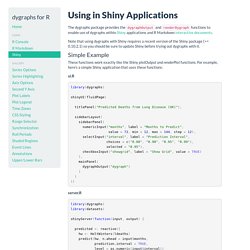
Note that using dygraphs with Shiny requires a recent version of the Shiny package (>= 0.10.2.1) so you should be sure to update Shiny before trying out dygraphs with it. Simple Example These functions work exactly like the Shiny plotOutput and renderPlot functions. Sankey from Scratch. Introduction This example will walk through the steps of using the R package igraph to create a tree network for a sankey diagram.

This is a great exercise to learn some basics of igraph, explore the construction of a sankey, and determine the conditions for a network to be drawn properly as a sankey. After all of this, we will plot our network with the rCharts implementation of the d3.js sankey plugin. Build a Network. Chart : Loading... NetworkD3. NetworkD3: D3 JavaScript Network Graphs from R Fork me on.
Qinwf/awesome-R. Rich-iannone/DiagrammeR. Jcheng5 (Joe Cheng) Best R packages for data import, data wrangling & data visualization. One of the great things about R is the thousands of packages users have written to solve specific problems in various disciplines -- analyzing everything from weather or financial data to the human genome -- not to mention analyzing computer security-breach data.
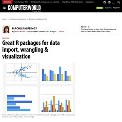
Some tasks are common to almost all users, though, regardless of subject area: data import, data wrangling and data visualization. The table below show my favorite go-to packages for one of these three tasks (plus a few miscellaneous ones tossed in). The package names in the table are clickable if you want more information. Qinwf/awesome-R. Making Complex Heatmaps. Jvmr Package. Calling Scala code from R using jvmr. Introduction In previous posts I have explained why I think that Scala is a good language to use for statistical computing and data science.
Despite this, R is very convenient for simple exploratory data analysis and visualisation – currently more convenient than Scala. I explained in my recent talk at the RSS what (relatively straightforward) things would need to be developed for Scala in order to make R completely redundant, but for the short term at least, it seems likely that I will need to use both R and Scala for my day-to-day work. Since I use both Scala and R for statistical computing, it is very convenient to have a degree of interoperability between the two languages.
Calling R from Scala sbt projects. Overview In previous posts I’ve shown how the jvmr CRAN R package can be used to call Scala sbt projects from R and inline Scala Breeze code in R.
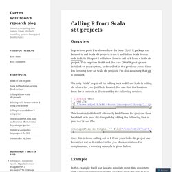
In this post I will show how to call to R from a Scala sbt project. This requires that R and the jvmr CRAN R package are installed on your system, as described in the previous posts. Multiple graphs on one page (ggplot2) Problem You want to put multiple graphs on one page.
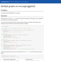
Solution The easy way is to use the multiplot function, defined at the bottom of this page. If it isn’t suitable for your needs, you can copy and modify it. First, set up the plots and store them, but don’t render them yet. Kdd10-outlier-tutorial.pdf. Getting started with Shiny Dashboard. Installation shinydashboard requires Shiny 0.11 or above.
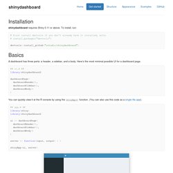
To install, run: devtools::install_github("rstudio/shinydashboard") CA_lab.pdf. Cluster analysis in R: determine the optimal number of clusters. Part 3b: EDA with ggplot2. In Part 3a I have introduced the plotting system ggplot2.

I talked about its concept and syntax with some detail, and then created a few general plots, using the weather data set we've been working with in this series of tutorials. My goal was to show that, in ggplot2, a nice looking and interesting graph can usually be created with just a few lines of code. Given the positive feedback that post has received, I believe I had some success with what I had in mind. Who knows if some of the readers will decide to give ggplot2 a try using their own data? It is often said that a picture is worth a thousand words, but I often see some highly experienced R users, after doing really complex data analyses, plotting the results in a way that falls short of the expectations, given the quality of their analytical work.
After framing the question, and before fitting any model, EDA techniques (such as visualisation) are used to gain insight from the data. . # Histogram of the daily rain amount. Dygraphs for R. The dygraphs package is an R interface to the dygraphs JavaScript charting library. It provides rich facilities for charting time-series data in R, including: Installation You can install the dygraphs package from CRAN as follows: install.packages("dygraphs") Data Science - Part XIII - Hidden Markov Models. RStudio – Webinars.
Webinars On Demand Webinars are presented on a variety of subjects. We will cover packages, products (both Open Source & Commercial), have guest presenters, as well as general Q&A “Office Hour” recordings. All materials will be made available and at no cost. Our GitHub Webinar Repository for all webinars can be found at: Latest Webinar. DataTables Information. After you render a table on the page, you can use its output id to access some information about it. Currently the indices of rows on the current page and all pages are available (after filtering is applied). Suppose your output id is foo, input$foo_rows_current is the indices of rows on the current page, and input$foo_rows_all is the indices of rows on all pages. Navigate through all pages to see how the plot changes. Type in the search box to see the points filtered by the search string.
Using Checkboxes to Select Table Rows. The top example shows how you can insert a column of checkboxes into a table, and obtain their values in Shiny. The selected rows are plotted as solid points on the scatterplot. First, we appended the cars data with a column of checkboxes via appendCheckboxes(). The options argument of datatable() disabled the ordering of this column (since it does not make much sense to order these checkboxes), and escape = -4 means the 4th column should not be escaped since it is supposed to be raw HTML. The bottom example shows you can also use checkboxes as the "row names" of the data, and the indices of the selected rows are printed on the right.
R & Bioconductor - Manuals. How to Summarize a 2D Posterior Using a Highest Density Ellipse. Making a slight digression from last month’s Probable Points and Credible Intervals here is how to summarize a 2D posterior density using a highest density ellipse. This is a straight forward extension of the highest density interval to the situation where you have a two-dimensional posterior (say, represented as a two column matrix of samples) and you want to visualize what region, containing a given proportion of the probability, that has the most probable parameter combinations. Ggplot2 - How do I create a continuous density heatmap of 2D scatter data in R?
Session1.pdf. Network visualization in R with the igraph package. In this post I showed a visualization of the organizational network of my department. Since several people asked for details how the plot has been produced, I will provide the code and some extensions below. The plot has been done entirely in R (2.14.01) with the help of the igraph package. It is a great package but I found the documentation somewhat difficult to use, so hopefully this post can be a helpful introduction to network visualization with R.
Technical Tidbits From Spatial Analysis & Data Science. Even the most experienced R users need help creating elegant graphics. Jrnold/ggthemes. Technical Tidbits From Spatial Analysis & Data Science. Even the most experienced R users need help creating elegant graphics. Tr597.pdf. Streamgraph04. R - Conditionally change panel background with facet_grid? Comparison of String Distance Algorithms. For the visualization of votings in the Bundestag I had to read in handwritten protocols of the sessions. These are unfortunately studded with typos, which is why I had to deal with different versions of one name. Because I wanted a quick solution and the effort was reasonable I just took care of it manually.
But for larger projects this approach would not be feasible. R - Text clustering with Levenshtein distances. Self-Organising Maps for Customer Segmentation using R. Factor Analysis. This section covers principal components and factor analysis. The later includes both exploratory and confirmatory methods. Cluster Analysis. R has an amazing variety of functions for cluster analysis. In this section, I will describe three of the many approaches: hierarchical agglomerative, partitioning, and model based. While there are no best solutions for the problem of determining the number of clusters to extract, several approaches are given below. Karthik/wesanderson. Jennybc/r-graph-catalog. Solutions & Notes for ISL Hastie-Tibshirani. Using a little bit of algebra, prove that (4.2) is equivalent to (4.3). In other words, the logistic function representation and logit representation for the logistic regression model are equivalent.
Let… Crime Analysis with Shiny & R. Visualizing the CRAN: The Right Package for a Given Task « Data Scientist Insights. Active Analytics Ltd - Blog. Welcome · Advanced R. Sales Dashboard in R with qplot and ggplot2 – Part 2. Me nugget. Decision making trees and machine learning resources for R. Graphics by Examples. R Graphs Gallery - Wiki1. From Data to Graphics. Data Mining Algorithms In R/Classification/SVM.
R Language Tutorials. Web Technologies and Services.
Web Technologies and Services. Data Perspective: Build Web applications using Shiny R. R for Public Health.