
The R Graph Gallery – Help and inspiration for R charts. Rvisualization.com. Easy pictograms using R. Making infographics using R and Inkscape - Vik's Blog. I have been making charts with R for almost as long as I have been using R, and with good reason: R is an amazing tool for filtering and visualizing data.
With R, and particularly if we use the excellent ggplot2 library, we can go from raw data to compelling visualization in minutes. But what if we want to give our visualizations an extra kick? What if we want to do some manual retouching? I had long resisted this, thinking that conveying the data was the major concern, and it was up to viewer to parse it how they saw fit. Complex Graphics (lattice) Please direct questions and comments about these pages, and the R-project in general, to Dr.

Tom Philippi. Introduction Clear communication of pattern via graphing data is no accident; a number of people spend their careers developing approaches based on human perceptions and cognitive science. While Edward Tufte and his "The Visual Display of Quantitative Information" is more widely known, William Cleveland's "The Elements of Graphing Data" is perhaps more influential: reduced clutter, lowess or other smoothed curves through data, banking to 45° to emphasize variation in slopes, emphasizing variability as well as trends, paired plots to illustrate multiple components of the data such as fits and resuduals, and dot plots all come from his work.
Animating the Metropolis algorithm. The Metropolis algorithm, and its generalization (Metropolis-Hastings algorithm) provide elegant methods for obtaining sequences of random samples from complex probability distributions.
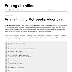
When I first read about modern MCMC methods, I had trouble visualizing the convergence of Markov chains in higher dimensional cases. So, I thought I might put together a visualization in a two-dimensional case. I’ll use a simple example: estimating a population mean and standard deviation. We’ll define some population level parameters, collect some data, then use the Metropolis algorithm to simulate the joint posterior of the mean and standard deviation. Then, to visualize the evolution of the Markov chains, we can make plots of the chains in 2-parameter space, along with the posterior density at different iterations, joining these plots together using ImageMagick (in the terminal) to create an animated .gif: Visualizing optimization process.
One of the approaches to graph drawing is application of so called force-directed algorithms.
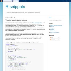
In its simplest form the idea is to layout the nodes on plane so that all edges in the graph have approximately equal length. This problem has very intuitive visualization so it is a nice case for showing how different optimization algorithms behave in high dimensions.I want to position several balls (8 in the example below) on a plane in such a way that distance between all balls is approximately 0.5. Precisely my objective is to minimize the highest deviance from 0.5 of distance between any pair of balls. The interesting feature of this problem is that visualization of 8 balls on a plane is simple and intuitive - it is important because it allows me to visually assess the solution quality - not having to rely on objective function value only.
DiagrammeR. SparkTable. Stickr: package to use RStudio Hex Stickers. Plotbb: Grammar of Graphics for base plot. Colorblindcheck: Check Color Palettes for Problems with Color Vision Deficiency. Deciding if a color palette is a colorblind friendly is a hard task.
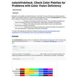
This cannot be done in an entirely automatic fashion, as the decision needs to be confirmed by visual judgments. The goal of colorblindcheck is to provide tools to decide if the selected color palette is colorblind friendly, including: The colorblindcheck accepts a vector of hexadecimal color descriptions as the input. It can be created using different existing R functions (e.g. rainbow()) or packages (e.g. colorspace, RColorBrewer, rcartocolor, etc.). library(colorblindcheck)rainbow_pal = rainbow(n = 7)rainbow_pal#> [1] "#FF0000" "#FFDB00" "#49FF00" "#00FF92" "#0092FF" "#4900FF" "#FF00DB" The primary function in this package is palette_check(), which creates a summary comparison between the original input palette and simulations of color vision deficiencies - deuteranopia, protanopia, and tritanopia.
Controlling Axes of R Plots. (This post is part of the #cumpa series of blog posts and tweets I am writing leading up to SPSA. For more information, see this blog post. To follow along, subscribe to my blog here or follow me on Twitter here. To engage in the conversation, reply to this tweet.) R has powerful graphical capabilities and I use it in all my papers to plot data and illustrate theoretical ideas. The default plot function, however, doesn't give the reader needed control over the axis labels. The default plot function in R works something like this. Custom point style in plot.
R List of Colours. Colorspace: New Tools for Colors and Palettes. A major update (version 1.4.0) of the R package colorspace has been released to CRAN, enhancing many of the package's capabilities, e.g., more refined palettes, named palettes, ggplot2 color scales, visualizations for assessing palettes, shiny and Tcl/Tk apps, color vision deficiency emulation, and much more.
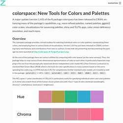
Overview The colorspace package provides a broad toolbox for selecting individual colors or color palettes, manipulating these colors, and employing them in various kinds of visualizations. Version 1.4.0 has just been released on CRAN, containing many new features and contributions from new co-authors. A new web site presenting and documenting the package has been launched at At the core of the package there are various utilities for computing with color spaces (as the name conveys). The colorspace package provides three types of palettes based on the HCL model: More detailed overviews and examples are provided in the articles: Installation install.packages("colorspace") Math Annotation in R. R Core Team (R-core@R-project.org ) The R Project for Statistical Computing.
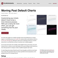
Moving Past Default Charts. For static data graphics my workflow typically involves R and Illustrator at varying degrees.
I covered the process in Visualize This and provided an introduction on how to do the same with Inkscape, Illustrator's open source counterpart. Exporting nice plots in R. A vital part of statistics is producing nice plots, an area where R is outstanding.
The graphical ablility of R is often listed as a major reason for choosing the language. It is therefore funny that exporting these plots is such an issue in Windows. This post is all about how to export anti-aliased, high resolution plots from R in Windows. There are two main problems when exporting graphics from R: Anti-aliasing is not activated in Windows R (this does not apply to Linux or Mac). My previous solution to this problem has been to export my graph to a vector graphic (usually the SVG format), open it in Inkscape, and then export it to the resolution of choice.
Saving R Graphics across OSs. R is known for it’s amazing graphics.
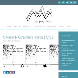
Not only ggplot2, but also plotly, and the other dozens of packages at the graphics task view. There seems to be a graph for every scenario. However once you’ve created your figure, how do you export it? Unicode Characters in ggplot2 PDF Output. Ragg 0.1.0. We’re stoked to announce the release of ragg 0.1.0 on CRAN. ragg provides a set of high quality and high performance raster devices, capable of producing png, tiff, or ppm files, or a matrix of raw color values directly within R. ragg is part of our broader effort to improve graphics performance and quality in R at all levels of the stack, so that you’ll benefit no matter what plotting framework you choose to use.
Other parts of this efforts have been: Take Screenshot of Webpage using R. The av Package: Production Quality Video in R. At rOpenSci we are developing on a suite of packages that expose powerful graphics and imaging libraries in R. Our latest addition is av – a new package for working with audio/video based on the FFmpeg AV libraries. This ambitious new project will become the video counterpart of the magick package which we use for working with images. install.packages("av") av::av_demo() The package can be installed directly from CRAN and includes a test function av_demo() which generates a demo video from random histograms. Plotly Shiny Gallery. Comparing plotly & ggplotly plot generation times. The plotly package. A godsend for interactive documents, dashboard and presentations. For such documents there is no doubt that anyone would prefer a plot created in plotly rather than ggplot2. Why? Using plotly gives you neat and crucially interactive options at the top, where as ggplot2 objects are static.
In an app we have been developing here at Jumping Rivers, we found ourselves asking the question would it be quicker to use plot_ly() or wrapping a ggplot2 object in ggplotly()? Prerequisites Throughout we will be using the packages: dplyr, tidyr, ggplot2, plotly and microbenchmark. Install.packages(c("mosaicData", "dplyr", "tidyr", "ggplot2", "plotly", "microbenchmark")) library("mosaicData") library("dplyr") library("tidyr") library("ggplot2") library("plotly") library("microbenchmark") Analysis.
d3panels. This is a set of D3-based graphic panels, developed for the R/qtlcharts package but useful more generally. They are developed in CoffeeScript; the source is on GitHub. Update: The d3panels library has been completely re-written, changing the functions’ usage and data structures, to make it simpler and more consistent. Documentation on GitHub. Trelliscopejs. TrelliscopeJS by Ryan Hafen. Interactive Viewing of Spatial Objects in R. Creating Interactive Plots with R and Highcharts – RStudio.