
The Ultimate List of 21 Free and Open Source Data Visualization Tools. Searching for data visualization software can be a painstaking (and even expensive) process, one that requires lots of research and in some cases, a lofty budget.
Thankfully, there are a number of free and open source data visualization tools out there. While the most popular enterprise data visualization tools often provide more than what’s necessary for non-enterprise organizations, with advanced features relevant to only the most technically savvy users. While a number of these solutions are offered by providers hoping to eventually sell you on their commercial products, others are maintained and operated by a community of developers looking to democratize the process of insight generation.
In this article we will examine free and open source data visualization tools, first by providing a brief overview of each and what to expect as you begin your search. Thoughts on building my first bar chart race with Flourish - The Distant Librarian. One Chart, Nine Tools – Revisited · Lisa Charlotte Rost. 18 Oct 2018 Disclaimer: Since November 2017 I work for Datawrapper, a charting tool. Which means that I can’t review any charting tool unbiased anymore. I will still try. 2.5 years ago I wrote an article recreating the same bubble chart with 24 different charting tools: twelve charting apps and twelve libraries/frameworks. Afterward, I wrote an article for SOURCE explaining what I had learned during this experiment. During the last 2.5 years, the tool landscape changed. The chart I’ll rebuild is the same as last time. There’s also something new: I’ll embed all embeddable charts, e.g. from Infogram, Flourish, Datawrapper, Plotly and Google Sheets.
As last time, I will have opinions. Infogram I’m not sure why I missed Infogram in the last blog post. Flourish The new player in the tool landscape! Datawrapper In case you missed it: I work for Datawrapper. This is how I created the same chart in Datawrapper for the last blog post, in June 2017: Collection of data visualizations to get inspired and finding the right type. How to extract Twitter tweets data and followers to Excel - Simplified Web Scraping Tutorials! 13 Free Data Visualization Tools. By Vikas Lalwani Data doesn’t have to be boring.
Adding a dash of visual appeal to raw data can make it easily comprehensible and instantly appealing. In the interest of (1) making your data more user-friendly and (2) not boring the eyes out of anyone who sees your work, picking a trusty data visualization tool is a must. With so many tools out there, choosing the right one that serves your specific needs can be a tedious task. As a first step, read this detailed guide on the factors to consider when choosing your perfect data visualization tool. I’ve studied the most popular free data visualization tools available out there, and in this post I’ll talk about my top picks. 1. D3.js — often times, it’s simply called D3 — is the most well-known data visualization library today. D3 gives developers the ability to create even the most complex charts and graphs. The Rise of Bad Infographics. Given the ubiquity of infographics on the web today (according to one account they have increased 1200% in three years), you can be forgiven for thinking that they are a new phenomenon.
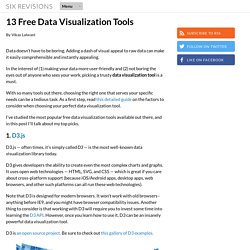
They aren’t. Infographics have actually been around for quite some time, as Edward Tufte pointed out with his popularization of one of the best infographics of all time (see pic and link): Charles Joseph Minard’s portrayal of the losses suffered by Napoleon’s army in the Russian campaign of 1812. Go ahead and take a look. Study it. I’ll be here when you get back. Do you see what he did? The Menard infographic also combines several different planes of information, from troop strength, to temperature, to distance. It’s sad, but many contemporary infographics are hardly anything more than numbers and clip art — often with only a tenuous connection between them. Minard’s early infographic ably demonstrates the best qualities of an infographic presentation:
The Surprising History of the Infographic. As the 2016 election approaches, we’re hearing a lot about “red states” and “blue states.”

That idiom has become so ingrained that we’ve almost forgotten where it originally came from: a data visualization. In the 2000 presidential election, the race between Al Gore and George W. Bush was so razor close that broadcasters pored over electoral college maps—which they typically colored red and blue. What’s more, they talked about those shadings. NBC’s Tim Russert wondered aloud how George Bush would “get those remaining 61 electoral red states, if you will,” and that language became lodged in the popular imagination.
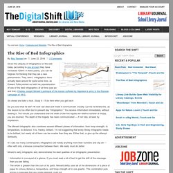
The Scottish Scoundrel Who Changed How We See Data. A 1824 Playfair line graph, illustrating of how bread and stock prices are affected by war.

(Image: William Playfair/Public Domain) As news events churn up a flood of new information, many turn to charts to absorb it. Need to swallow an election poll whole? Palladio. About Fusion Tables - Fusion Tables Help. Information is Beautiful. Australian datablog.