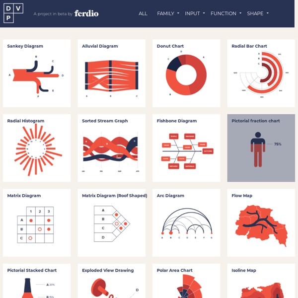


A Visual Vocabulary for Concept Models – Eleganthack Sign up to be alerted when Pencil Me In, my book on visual thinking, is available. I’m gone a little crazy for concept models. It started with when I wrote, How to Make a Concept Model, and then when I followed up with Five Models for Making Sense of Complex Systems. Martin Grandjean » Digital humanities, Data visualization, Network analysis » Mapping a Century of International Congresses International congresses, meetings of diplomats and experts, have been almost exclusively European events for more than a century. This map shows the location of the +8000 congresses held between 1840 and 1960 and highlights the domination of certain urban areas in Western Europe. A map of the distribution of international congresses with a focus on Europe (between 1840 and 1960, 6 congresses out of 7 took place in Europe). Scale: Paris=1092; London=546; Berlin=188. CC-BY-SA Martin Grandjean 2019 Data collection
Textures.js Textures are useful for theselective perception of different categories View on Github Getting started -- from the top of d3.js -- var svg = d3.select("#example") .append("svg"); var t = textures.lines() .thicker(); svg.call(t); svg.append("circle") .style("fill", t.url());
Vérifier son site pour les daltoniens >>> Toptal Color Blind Filter Use the Colorblind Colorlab to select safe colors earlier in the design process. Learn more about colorblindness in this Wikipedia entry. This tool is still in development, but feedback is welcome while we work on it. How to Make an Infographic: Free Visual E-Book for Beginners On average, Americans consume 63 gigabytes of information per person per day. That’s roughly half of all the storage space in a new MacBook Air laptop. With so much information bombarding us on a daily basis, it’s no wonder we’ve become desensitized to even the most shocking statistics. For example, what if I told you that the 74 million richest people in the world possess 50% of its wealth? The real meaning of this statement would probably be lost on most of us. The moment you translate it into a visual format, however, it suddenly becomes a much more palpable — and shocking — reality:
See How the World’s Most Polluted Air Compares With Your City’s The floating particles on this page depict microscopic particulate pollution called PM2.5. The number of particles you see here represents the upper limit for “good” air quality, as defined by the United States Environmental Protection Agency: 12 micrograms per cubic meter over 24 hours. We made our best guess for your location, or you can pick another.This is pollution in New York City on the worst air quality day this year.
Data Visualization 101: Pie Charts In our Data Visualization 101 series, we cover each chart type to help you sharpen your data visualization skills. Pie charts are one of the oldest and most popular ways to visualize data. This classic chart is the perfect example of the power of data visualization: a simple, easy-to-understand presentation that helps readers instantly identify the parts of a whole. Respecter les ratios >>> Misleading graph Graph that misrepresents data In statistics, a misleading graph, also known as a distorted graph, is a graph that misrepresents data, constituting a misuse of statistics and with the result that an incorrect conclusion may be derived from it. Graphs may be misleading through being excessively complex or poorly constructed. Even when constructed to accurately display the characteristics of their data, graphs can be subject to different interpretation, or unintended kind of data can seemingly and ultimately erroneously be derived.[1]
Periodic Table of Innovation Our Non-Executive Chairman, Mike Hutcheson, is currently in the process of developing an Innovation and Entrepreneurship paper for third year students at AUT University – based on his proprietary tool, the Periodic Table of Innovation. Here, he gives some insight into the structure and purpose of the paper – and what he hopes will be the future of entrepreneurialism in New Zealand. Ultimately, I want to make the Table open source, available to every Kiwi. Movement data exploration and analysis MovingPandas is a Python library for handling movement data based on Pandas and GeoPandas. It provides trajectory data structures and functions for analysis and visualization. The MovingPandas repository is hosted on Github. For more information on individual releases, check out the Changelog. The official documentation is hosted on ReadTheDocs.
Data Visualization Libraries Based on D3.JS - Mike McDearmon There are a lot of ways to visualize data on the Web (with more emerging every day), but the flexibility, versatility, and energized development community surrounding D3.js makes it a great option to explore. The following list of D3 plugins, extensions, and applications below is by no means comprehensive, but oughta be enough to keep you busy for a while. If you’re just getting your feet wet with D3.js, here are some great learning resources to get you acclimated:D3 for mere mortals: Great introductory lessons for those starting from scratch.Try D3 Now: Another great resource for learning about core D3 concepts.Data-Driven Documents (paper): An academic article by Mike Bostock with loads of footnotes.Learning D3, Scott Becker: A quick and effective tutorial series to get yourself up and running.Dashing D3: A very thorough tutorial series covering a LOT more than just D3.Interactive Data Visualization for the Web is a fantastic book by Scott Murray.
Respecter les ratios >>> Data-Ink Ratio [edit] Definitions The Data-Ink ratio is a concept introduced by Edward Tufte, the expert whose work has contributed significantly to designing effective data presentations. In his 1983 book, The Visual Display of Quantitative