
Victorian Infographics. A time table indicating the difference in time between the principal cities of the World and also showing their air-line distance from Washington.
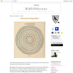
IN: 'Mitchell's New General Atlas, Containing Maps Of The Various Countries Of The World, Plans Of Cities, Etc., Embraced In Ninety-Three Quarto Maps, Forming A Series Of One Hundred and Forty-seven Maps and Plans, Together With Valuable Statistical Tables..' by Samuel Augustus Mitchell Jr, 1883; published in Philadelphia by WM Bradley. Tableau d'Astronomie et de Sphère IN: 'Atlas Universel d'Histoire et de Geographie Anciennes et Modernes, de Mythologie, des Religions, d'Astronomie, de Physique, de Geologie, de Histoire Naturelle, de Grammaire, de Rhetorique..' by Henri Duval, 1834; published in Paris by L Houbloup. Tableau d'Astronomie et de Sphère [detail] Inspiration Impuls: Complexity Graphics on Datavisualization.ch. Tatiana Plakhova is a Moscow based designer and the art director at Moscollective design studio.
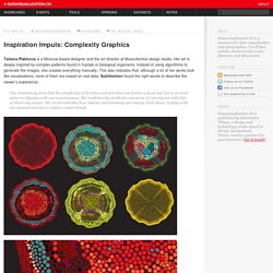
Her art is deeply inspired by complex patterns found in fractals or biological organisms. Instead of using algorithms to generate the images, she creates everything manually. A Collection of Very Strange Maps. Slagsmålsklubben - Sponsored by destiny. The latest delivery — Dear Data. Using Cows to Define Politics. Ever needed to know the difference between communism and socialism?
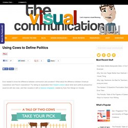
What about the difference between American corporations and French corporations? Try taking an explanation from Howard Lindzon about what each political perspective would do with two cows, and then visualize it with a hilarious infographic created by Kyla Tom Design on Visually. Help spread visual literacy. Share the news! Evolution of Minecraft (Infographic) The-world-as-100-people_51505a8baf475.png 1 370×1 370 pixels. OECD – Your Better Life Index. Average personal index for Germany, men, 15–24.

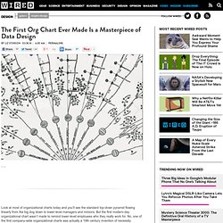
The First Org Chart Ever Made Is a Masterpiece of Data Design. Look at most of organizational charts today and you’ll see the standard top-down pyramid flowing linearly from the big dog down to lower-level managers and minions.
Data Visualizations, Challenges, Community. 5 years of infosthetics. 3.14159265358979323846264338327950288419716939937510582097494459230781640628620899862803482534211706798214808651328230664709384460955058223172535940812848111. Kunal Anand - looks del.icio.us. Introduction The looks del.icio.us project is my first attempt to combine graphics design with programming.
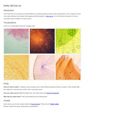
The concept is to see how users develop and sustain their tagging methodologies on del.icio.us. I'm not a formal art student or have a computer science degree. Nicola Triscott. Lise Autogena + Joshua Portway, Most Blue Skies (2010) I’m currently at ISEA2012, the 18th International Symposium on Electronic Art, a six-day international conference, this year taking place in Albuquerque under the glorious banner ‘Machine Wilderness’, which references the New Mexico region as an area of rapid growth and technology within vast expanses of open land.
Collab_vis. Citeology - Projects. DataArt - Visualisations. 5 Best Data Visualization Projects of the Year – 2009. It was a huge year for data.
There's no denying it. Data is about to explode. Applications sprung up left and right that help you understand your data - your Web traffic, your finances, and your life. There are now online marketplaces that sell data as files or via API. Data.gov launched to provide the public with usable, machine-readable data on a national scale. The Evolution of the Web. Demonstrations Project. 20 Great Motion Graphics of 2012. DataViz. DataViz Mediaeater MMX Archive / RSS June 21.
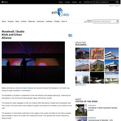
IMMATERIALS. Moodwall / Studio Klink and Urban Alliance. Media architecture collective Urban Alliance has recently finished the Moodwall: a 24 meter long interactive light installation in Amsterdam.
Michael Deal ◊ Graphic Design. Ongoing study of Beatles through infographics, much of which is based on secondary sources such as sales statistics, biographies, recording session notes, sheet music, and raw audio readings. This graphic traces songwriting contributions by different band members (data based on authorial attributions quantified by William J. Dowlding in the book Beatlesongs Longwinded notes: Color patterns offer clues about the band's gradual fracturing as each member became more independent. Red stalks (signifying jointly written songs) decrease in the second half of the timeline; the split-color bars give way to solid bars of a single color. Bestiario. Mapa uczuć Głównego Miasta. Mind-bending music visualizations. Blog About Infographics and Data Visualization - Cool Infographics.
10 significant visualisation developments: July to December 2012. To mark the milestone of each mid-year and end of year I try to take a reflective glance over the previous 6 months period in the data visualisation field and compile some of the most significant developments. These are the main projects, events, new sites, trends, personalities and general observations that have struck me as being important to help further the development of this field. Hans Rosling shows the best stats you've ever seen. Hans Rosling's new insights on poverty. David McCandless: The beauty of data visualization. Research: Lev Manovich Coins the Term 'Media Visualization' New media theorist Lev Manovich just released a new text, titled What is Visualization?
[manovich.net]. One might first wonder if such a question is not too... obvious, but in the light of the contentious discussion about the tension between artistic and scientific representations of data, and whether data art should be called visualization at all, it is always worth covering the basics. The text is quite substantial, so you might want to wait for some quiet time to dive into it.
Datasets on Datavisualization. Wikileaks US Embassy Cables 29 Nov 2010 Datasets Infographic, Politics Wikileaks began on Sunday November 28th publishing 251,287 leaked United States embassy cables, the largest set of confidential documents ever to be released into the public domain. 10 Best Data Visualization Projects of the Year – 2010. Visuwords™ online graphical dictionary and thesaurus.
Word Tree. A visual exploration on mapping complex networks. 50 Great Examples of Data Visualization. Blaise Aguera y Arcas demos Photosynth. A visual exploration on mapping complex networks. Information Is Beautiful.
Visual Communication. Identity GNP+ is the global network for and by people living with HIV. As a network of networks they are driven by the needs of people living with HIV worldwide. Futurelab – An international marke. Introducing the Knowledge Graph. Kultura popularna w sieci i poza siecią.