

No, they¿re not photographs: Astonishing acrylic paintings which are so detailed they look like they were taken on a camera By Damien Gayle Published: 11:28 GMT, 9 June 2012 | Updated: 14:56 GMT, 9 June 2012 With their spectacular use of focus and reflected light, these incredible artworks look like carefully composed still-life photographs. But in fact they are all painstakingly rendered on canvas with acrylic paints by Canadian artist Jason de Graaf. The hyperrealistic paintings, which almost appear as if they are computer generated, are like freeze frames of a world more magical than our own - inspiring the term Magic Realism as a description. The X-Statix: Acrylic on canvas 30in x 24in Untitled (Self-portrait): Acrylic on canvas 30in x 30in Bedlam: Acrylic on canvas 24in x 30in Dalliance: Acrylic on canvas 24in x 36in Fluid mechanics: Acrylic on panel 22in x 42in That Morning: Acrylic on wood 24in x 18in A Wave Of Refreshment: Acrylic on canvas 30in x 24in Kiwi Splash: Acrylic on canvas 30in x 40in Suspension Of Disbelief: Acrylic on canvas 24in x 36in Apple Blossoms: Acrylic on canvas 24in x 18in
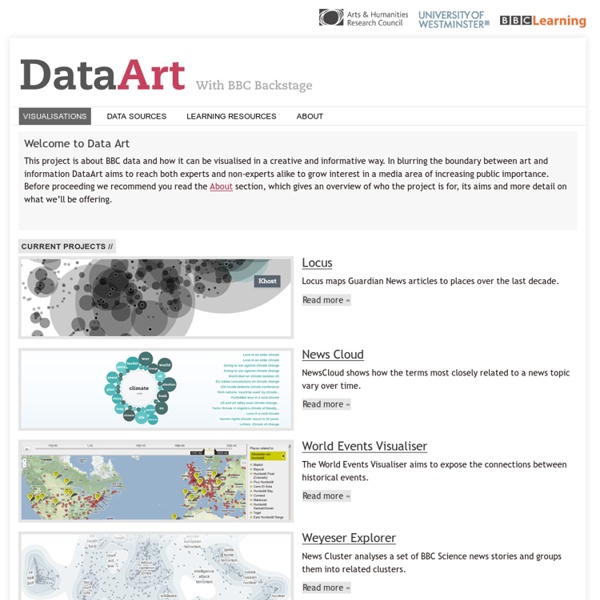
designplaygrounds.com 50 Great Examples of Data Visualization Wrapping your brain around data online can be challenging, especially when dealing with huge volumes of information. And trying to find related content can also be difficult, depending on what data you’re looking for. But data visualizations can make all of that much easier, allowing you to see the concepts that you’re learning about in a more interesting, and often more useful manner. Below are 50 of the best data visualizations and tools for creating your own visualizations out there, covering everything from Digg activity to network connectivity to what’s currently happening on Twitter. Music, Movies and Other Media Narratives 2.0 visualizes music. Liveplasma is a music and movie visualization app that aims to help you discover other musicians or movies you might enjoy. Tuneglue is another music visualization service. MusicMap is similar to TuneGlue in its interface, but seems slightly more intuitive. Digg, Twitter, Delicious, and Flickr Internet Visualizations
ScienceMap BOLIDES - Visualizing meteorites TOC Arts Impression 3D pour faire des instruments de musique L’impression 3D qui permet de fabriquer des objets simplement soi même commence tout juste à se démocratiser, mais on voit déjà des pionniers innover en fabriquant des instruments de musique complexes. En voici quelques exemples en vidéo. Lire la suite… Comment monétiser ses vidéos sur YouTube? (et faut il le faire ?) Quelles audience faut il atteindre pour monétiser ses vidéos ? Instrument DIY: comment fabriquer une carrotte-clarinette Dans cette vidéo TEDx, Linsey Pollak transforme une carotte en clarinette en moins de 5 minutes utilisant simplement une perceuse et un embout de saxophone. Lire la suite… Street Pianos et réflexions sur les usages collectifs de la culture A travers cet article, une belle réflexion sur le droit d’auteur, la culture et ses usages. Les évènements co-créatifs pour passer du Do-it-yourself au Do-it-Together Inspiration: magnifique performance mélant technologie, danse, lumières
Looking 4 data visualization 15 Stunning Examples of Data Visualization Data Visualization is a method of presenting information in a graphical form. Good data visualization should appear as if it is a work of art. This intrigues the viewer and draws them in so that they can further investigate the data and info that the graphic represents. In this post there are 15 stunning examples of Data Visualization that are true works of art. Click on the title or image for a larger view of each visualization. The Strengths of Nations Here’s an image that discusses the variations in how different nations pursue science. Madrid.Citymurmur CityMurmur tries to understand and visualize how media attention reshapes the urban space and city. Genome Jules & Jim This visual represents the relationship between characters in the movie Jules & Jim. One Week of the Guardian This is one day in a series that takes the news from one week of the Guardian newspaper, and visually represents it as a series of static visualisations. One Week of the Guardian Leisure & Poverty Stock Data Related Posts
peoplemovin - A visualization of migration flows Art and the Internet of Things Wireless is increasingly pulling in all kinds of applications, platforms, services and things (rfid) into networks. Many people communicate through mobiles, blackberries, digital organizers, palmtops. Cars become information spaces with navigational systems and consoles like Nintendo DS have wireless capacities and get linux kernels installed.We are witnessing a move towards pervasive computing and disappearing technologies in intelligent clothing (wearables), smart environments (knowing where and who we are), pervasive games, and we will see doors opening for some and closing to others. Mimickry and camouflage will become part of application design. Ipods and Iphones will show colors and produce sounds corresponding with your surroundings. Katherine Moriwaki’s handbag, (Inside/Outside) is a keywork. This means we deal with ad hoc networks, environmental sensors and smart textiles.
Generative art and data visualization A Beautiful Poster Packed With a Year of Global Weather Data | Wired Design The Weather Radials poster is about as much meteorological data as you can cram onto a single sheet of paper. Raureif GmbH Each day of 2013 is represented by a single line. The bottom is the low temp; the top is the high. The color is dictated by the average. Reykjavik looks fairly miserable year round. Mumbai is always hot. Look at Sydney's spiky winter. Seattle's reputation as a rainy city bears out with its steady band of blue, from roughly September to May. An unseasonably cold spell in December brought the first snow Cairo had seen in a century. 2013 was a wet year for Berlin. <div class="slide" data-slide-id="631549" ><img title="" alt="" width="650px" src=" data-image-width="1400" data-image-height="1050" /><p class="caption">The Weather Radials poster is about as much meteorological data as you can cram onto a single sheet of paper. Weather apps are something of a designers’ playground.
The Internet map