Structurer son enseignement avec des cartes conceptuelles et des objectifs pédagogiques
22 novembre 2009 par Amaury Daele Dans une perspective de conception de l’enseignement axée sur l’apprentissage, nous abordons régulièrement avec mes collègues deux thématiques lors des formations-réflexions que nous proposons aux enseignant-e-s et aux assistant-e-s: la structuration des contenus au moyen de cartes conceptuelles et l’identification et la rédaction d’objectifs pédagogiques. Ces deux thématiques sont fortement liées.
Mind Map Library. 1000s of Mind Maps in FreeMind, MindManager and other formats - Mappio
The Best Tools for Visualization
Visualization is a technique to graphically represent sets of data. When data is large or abstract, visualization can help make the data easier to read or understand. There are visualization tools for search, music, networks, online communities, and almost anything else you can think of.
Mind map
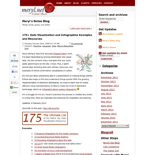
A mind map about educational technology A mind map is a diagram used to visually organize information. A mind map is hierarchical and shows relationships among pieces of the whole.[1] It is often created around a single concept, drawn as an image in the center of a blank page, to which associated representations of ideas such as images, words and parts of words are added.
Visualisation Tools and Resources
Drawing by numbers organises data visualisation tools under four categories - Charts and graphs; Mapping and mashups; Design, layout and presentation; and Data management tools. Browse through them below. However advanced their capabilities, most of the tools profiled here address fairly simple data and design tasks.
» 100 ressources autour de Freemind - Lettres et Cartes Heuristiques
LogicielsMarie25 octobre 2009, 14:22 Je me suis rendue compte qu’avec le temps j’avais accumulé pas mal de liens à droite et à gauche autour du célèbre logiciel de mind mapping gratuit Freemind ; j’ai donc pris le temps de recenser, classer, compléter ces ressources, le tout dans une mind map, évidemment ! Je vous propose donc 100 liens en rapport avec Freemind, qui vont de l’installation du logiciel aux astuces pour les plus exigeants, en passant par un bon nombre de vidéos, de sites ou encore de livres consacrés à Freemind. Deux supports sont à disposition : – la carte Freemind en natif à télécharger : 100 ressources autour de Freemind (cliquer sur « enregistrer sous ») – la carte exportée dans MindMeister : 100 ressources autour de Freemind (voir également ci-dessous). Si vous avez d’autres liens intéressants à proposer sur le sujet, n’hésitez pas !
40 Essential Tools and Resources to Visualize Data
One of the most frequent questions I get is, "What software do you use to visualize data?" A lot of people are excited to play with their data, but don't know how to go about doing it or even start. Here are the tools I use or have used and resources that I own or found helpful for data visualization – starting with organizing the data, to graphs and charts, and lastly, animation and interaction. Organizing the Data by sleepy sparrow Data are hardly ever in the format that you need them to be in.
Ressources sur les cartes heuristiques — Éducnet
Parution du programme du Rendez-vous des lettres 2018Le Rendez-vous des lettres aura lieu les 14 et 15 mai 2018 à la BnF. (Lire la suite >>)Lector in fabula. Devenir lecteur en langues anciennesVoici le thème de la 21e émission de la webradio « Des souris et des lettres ». (Lire la suite >>)Objectif DNBQuelques recommandations pour préparer l’épreuve de français du DNB, entraîner ses élèves et les guider dans leurs révisions. (Lire la suite >>)Au bonheur des dames, la version enrichie de la BnFL'édition enrichie du roman de Zola est disponible sous la forme d'une application et d'un site en ligne.
75+ Tools for Visualizing your Data, CSS, Flash, jQuery, PHP
Most people would agree that the old adage “A picture is worth a thousand words” is also true for web based solutions. There should be no discussion – Charts and Graphs are ideal to visualize data in order to quickly deliver an overview and communicate key messages. Whatever type of data presentation you prefer or suits you data (pie charts, bubble charts, bar graphs, network diagrams etc.), there are many different options but how do you get started and what is technologically possible?
nicolaslevy.net