

Services Hub Learning — Maria Buan. (11) La felicidad de un niño al recibir una banana de regalo. Gallery 3 — Lauren Mulvehill. Instagram. Untitled. Untitled. Por @Alvy — 20 de Abril de 2017 Una técnica que todos hemos experimentado en primera persona al visualizar ciertas infografías es el llamado scrollytelling, cuyo nombre es un juego de palabras que combina scroll («desplazamiento») con storytelling («contar historias»).
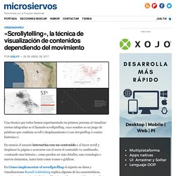
En esencia el usuario interactúa con un contenido y al hacer scroll y desplazar la página o acercarse con el zoom el contenido va cambiando, «contando una historia», como pueden ser más detalles, una cronología o nuevos elementos, tanto texto como iconos o gráficos. En Cómo implementar el scrollytelling el experto en datos y visualizaciones Russell Goldenberg explica algunas de las características, ventajas y desventajas de distintas librerías gráficas cuyo código está ya listo con todo lo necesario para servir de base a este tipo de proyectos. Untitled. Entonces… ¿cuál es la diferencia entre ellos?
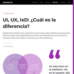
¿Y por qué es importante conocer esa diferencia? Diseño de Interfaces, o UI Hace foco en el artefacto, o, dicho de otra manera, en lo que está dentro de la pantalla. Cuando uno diseña interfaces el problema que está resolviendo está en el diseño: selección y distribución de los elementos de la interfaz (ej. textos y campos del formulario), consistencia del diseño (con la plataforma, con otras pantallas), etc. Experience, Identity and Ideology – Pan Studio. There is an integral relationship between personal experience, identity and ideology.
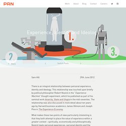
This relationship was touched upon briefly by political philosopher Robert Nozick in the “Experience Machine” thought experiment, which he published as part of his seminal work Anarchy, State and Utopia in the mid-seventies. Choose a facet to tell. The History of UX Design – A Definitive Timeline. User experience design: a term that we instantly associate with apps and websites.
Especially when considering the typical job description of a UX designer, you’d be forgiven for thinking that it’s a purely modern concept. Cognitive psychologist and designer Don Norman coined the term “user experience” in the 1990s—but UX predates its name by quite some decades. Why does all this matter? Shouldn’t we be looking to the future rather than dwelling on the past? Actually, exploring the history of UX is crucial to understanding this highly important field.
Apathy to empathy: engaging product stakeholders with User Experience. “What’s the big deal if the buttons don’t have a tap interaction?”
Asked a developer. “For an employee facing application, why should it matter how the app looks?” Asked a product manager. “We should introduce a new business process and educate the users. There’s no need to ask the users what they want”, claimed business. We, the UX designers are supposed to be the ones that collaborate with all of the product stakeholders and design an experience that brings an efficiency and effectiveness into the user’s tasks.
The 5E Experience Design Model. A step by step guide to designing… The first step in ‘designing’ the experience is to create a High Concept — the easily pitched premise of an experience The film industry invented the idea of a High Concept to organize a lot of peoples creativity into the creation of a coherent story.
The Practical Guide to Experience Design. Shannon E.
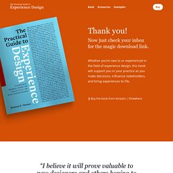
Thomas is a painter, designer, and struggling optimist living in Amsterdam. She is also the founder of Artificial Design. Shannon is a creative leader with a history of building diverse and effective teams, collaborating with business and technology partners, and establishing inclusive processes within organizations. Using curiosity, passion, and humility, she works with global clients across industries to define opportunities and deliver marketable solutions. 5 enfoques semiológicos que nos ayudan a comprender mejor los orígenes del UX. “Todos ahora estamos haciendo semiología sin darnos cuenta.
Cualquier persona que comunica trabaja bajo la influencia de Barthes, nosotros mismos cuando desciframos los procesos de manipulación, que actualmente son permanentes, de alguna manera pagamos tributo a Barthes y sus amigos semiólogos que nos enseñaron que los signos están por todas partes y nos enseñaron a buscarlos e interpretarlos.”- Laurent Binet. Design Practice MethodsDesign Practice Methods - Explore and share design methods.
10 useful UX toolkits & method guides - UXM. 4 minutes read Every few months or so I run a one day introduction to UX training course.
During the course, I cover the basics of user-centred design including key tools, such as user interviews, personas, user journey mapping, storyboarding, prototyping and usability testing. Untitled. In the process above, step 3 is the most challenging.
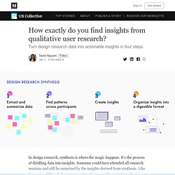
It’s when the data takes a leap from information to insights, from interesting to actionable. How exactly do we discover insights? Every person and context will have a different definition of insights. Untitled. Any business is struggling to create such kind of product design that reflects the product’s ideas, brings conversions and of course, the users love it. Then the question on how to develop such UI/UX design that would be engaging, user-centered and conversions optimized probably arises.
For these purposes, you need to develop a consistent UX design process applying the most effective UX design methodologies and deliverables in it. But firstly, let’s come back to the backbone of any successful design. Using the Microsoft Desirability Toolkit to Test Visual Appeal. Along with satisfaction-rating scales or qualitative-comment analysis, the Microsoft Desirability Toolkit (also known as the Microsoft Reaction Card Method) can help designers gauge users’ responses to the aesthetic qualities of a site.
This desirability study methodology was first introduced by Joey Benedeck and Trish Miner in their 2002 paper, “Measuring Desirability: New methods for evaluating desirability in a usability lab setting.” Benedeck and Miner set out to develop a practitioner’s methodology suited to the challenges of measuring intangible emotional responses like desirability and fun. They created 118 physical cards with different product-reaction words written on each card. At the end of usability testing sessions, participants were given the deck of cards and asked to select the five words that best described the product. (The product reaction cards are called "Microsoft reaction cards" because the 2002 study was done at Microsoft.)
References J. Creative and Great Heres an attention-grabbing mannequin primarily based on the 4Ds of design. Ideate U… Process. The Double Diamond keeps designers within a set of constraints. It has allowed me to uncover a wide range of problems, create multiple solutions and gather feedback from different stakeholders, before the product or service was built. Mostly, however, it helped me focus and tap into uncharted solution territory. Personally, I feel it's a guarantee that the best idea will continually be in the mix, and by the end filter out the best one with the most impact. That being said, the Double Diamond is slightly unrealistic. Process. Human-Centered Design - Jordan Clive. Design is a frame of mind and a mode of problem solving. To put structure to a notoriously nebulous field of work, here are explanations for the architecture and process of Product Design or Human-Centered Design. Inspired by The Elements of User Experience, by Jesse James Garrett:
Process. Jesse James Garret's methodology for designing digital products. Jesse James Garrett is an information architect based in San Francisco. Garrett authored "The Elements of User Experience", a conceptual model of user-centered design first published as a diagram in 2000 and later as a book in 2002. Although originally intended for use in web design, the Elements model has since been adopted in other fields such as software development and industrial design. He also created the first standardized notation for interaction design, known as the Visual Vocabulary. In the Elements of User Experience Garret describes UX design as a process applied in order to ensure all actions of the user happen as planned, to accomplish this goal he identifies 5 planes that allow to understand the user’s expectations and behavior, which will affect how the product you are designing looks, how it behaves and what it allows the user to do.
Strategy Plane. Medium. Usability and User Experience Lab - Services - Interactius.