

Color Scheme Designer 3. Color Scheme Designer 3. Crafted by Love. Best Web Gallery. SiteInspire - Web Design Inspiration. A Simple Web Developer's Guide To Color. In this article, Laura Elizabeth shares a simple color workflow that you can use in your next web project.
I’ve never been a fan of color theory. I think it’s because I’ve always been a bit hopeless at it. I’d love to be able to sit there, color wheel in hand, and pick out complementary, split-complementary and triad color schemes, impressing all of my friends, family and clients in the process. But the theory has always eluded me, and, truthfully, I’ve never found it useful when trying to use color in my projects. Crafted by Love. Book: Drupal 7 – the Essentials. Last updated September 17, 2014.
Created on May 13, 2012.Edited by Itangalo, WorldFallz, oups, mbouchard58. Log in to edit this page. This book, "Drupal 7 – the Essentials" was written and published in 2011 for the DrupalCon London conference, and added under creative commons license to drupal.org in May 2012. #5 UsefulCapable ofproducing thedesired orintended.
HTML and CSS. Heuristics. Nice websites. Flexbox Froggy - A game for learning CSS flexbox. Clicking Fast and Slow. Through social psychology and cognitive science, we now know a great deal about our own frailties in the way that we seek, use, and understand information and data.
On the web, user interface design may work to either exacerbate or counteract these biases. This article will give a brief overview of the science then look at possible ways that design and implementation can be employed to support better judgements. Fast and slow cognitive systems: How we think If you are even remotely interested in psychology, you should read (if you haven’t already) Daniel Kahneman’s master work “Thinking Fast and Slow.”1 In it, he brings together a mass of findings from his own and others’ research into human psychology. The central thesis is that there are two distinct cognitive systems: a fast, heuristic-based and parallel system, good at pattern recognition and “gut reaction” judgements, and a slower, serial, and deliberative system which engages more of the processing power of the brain.
References. Emmet — the essential toolkit for web-developers. Sketches/Mockups Vs WireFrame vs Prototype. The role of the sketch Contrary to wireframes or prototypes, sketches are rapid freehand drawings that are in no way meant to be a model of the finished product; they are meant to be a kind of foundation stone.

Sketches are useful if an idea pops into your head and you want to quickly jot it down on paper so that you don’t forget it. “Sketching is a tool that supports the process of making, not the actual design itself”, says Lepore. Turning Qualitative User Data Into Actionable Design. Once our Yelp research was complete, it was time to analyze the findings and determine the major pain points users experienced with Yelp’s current site.
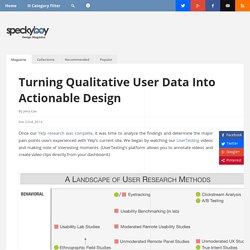
We began by watching our UserTesting videos and making note of interesting moments. (UserTesting’s platform allows you to annotate videos and create video clips directly from your dashboard.) Image Source: Which UX Methods. As discussed in The Guide to Usability Testing, there are a wide range of user research options ranging from resource-intensive usability lab studies to simple email surveys. Latitude and Longitude - Find your Latitude and Longitude Map Location - GPS Coordinates. Welcome to GOV.UK. University Website. Information Architecture for the World Wide Web, 3rd Edition - O'Reilly Media. Does that definition make it any clearer?

Maybe a little, but basically it means how to properly design the architecture of medium to large websites (kind of). Unless you're a senior developer of a large company that has a large website, or are in the process of doing so, you probably never had the first hand experience of how to set the foundation of properly displaying large amounts of data to customers. The beginning of the book the author explains the importance of Information Architects and how one can gain the experience to be one since there is really no degree or certification at this point in time. The author explains the backgrounds one may need to have to gain the necessary knowledge: journalism, library science, product management, technical writing, etc. Information Architecture - European commission.
Websites structured around a logical hierarchy can make it easier to decide on a navigation system and to design page layouts.
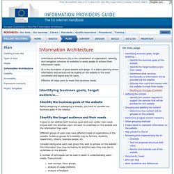
Consider the hierarchy that will be most appropriate for the information and services to be provided on the website and that meets the needs of users. Hierarchies can be narrow and deep, or broad and shallow: Narrow hierarchies In these there are few main menu choices and many lower levels of the hierarchy. The disadvantage is that the choices may be not be specific enough, so users may need to click through a number of levels to find the information they require. Broad hierarchies. W3Schools Online Web Tutorials.