

The Truth About Multiple H1 Tags in the HTML5 Era. Whether you're a webmaster or a web designer, there's a question you've most likely either asked or answered many times over the years.
That question is, "How many <h1>tags can I use per page, and how exactly should I implement them? " There are generally two reasons this question is asked. The first and most common is for SEO purposes; ensuring content is formatted in the best way possible to aid search engine indexing. The second is technical correctness; ensuring that markup is written in accordance with the appropriate W3C spec. With the advent of HTML5 the answer to this question has significantly changed in both SEO and technical regards. However, because the HTML5 spec is not all that widely understood yet, there is still a lot of advice floating around, some even written very recently, based on the rules of pre-HTML5 web design. In this tutorial we're going to clear up some misconceptions. Let's consider an example pre-HTML5 business website. 1. 1. 1. <! 1. Yes, it's true. They are: Display Instagram Feed On Your Website - Step By Step.
Do you have a photo or video manager on your website?
Do you upload photos or videos on your Instagram account? If your answer is both YES, you’re wasting a lot of time managing your brand’s Instagram photos online. What if there’s a way to upload your photo or video ONCE, and then let if appear both on your Website and your Instagram account? Will you be happy saving your precious time? Our code for today will make you happy then, just like we are! Today we’re gonna talk about how to display publicly available Instagram photos and videos on your website using PHP and Instagram API. This one is great if you want your Instagram photos and videos to be shown on your website in a synchronized way. AppendTo Web Development Training Courses for Teams. Before I get started, I just want to make it clear that this review of OOCSS is simply my take on the methodology and my method of comprehending it.
There seems to be a lot of different views on the topic, and I’m sure I don’t have the perfect answer, but hopefully this article will help others struggling to comprehend OOCSS in one way or another. My take Object oriented CSS (OOCSS) is a methodology of writing reusable CSS that is fast, scalable and maintainable. It’s the first of the popular CSS “systems” (SMACSS & BEM are two other popular systems) that aim at making CSS more modular and scaleable. First introduced by Nicole Sullivan at Web Directions North in 2009, the object oriented concept comes from, as you probably guessed, more traditional engineering practices that are used in programming languages like PHP, Ruby or JavaScript. Home · brunogarcia/Front-end-Wiki Wiki. Bootstrap sí, pero no. Getting started with RESS. Responsive Web Design Resources. Atomic Design.
Hey there!
I wrote a book called Atomic Design that dives into this topic in more detail, which you can buy in paperback and/or ebook formats. We’re not designing pages, we’re designing systems of components. —Stephen Hay As the craft of Web design continues to evolve, we’re recognizing the need to develop thoughtful design systems, rather than creating simple collections of web pages. A lot has been said about creating design systems, and much of it focuses on establishing foundations for color, typography, grids, texture and the like. In searching for inspiration and parallels, I kept coming back to chemistry.
Similarly, interfaces are made up of smaller components. Icon hamburger el mal uso y la solución - Principios Diseño UX. Material Design - Traducción al español. 6 Color Matching Techniques for WordPress Web Designers. There is a psychology behind the use of color.
Many clients want shiny and flashy, and they choose colors because they like them. But a color they like might not have the desired effect. Color plays an important role in the success of UX. Users tend to click and scan on things that visually appeal to them. If used correctly color is pretty. Google Design. Top 5 Common Mistakes in Website Design – Designhill Blog. The Internet swarms with millions of different websites.
And thousands are created, every hour! With so many useful resources freely available online, building a website is no longer a daunting task for a designer. But the real challenge lies in making the website useful enough for users. More often than not, website designers forget about the practicality aspect in a bid to make their websites more creative.
In this blog, we would highlight 5 common web design mistakes that web developers and designers make when they give ingenuity priority over usefulness. 1. Most websites are like huge wardrobes of vital information. 7 Latest Design Trends You Can’t Ignore — TechPatio. The design of any website is one of the most important things.
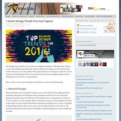
It will impact the visitors in a go, if the design is good then the visitors will love browsing your site and if it is bad visitors may leave your site quickly. Web design industry is evolving at a rapid rate, If you want to get along this pace then you must have the idea about changing design trends. It will help you to meet the user expectations. Here is a list of some famous design trends which you can not afford ignoring: 1. Material Design was developed by Google in 2014. it has slowly and steadily gained the popularity among the web designers since its inception and now it is one of the most important design trends to be followed. Calculer le Prix d'un site internet - Toulouse.
Manual de XML. Comment rédiger le brief pour la création d'un site internet ? Si vous souhaitez confier la création de votre site internet à un prestataire, un freelance ou une agence web, la première étape est la rédaction d’un brief.
Selon le type de site internet envisagé ou le périmètre d’intervention du prestataire, le brief du projet de création de site internet prendra une forme différente, mais la logique générale est toujours la même. Le brief est un support de travail et d’inspiration pour le prestataire web. Il doit contenir toutes les informations utiles sur votre activité, votre positionnement et vos objectifs, sans toutefois en dire trop pour laisser la créativité du prestataire s’exprimer pleinement. Le point sur les différentes étapes incontournables du brief d’un site internet et les pièges à éviter. 5 clés pour réussir son brief agence ! L’objectif du brief est de faire comprendre votre demande à un prestataire, notamment aux agences.

Ce doit être un document de synthèse écrit. Un mini cahier des charges qui reprend les points importants à communiquer à un prestataire. Site Web adaptatif ou responsive ? 16 portfolios créatifs pour votre inspiration. Présenter ses créations en ligne n’est pas toujours une mince affaire… Dois-je utiliser une plate-forme ou créer ma propre vitrine ?
What Makes a Great 404 Error Page? What Makes a Great 404 Error Page? No one wants to think website visitors are spending time on error pages, but it happens. The 404 error page is one place that these interactions happen rather frequently. Design it in a way that speaks to users rather than encouraging them to leave your site. More memorable and less frustrating 404 error pages are the most successful. They can also be the most fun to design. 30 brilliantly designed 404 error pages. If you're starting a blog or website, don't forget the all-important 404 page – a standard response code in HTTP telling the user, in effect, that they've clicked on a broken link. It's traditionally been an immense source of frustration. But in recent years, creatives have taken up the challenge of designing bespoke 404 pages that use humour, great UX or beautiful design to at least sweeten the pill of finding out that you're in the wrong place.
Done really well, a 404 page can become a mini-ambassador for the website itself. It might even be shared on Twitter or relevant blogs as an example of the site's keenness for customer service or unique approach to design. 50 trucs pour optimiser votre expérience utilisateur web. Au-delà du design flamboyant de votre site internet ou de toutes les fonctionnalités extraordinaires qu’il peut offrir, la qualité de l’expérience utilisateur que vous offrez est cruciale pour atteindre vos objectifs sur le web. Si les visiteurs qui atterrissent sur votre site trouvent facilement l’information qu’ils recherchent et peuvent naviguer instinctivement sans embuches, ils reviendront.
20 of the Very Best E-Commerce Web Sites. 33 Great Examples of Web Design Sketches. Design Trend: Using Watercolor Patterns in Web Design. Design Trend: Using Watercolor Patterns in Web Design Add a little art to your web design with the watercolor trend. Watercolor techniques are a popular design option because they are fun, easy to use and work with a variety of different types of content. Watercolor styles can be used in a number of ways to emphasize your content. Whether you are considering a watercolor look for your website framework or just want to experiment with the style, we have a collection of ideas, examples and resources to help you get started.
Bright and Light. 15 Great Examples of Calls-to-Action for Lead Generation. Ever tried so hard NOT to click on a graphical link or button on a website only to be thwarted by the tantalizing message and promise of what would be on the other side? Well my friends…you've just witnessed examples of calls-to-action working effectively.
It gave you something to do…and well...you did it. Why'd you do it? It's probably because calls-to-action add some serious meaning to simple graphical links. 13 Quick Tips to Improve Your Web Design Skills. Designing your company website can be a challenging proposition. You’ve got to juggle the expectations of many stakeholders, and you can often hit obstacles that prevent new ideas from emerging. I was the design manager for a large company website for nearly six years, and during that time, I found myself losing perspective of what our target audiences really needed. Call it “tunnel vision.” When you work on the same website, it often helps to take a step back and think through new approaches.
That’s the purpose of this blog post. La méthode Agile - Optimisation de la relation "client / fournisseur" Placer le client au centre des démarches et des personnes. Un modèle de cahier des charges pour votre site internet. "Cahier des charges" peut désigner plusieurs types de documents et différents types de projets. Si vous lisez cet article, c'est probablement parce que vous cherchez un modèle qui vous permettra d'organiser votre projet de création de site Internet et de briefer les potentielles agences auxquelles vous pourriez faire appel. The New Rules for Scrolling in Web Design. What was once taboo in website design has made a complete resurgence as one of the most popular techniques in recent years as users are finding a new love and appreciation for sites where scrolling is a necessity.
Shedding its old stigmas, scrolling is reinventing itself as a core interaction design element – that also means designers need to learn the new rules. Photo credit: Fitbit. Muzli Design Inspiration. 10 claves para rediseñar tu web. 1. 15 ejemplos de diseños web con imágenes grandes. 20 webs que marcan nueva tendencia: utilizar fotos de retrato. Forbes Welcome. 20 Signs Your Web Designer is Terrible. Différence entre le développeur Front-End et le développeur Back-End ? - alticreation. InsertHTML. Animating Vectors with SVG. Animated line drawing in SVG. 50+ incredible freebies for web designers, March 2015.
The 10 Commandments of Good Form Design on the Web – Mono. Design Tip: Never Use Black. 7 habits of great Web designers. 15 raisons de ne pas utiliser les outils en ligne de création de sites web. Wwwhere. What’s new for designers, July 2014. Crafted by Love. 50+ incredible freebies for web designers, March 2015. Unsemantic CSS Framework. Html - Why width 960px? Guía de resoluciones efectivas CSS (o “viewport”) en smartphones, tablets, ordenadores especiales y otros dispositivos » (No copypaste de) Tecnología » fernastro.com G8. Optimal characters per line. 5 Common Website Design Mistakes. Faire une newsletter. Comment créer un email, une newsletter en HTML? 5 Banner Ad Best Practices and Why You Should Ignore Them.
Qu'est-ce qu'une bonne bannière publicitaire ? Qu'est-ce qu'une bannière publicitaire réussie ? Bannières pub : quel format choisir ? où les placer ? comment obtenir le meilleur taux de clic ? - Le savoir-faire de l'e-mailing. La bannière d'un site web. Material Design, Daily – MaterialUp. 2015 — Creative Trends — Shutterstock. Sliders, faut-ils les utiliser ? [Etude de cas] - Canal-Web, le BlogCanal-Web, le Blog. 5 soluciones prácticas para el desarrollo de Responsive Web Design. Las tendencias en Diseño Web para 2015.
Design Tip: Never Use Black by Ian Storm Taylor. Medidas de la pantalla y resolución de teléfonos celulares y tabletas. Lista de fuentes – web safe fonts. 16 Gorgeous Web Safe Fonts To Use With CSS. Choosing web fonts: 15 expert tips. Google fonts : tests de lisibilité. Usar inteligentemente Google Web Fonts. Getting Started - Google Fonts. Ideal line length for content. A frequently-updated compendium of web app first-run experiences. Columnas, anchos de línea y legibilidad. 5 pasos para hacer tu web más legible. Montserrat Font Combinations + Similar Fonts → Typewolf. Qué es el DOM. Web Form Design Awards. Jawbreaker input field by Andrej Radisic.
Page contact : conseils et ressources webdesign. W3C Sites - Web sites created by designers that conform with W3C standards. 10 Tips for Designing with Type on a Photo. Qu'est-ce qu'un intégrateur web ? (ou développeur web front-end) Instalar y configurar un servidor locar localhost WampServer. Conceptos básicos: Direcciones electronicas. Designer News. Ampersands and validation. Web development mistakes. Tienes problemas al visualizar una página web en #Safari? What You Need to Know About Open Graph Meta Tags for Total Facebook and Twitter Mastery. W3Schools? No gracias. Elige bien tus referencias y fuentes de información. W3Fools – Better web education for all. Favicon.net. Otras opciones para instalar el botón de Pinterest.