
10rulesinfographic-700x4737. Untitled. Untitled. Untitled. The process of designing an infographic - Visme. Maps Mania: How to Create Grid Maps. Most of the successful UK election maps over the last week have used hexagon grid maps or plain square grid maps.
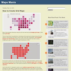
The npr Visuals Team has published an interesting article exploring the design choices that they made for using hexagon grid maps in some of their recent data visualizations. Let’s Tesselate: Hexagons For Tile Grid Maps explains why and how the Visuals Team have been creating hexagon grid maps for a number of mapped visualizations on NPR. If you want to create your own USA state grid maps you can follow Kyle Walkers tutorial on how he created a grid map to show obesity by state in the USA. Obesity by state, 2013: a CartoDB state squares experiment uses a state squares GeoJSON file shared by Bill Dollins on his GitHub repository.
Just for the hell of it I decided to create my own Leaflet.js square grid map from the same GeoJSON file. You can explore the HTML of my map to see how it is made. Maps Mania: How to Create Hexagon Grid Maps. In How to Create Grid Maps I gave an example of a square grid map created using the Leaflet.js mapping library.
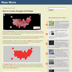
I really wanted to add an example of a hexagon grid map to that post but I didn't have the time to create the hexagon shapes. CartoDB however has come to the rescue with this nice hexagon grid map of Bee Loss in the USA. The map shows the percentage of bee loss in each state from April 2014 to April 2015. The hexagon polygons for the Bee Loss map is provided in a table view with a neat little button to download the data as a GeoJSON file. So what's a guy to do? 140409_10tipsV2-01-816x3191-700x2737.png (PNG Image, 700 × 2737 pixels) - Scaled (36%) How-to-make-an-animated-GIF-infographic-Part-1-600px.gif (GIF Image, 600 × 1230 pixels) - Scaled (81%) The-evolution-of-infographics_55401d300cc91_w1500.jpg (JPEG Image, 1500 × 10941 pixels) - Scaled (9%)
Creative_552edefd9f328_w1500.jpg (JPEG Image, 1500 × 7625 pixels) - Scaled (13%) Infographics. Spotting-bas-science.png (PNG Image, 660 × 934 pixels) WhyWeLoveInfographics.jpg (JPEG Image, 720 × 7300 pixels) - Scaled (13%) MAKE YOUR OWN INFOGRAPHIC. Infographic List. Infographic List. Infographic Website Offering Infographics and Data Visualization. DATA! _nc0rrxhAoV1tx10wyo1_1280.png (1134×988) StoryMap JS - Telling stories with maps.
@komox37. Helping people with everyday data visualizations. 834263.png (PNG Image, 2083 × 17081 pixels) What-you-need-to-know-about-juicing-thumbnail_53722ae9d7e12_w1500.png (JPEG Image, 1500 × 7550 pixels) - Scaled (8%) Infographic-drupal.jpg (JPEG Image, 1400 × 8150 pixels) - Scaled (8%) How To Be a Badass Designer. Making Meaning Through Infographic Design. Thinking in D3. How To Create Viral Infographics. Disinformation Visualization: How to lie with datavis. By Mushon Zer-Aviv, January 31, 2014 Seeing is believing.
When working with raw data we’re often encouraged to present it differently, to give it a form, to map it or visualize it. But all maps lie. In fact, maps have to lie, otherwise they wouldn't be useful. Some are transparent and obvious lies, such as a tree icon on a map often represents more than one tree. It all sounds very sinister, and indeed sometimes it is. Over the past year I’ve had a few opportunities to run Disinformation Visualization workshops, encouraging activists, designers, statisticians, analysts, researchers, technologists and artists to visualize lies. Centuries before big data, computer graphics and social media collided and gave us the datavis explosion, visualization was mostly a scientific tool for inquiry and documentation. Reproducing Lies Let’s set up some rules. We don’t spread visual lies by presenting false data. Should we legalize the killing of babies? I would hope most of you would say: No. McClatchy-Tribune. Related media: Text | Visuals Graphic shows what happens during a lunar eclipse and explains the differences between a lunar and solar eclipse; North America has two opportunities to view a total eclipse of the moon this year, the first in the early hours of April 15 and the second on Oct. 8.

MCT 2014 Graphic compares the specs for the new Samsung Galaxy S5 and the Apple iPhone 5S; Samsung has unveiled the Galaxy S5, the latest version of its flagship smartphone. MCT 2014 Graphic explains how Google Glass, a headset that sits above the eyes and contains a tiny computer, works; Google is selling its face computer to U.S. customers for one day, April 15. Chart showing median age of viewers for late night U.S. Types-of-infographics_5280d6123cba8.jpg (JPEG Image, 1748 × 7441 pixels) - Scaled (9. The-infoceptiongraphic_5283cee9279dc.jpg (JPEG Image, 720 × 6800 pixels) 13 Reasons Your Brain Craves Infographics. An-infographic-about-infographics_50b7221e1c189.png (1000×6486) WhatMakesaGoodInfographic_5111a33e978c0.png (PNG Image, 685 × 656 pixels) - Scaled (97. E-Learning Infographics - The No.1 Source for the Best Education Infographics.
Huge Infographics Design Resources: Overview, Principles, Tips and Examples. Design Imagine what would happen if you were speeding on a highway, and trying to read a traffic sign that contains too much information, would you be able to read the information exactly?

Compare if you were just seeing a place name, a mileage, or an arrow-sign, which one would be more effective for you? Well, that’s just a simple instance. Simply due to the unclear information given, anyone who sees and reads it could miss the important message on it. Data visualization to overcome this has been used worldwide for many years, where a complex piece of information needs to be delivered fast and clear. We can see in recent years that patterns of communication are becoming more effective, delivering information that people need to know.
A History of Infographics I think it is a good idea to begin this article by imparting some historical knowledge about Infographics. Images credit: Public Transport Infographics Image credit: Jan08 407 Brief Description of Infographics Further references: InfoActive. Principles-of-efffective-web-design-in-2013_5180991fc6a4e.jpg (JPEG Image, 1500 × 2783 pixels) - Scaled (21. The Art of Data Visualization. Rise-of-the-infographic_5152fc985feb5.jpg (JPEG Image, 1000 × 4387 pixels) Infographic-deep-dive-into-technology_51658be168b3c.jpg (JPEG Image, 900 × 1450 pixels) What-is-data-journalism_50fe857092486.png (PNG Image, 842 × 1335 pixels) Infographic-architecture-made-easy_51b5ebb7f089a.png (PNG Image, 1000 × 1825 pixels) - Scaled (35. Typography Infographic. 10-ways-to-make-your-infographic-totally-awesome_505085ce59fa8.jpg (JPEG Image, 970 × 6502 pixels)