
Ant Design - One Design Language for UI. Avocode – The bridge between designers and developers. Explaining graphic design to four-year-olds. I recently offered to talk at the local primary school, about my job (or at least part of my job).

I expected to be speaking to the older kids, and be able to talk specifically about the cool parts of the job, and maybe some of the sucky bits too, and how you get around them. Responsive Web Design: 50 Examples and Best Practices. Responsive web design term is related to the concept of developing a website design in a manner that helps the lay out to get changed according to the user’s computer screen resolution. More precisely, the concept allows for an advanced 4 column layout 1292 pixels wide, on a 1025 pixel width screen, that auto-simplifies into 2 columns.
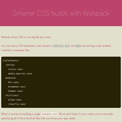
Also, it suitably fixes on the smartphone and computer tablet screen. This particular designing technique we call “responsive design”. Now you can test your website using the Responsive Design Tool. Responsive web designing is an entirely different designing version than traditional web designing, and developers (especially fresher) must know about the pros and cons of responsive web designing. Pages that include data tables pose a special challenge to the responsive web designer. Images in responsive web designs are called context-aware. Designmodo Designmodo has a very clean and clear design with a perfect responsive design interface. Smarter CSS builds with Webpack. Nobody writes CSS in one big file any more.

You, the savvy CSS developer, well-versed in SMACSS, SUIT and BEM, are writing small, isolated modules in separate files. stylesheets/ config/ colors.sass media_queries.sass modules/ btn.sass dropdown.sass header.sass utilities/ align.sass clearfix.sass When it comes to building a single bundle.css file to send down to your users, you're manually specifying all of the individual files that you know your app needs. If you're using a preprocessor like Sass, you might be using its @import statement: @import "vendor/normalize" @import "config/colors"@import "config/media_queries" @import "modules/btn"@import "modules/dropdown"@import "modules/header" @import "utilities/align"@import "utilities/clearfix" If you're working with Rails or Middleman, you might be using Sprockets' //= require directives: //= require vendor/normalize //= require_tree . gulp.task('styles', function () { gulp.src('styles/**/*.scss') .pipe(sass()) .pipe(gulp.dest('.
MindBEMding – getting your head ’round BEM syntax. One of the questions I get asked most frequently is what do -- and __ mean in your classes?

The answer is thanks to BEM and Nicolas Gallagher… Responsive Web Design Resources. Putting the “VP” into MVP. When I first started working at the wireframing & prototyping app UXPin, we were big fans of the “grand unveiling” approach to product development—hunker down with the team, spend a few months creating an awesome bundle of features, and then unleash it on the public.

What we soon learned was that this was a hit or miss strategy. When it worked, the conversion from trial users to paying customers surged. When it flopped, we flatlined at the cost of untold hours of labor, money, and sanity. Soon enough, we learned that we needed to release smarter, not larger. Enter the MVP: a “minimum viable product,” that helps companies test their assumptions about customers with the least amount of effort. In this article we’ll clear up misconceptions about MVPs, and identify different methods UX designers can explore, to balance minimalism, viability, and product quality. The Right Way to Ask Users for iOS Permissions. How Cluster Approaches this Problem Over time, we’ve learned to ask our users for permission when, and only when, we absolutely need it and we think the user can clearly relate how this access will benefit them.

We’ve re-engineered Cluster using two methods to only show the system permissions dialog once a user has told us that they intend to say “Allow”. Pre-permission Dialogs We’ve had a lot of success asking for permissions using our own UI before popping the iOS dialogs. As stated above, the worst possible thing is for a user to deny permission at the system level, because reversing that decision in iOS is very complicated.
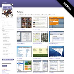
For photos alone, 46% of people who denied access in a pre-permissions dialog ended up granting access when asked at a better time later. Patterns : Designing Interfaces. Selected patterns from the book are featured here on the website, in their entirety.

Here are all of the patterns in the second edition of the book, sorted by chapter. Interaction Design Pattern Library - Welie.com. Suggest a pattern Have you seen new examples of patterns out there that have not been described on this site?

Send me a link to an example and I'll add it to my to-do list. Suggest a pattern Latest comments Form (Lucas Gwadana) Sometimes the ERROR handling is not explicit enough because when a user makes an... Map Navigator (Marcus) For print pages etc static maps are still relevant. Interaction Design Pattern Library - Welie.com.