
Creativebloq. With the right Instagram tips, you can transform your feed into a hotbed of activity.

Instagram is no longer just an image-sharing app, but has evolved to become an extremely useful tool for enabling creatives from a range of disciplines to showcase their work to a potentially huge audience. Understanding how to ride the wave of Instagram’s rising popularity and tap into this growing community can pay dividends for artists and illustrators, and it’s no surprise that those with larger audiences reap the benefits. However, simply chasing Likes does not build engagement, especially as Instagram phases out Like counts (for more on this, see our Instagram engagement post).
Growing Insta engagement requires a clever eye, interesting viewpoint and genuine passion for what you do (and of course, simple tricks like how to change the font in your Instagram bio). Luckily for the time-poor, getting Instagram right doesn't involve as much planning as you might think. 01. 02. 03. 04. 05. 06. 07. 08. Free Graphic Design Software. Discover the World’s Top Designers & Creative Professionals.
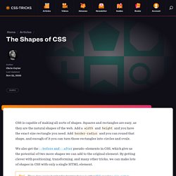
Qbdp. The Shapes of CSS. CSS is capable of making all sorts of shapes.

Squares and rectangles are easy, as they are the natural shapes of the web. Add a width and height and you have the exact size rectangle you need. Add border-radius and you can round that shape, and enough of it you can turn those rectangles into circles and ovals. We also get the ::before and ::after pseudo-elements in CSS, which give us the potential of two more shapes we can add to the original element. By getting clever with positioning, transforming, and many other tricks, we can make lots of shapes in CSS with only a single HTML element.
These days, you’re best bet for drawing shapes is either SVG or using a clip-path in CSS, which is SVG-like (and can reference SVG). Triangle Bottom Left Shape Triangle Bottom Right Shape Cut Diamond Shape via Alexander Futekov. Gotowe zasoby dla Product Designera. Od ikon po animacje. - ProductVision. Uizard. Qbdp. 105 Must-Have InDesign scripts (Free and paid) [Updated: May 2017] Update: we recently developed a free plugin that lets you find and add stock photos to your InDesign documents in a very convenient way.
![105 Must-Have InDesign scripts (Free and paid) [Updated: May 2017]](http://cdn.pearltrees.com/s/pic/th/must-indesign-scripts-redokun-150806968)
Learn more in this blog post. Scripts for InDesign Scripts, like InDesign Templates, Plugins, and the proper use of shortcuts, are one of the most powerful (if not the most powerful) tools we have as InDesign users. Scripts are, in fact, like magic added to InDesign. Each time you have a repetitive task to carry out in InDesign, there is probably a script ready to do just that. Adobe InDesign translation made easy. Natanael Gama. Video Creation Platform for Business. Four-Fold A5 Brochure Mock-up by yogurt86. The Color Scheme Designer. Making more out of Wood - LIGNA. Youtube Full Color Palette. Facebook Color Palette. Untitled. Decyzja o tym, jakie oprogramowanie wykorzystamy w wybranym celu, często podejmowana jest na podstawie analizy czasu potrzebnego na jego wdrożenie oraz sumarycznej ilości funkcji, jakie ten system nam dostarczy.

Prawdopodobne jest jednak to, że tam, gdzie priorytetem jest wygodna i czas, w pierwszej kolejności ucierpi bezpieczeństwo. Czym jest WordPress WordPress należy zaliczyć do oprogramowania klasy CMS (ang. Content Management System). Podstawowy zakres funkcji pozwala na szeroko pojęte dostarczanie treści oraz ich komentowanie. WordPress w liczbach Opierając się na danych z serwisu w3techs.com, można wysnuć wniosek, że przeglądając cztery serwisy internetowe, jeden spośród nich będzie wykorzystywał jako silnik właśnie WordPress. 7 Practical Tips for Cheating at Design – Refactoring UI.
When there are multiple actions a user can take on a page, it’s easy to fall into the trap of designing those actions based purely on semantics.

Frameworks like Bootstrap sort of encourage this by giving you a menu of semantic styles to choose from whenever you’re adding a new button: “Is this a positive action? Make the button green.” “Does this delete data? Make the button red.” UX Case Study: Simplest and Most Beautiful Banking Design in The World, As We See It.
UX Design Practices: How to Make Web Interface Scannable. What Is Scannability?

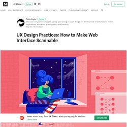
Applied to a page or screen, the verb “scan” means to glance at/over or read hastily. So, scannability is the way to present the content and navigation elements as the layout that can be scanned easily. Interacting with a website, especially the first time, users quickly look through the content to analyze whether it’s what they need. Any piece of the content may become a hook in this process: words, sentences, images, or animations. By the way, this behavior is nothing new: for many decades, people often do the same with a new magazine or newspaper looking through them before they start attentive reading of the articles. Why is that important? How can you check if the webpage is scannable? – Does what you see in the first couple of minutes correspond to what target audience expects from this page? – Can you understand what kind of information is on the page for the first minute or two?
Popular Scanning Patterns Tips on Improving Scannability.