

Manga Temple Font Family. Bubble Chart. Downloadable D3.js API Documentation. Tooltip - D3: show data on mouseover of circle. d3.js - Show d3 node text only on hover. SVG Text Element. The Goal In this section, we will cover the SVG Text Element, why it is important and how we use it within our D3.js Data Visualizations.
First, we will cover what the SVG Text Element is and how we will use it. Then, we will use the SVG Text Element to get a feel for how it works. Finally, we will create and add SVG Text Elements to a Data Visualization using the D3.js. SVG Text Element The SVG Text Element defines a graphics element consisting of text. The attributes and properties of the the SVG Text Element indicate things like the font specification, writing direction, and attributes for how to exactly render and paint the characters. Because SVG Text Elements are rendered using the same rendering methods as the rest of the SVG Graphical Elements, the same coordinate system, transformations, ... etc also apply. d3 add text to circle. Creating SVG Elements Based on Data. The Goal In this section, you will use D3.js to add SVG elements to a webpage based on data.
This will include binding the data to those elements and then using those elements to visualize the data. Note - unlike previous sections where we started with the end product and then worked to understand it, from this section forward, we will build our data visualizations from ground up. Our Goal is to take the following data set: 1var circleRadii = [40, 20, 10]; Drawing SVGs. Last updated 2012 December 30 Now that we’re familiar with the basic structure of an SVG image and its elements, how can we start generating shapes from our data?
You may have noticed that all properties of SVG elements are specified as attributes. That is, they are included as property/value pairs within each element tag, like this: Hmm, that looks strangely like HTML! Fundamentals. Last updated 2015 September 10 These tutorials address an older version of D3 (3.x) and will no longer be updated.
See my book Interactive Data Visualization for the Web, 2nd Ed. to learn all about the current version of D3 (4.x). Working with D3 requires an appreciation of the following concepts. Hypertext Markup Language is used to structure content for web browsers. The simplest HTML page looks like this: <html><head><title>Page Title</title></head><body><h1>Page Title</h1><p>This is a really interesting paragraph. The Document Object Model refers to the hierarchical structure of HTML. Web browsers parse the DOM in order to make sense of a page’s content. Cascading Style Sheets are used to style the visual presentation of HTML pages.
CSS styles consist of selectors and rules. h1 /* Selects level 1 headings */ p /* Selects paragraphs */ .caption /* Selects elements with class "caption" */ #subnav /* Selects element with ID "subnav" */ We connect selectors and rules using curly brackets: D3 Tutorial Table of Contents. D3 Tutorial Table of Contents. How to Make an Interactive Network Visualization. Networks!
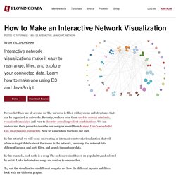
They are all around us. The universe is filled with systems and structures that can be organized as networks. Recently, we have seen them used to convict criminals, visualize friendships, and even to describe cereal ingredient combinations. We can understand their power to describe our complex world from Manuel Lima's wonderful talk on organized complexity. Now let's learn how to create our own. In this tutorial, we will focus on creating an interactive network visualization that will allow us to get details about the nodes in the network, rearrange the network into different layouts, and sort, filter, and search through our data.
In this example, each node is a song. Try out the visualization on different songs to see how the different layouts and filters look with the different graphs. Technology This visualization is a JavaScript based web application written using the powerful D3 visualization library. jQuery is also used for some DOM element manipulation. Functions. d3.js: Examples of Basic Charts. By Ben Lorica (last updated Apr/2012) The set of tools I use to create charts include Excel & R (for generating static images), Processing, Protovis, and the Google Visualization API (for interactive graphics).
I tend to customize the charts I create so any tool I choose to learn & use needs to be flexible in that regard. I use Processing and R for prototyping and designing visualizations that I plan to deliver on the web -- the final product is either a static image or something done through Javascript. Both Protovis and the Google Visualization API use JSON and Javascript, and are great for delivering charts on a web browser. Recently the creators of Protovis announced that they would cease development, and instead focus their efforts on a new visualization library called d3.js: D3 allows you to bind arbitrary data to a Document Object Model (DOM), and then apply data-driven transformations to the document.
Paired Bar Charts Back to top Time-series: Two Line Charts (with Title & Legend)