

Sebastiano Girardi Studio. Slack — Story — Pentagram. Slack is a collaboration hub that is changing the way people work and communicate, helping workers be more productive through a cloud-based set of proprietary collaboration tools.
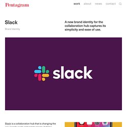
Pentagram has designed a new brand identity for Slack that captures the software’s simplicity and ease of use, updating its familiar hashtag logo to work consistently in different scales and contexts. The extended visual language introduces a more refined color palette but retains the brand’s playful visual personality. Pentagram worked closely on the project with Slack founder and CEO Stewart Butterfield and the in-house design and brand team. The update is the first significant change to Slack’s brand identity since the company launched in 2013 with a logo that resembles a hashtag, or octothorpe.
The hashtag is an organizing element in the platform, signaling the beginning of the channels where teams can talk about individual projects. 6 great logo ideas that break the mould. Making a good logo great is about taking the brief that one step further.
Nicely crafted, fit-for-purpose designs that meet, rather than confound, expectations risk blending into the background. It takes that extra spark for a logo to really stick in the mind – and a killer idea is everything. The very best logos use intelligence, wit and unconventional thinking to find that hidden gem that makes them special. 41 cool logos that are so hot right now - 99designs. Any list of cool logos is going to be necessarily subjective, paradoxically both incomplete and overly broad.
But I’m a freelance writer, and numbered lists on the internet are how I pay my bills, so we’re doing it anyway. Identité visuelle Saint-Didier-Au-Mont-d'Or. 30+ Examples of Brand Logo Designs Used by Modern Companies. Nowadays all companies have a brand logo which represent the companies brand in front of the public.
Anyone can now identify the company just by looking at the logo. So these days the logo design plays an important for branding of a company. Designing a logo for the company is a crucial part as that logo will represent that company forever. All well-established companies have their own brand logo. Here you can find some awesome logo designs used by modern companies. Also check our related articles on logos Video Sharing App Logo Design. Logo Of The Day - Logo Design Inspiration, Gallery & Award Scheme! Logos responsive, la nueva tendencia en branding. Salvador Dalí’s Real Masterpiece: The Logo For Chupa Chups Lollipops. Salvador Dalí, the wacky surrealist known for his signature pointy mustache and painting melting clocks, was also graphic designer behind the classic Chupa Chups–an enduringly sweet, bright rendition of a daisy.
The Catalan lollipop made its first appearance in 1958, when the company founder Enric Bernat hatched the idea of placing a bonbon on a stick. Chaz Digital Craftsman. Loghi di brand italiani con il font Comic Sans MS. Il font Comic Sans MS è da sempre odiato dai graphic designer, ma non solo, è un po’ la pecora nera dei font: colpa del suo aspetto infantile, ingenuo, se non addirittura approssimativo.
Per “rendere omaggio” al font, un Tumblr ha deciso di riprendere i loghi di brand internazionali in Comic Sans MS e offrirci un momento di spensieratezza. Revolutionary bespoke typeface splits opinion. When The New School approached Pentagram partner Paula Scher to help resolve its unique visual identity challenges, she didn't think she would end up designing a whole new typeface.
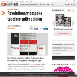
The logo and identity, which replace Siegel+Gale's 2005 efforts, have attracted a mixed reaction, but the bold new typeface undeniably commands attention, gaining personality as it extends. Here, Scher walks through the design process. I logo più memorabili del mondo. Il Branding è tornato di moda, se cosi si può dire, nella community dei graphic designers.
Ci siamo sbagliati sul logo di Hillary? La freccia di Hillary Clinton. Antonio Viscardi / New Personal Branding on Behance. 50 Meticulous Style Guides Every Startup Should See Before Launching. All good brands have a great style guide.
Creating a simple booklet that catalogues the specific colors, type, logos, imagery, patterns, taglines, etc. of a brand makes sure the brand machine runs smoothly. To prove why you shouldn’t let your style guide go by the wayside, we’re going to take a look at 50 stunning and detailed examples of style guides that are sure to encourage you to begin compiling your own. And when you’re ready to put that style guide to work, trial it the fun way, by designing a branded social media graphic in Canva (click here). 01. Woshi-Woshi cosmetics visual identity.
Sushi & Co Visual Identity. Situé sur un bateau de croisière de la Mer Baltique, Sushi & Co. est un restaurant japonais qui avait besoin d’une identité toute nouvelle.
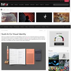
Les designers finlandais de chez Bond se sont occupés de l’identité visuelle du restaurant, en imaginant un logo en forme de poisson et d’hameçon dans l’esperluette de leur nom, ainsi que des menus, des plateaux avec des couleurs et des motifs océaniques. Photos by Angel Gil. Unit Editions — Manuals 2. Manuals 2Design and Identity Guidelines After the success of Manuals 1 [Unit 15] there was never any doubt that Manuals 2 [Unit 18] would follow.
In this book, Unit Editions presents another thorough compendium of graphic standards and corporate identity manuals. Manuals 2 features a mix of 20 outstanding American and European design manuals. Each is photographed in exquisite detail and accompanied by meticulous descriptions of their physical make-up. Déjate inspirar por estos 50 logos increíblemente inteligentes con mensajes ocultos. 21 outstanding uses of colour in branding. Colour theory is a central and often overlooked area of design. On a simple level, the colours on the warm side of the spectrum – such as red and yellow – are bold, uplifting and energetic, while their cooler counterparts, blue and green, exude calmness and feel more reserved. This is particularly relevant when it comes to branding: on an emotional level, in terms of how consumers feel when they look at it; but also on a practical level, in terms of market standout.
Ridley on Behance. Ridley is an Australian based firm at the forefront of some of the biggest developments in the architecture and construction industry. Historical… Read More Ridley is an Australian based firm at the forefront of some of the biggest developments in the architecture and construction industry. Historically an architectural documentation specialist, they’ve pioneered the use of Virtual design construction – the digital revolution that is reshaping the industry, using Building Image Modelling software (BIM). Every part of the 3D model has attached live data – information on materials, costs, weight, – so that any adjustment will update costs, load bearing etc. – It enables massive cost and time saving, whilst having a live model of the building after the building is complete. Pleno Visual Identity by Futura. Le studio de Branding Mexicain Futura a imaginé la charte graphique du restaurant Pleno, situé au coeur de la Condesa au Mexique.
Du menu au packaging en passant par des set-designs originaux, le studio a imaginé une identité visuelle graphique et colorée, mêlant influences Art déco et modernistes. Reverse Realities - Famous Logo Experiment! on Behance. Telgo. Contributed by Luís Feitoza of Goiânia-based BR/BAUEN. Telgo is a telecommunications company based in Anápolis, Brazil, offering broadband internet, dedicated circuit and fibre cable services. To develop the brand identity, we conducted research about the business and their perceptions, evaluated their service with customers, and defined the company’s positioning and identity. Shake Shack: Branding a Better Burger. Paula Scher's distinctive Shake Shack identity has helped launch the fast-casual hamburger chain as a $1.6 billion brand.
As every Shackburger fan knows, Shake Shack serves some of the best burgers in the world. And now, with a recent IPO that has valued the company at a staggering $1.6 billion, more of the world will get to know the Shack: From its roots as a hot dog stand in New York’s Madison Square Park, the company has grown into a chain of 63 restaurants from Chicago to Dubai, and plans to use the additional funds to expand to over 400 locations in the next decade. Grohs Visual Identity. Como ha ufficialmente un logo: venite a scoprire il vincitore! Tokyo TDC 2014 Visual Identity. Chaque année, le Tokyo Type Directors Club présente les résultats de ses prix annuels à la galerie graphique Ginza de Tokyo et la galerie DDD à Osaka.
Les organisateurs ont invité l’équipe Non-Format à créer l’affiche promotionnelle. Voici leur identité visuelle pour l’édition 2014. Nouveau logo Quick. Bella collezione di progetti di immagine aziendale. Sorprendenti biglietti da visita dal design creativo. Creative Logo Designs for Inspiration #32. Corporate identity or Branding is all about creating a logo design and in building up the brand value is essentially best done by a graphic designer who is adept in creating images keeping the color schemes, and the artistic value of the image that represents the brand as well as the organizations. When designing a new logo, it should be done in such a way that the customer is able to recollect and recognize the logo design. Here we have some superb logo design examples, i hope you will enjoy the concept and ideas of these creative logos.
Wild Card: Design Observer. Unibz Design Festival 2014 - visual identity on Behance. A new look for London Luton Airport. DeviantArt reveals new logo and website. MIT Media Lab. Ecco il nuovo logo del Maxxi. In anteprima su Artribune il progetto grafico dell’agenzia Inarea: che ne pensate voi? Domaine Lepovo Wine Identity. IBRA. Cambridge Design Partnership. Guidelines - Associazione dei Commercianti al Dettaglio del Trentino.
Behance.