
Baubauhaus. Digitalartsonline.co. Logos, movie posters, cover art and branding: the most immense identity work of the last decade.
Any product, service or package comes with an identity, whether it be book, brand or burrito. But how many went that extra mile in creativity? Which logos, adverts and cover artworks went on to inspire, entertain and - perhaps most importantly - encourage audience loyalty and plenty of online traction? The last decade was one defined by a lot of brands around the world going colourful and cute, chasing the likes and views on social media through blocky images, knowing gags and an emphasis on characters, mascots and emoji. In spite of this, there was a lot of conservatism when it came to creativity, especially in the dominant realm of Silicon Valley. Below we list our favourite examples of identity branding in the twenty-tens; hit us on social with your views on anything we may have missed out. Best Designed Film Poster: The Social Network By Chris Ware, 2010. Behance. Indirizzo di Grafica. La protesta "bianca" promossa dall'AIAP.
Lavori Creativi - Annunci di lavoro, freelance, portfoli e coworking. Euro Style. A Book That Takes a Fresh Look at Classic Type. The Kansas City and San Francisco-based Willoughby Design has designed a book that lets you explore brand-new typefaces that were created to represent “new classics” for today’s typographic design.
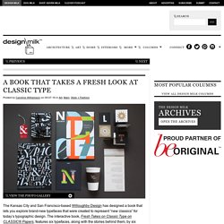
The interactive book, Fresh Takes on Classic Type on CLASSIC® Papers, features six typefaces, along with the stories behind them, by six different creators that range from emerging to notable. The firm worked with paper brand Neenah and printed the book on a variety of CLASSIC® Papers that will keep the reader engaged with each page. Besides the typography, the book has graphic design, traditional offset and UV printing, four-color imagery and spot color, foil stamping, spot thick UV, embossing and debossing, and die-cuts. While the book isn’t for sale, you can get a free copy from a Neenah rep.
Artist: Luke Lisi (designer)Typeface: Homestead Three single-layer fonts make up this typeface, which can be arranged in different ways to create custom plaid designs. How One Couple Turned a Graphic Design Hobby into a Major Modernist Collection. Swiss Style Graphic Design: 5 Award-Winning Examples. It doesn’t get any more international than graphic design from Switzerland, which has been commonly called Swiss graphic design—or international style.
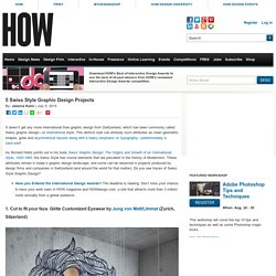
This distinct look can embody such attributes as clean geometric shapes, grids and asymmetrical layouts along with a heavy emphasis on typography—predominately a sans-serif. As Richard Hollis points out in his book Swiss Graphic Design: The Origins and Growth of an International Style, 1920-1965, the Swiss Style has crucial elements that are prevalent in the history of Modernism. 9 Scandinavian Graphic Design Projects to Make you Swoon. Words like “clean,” “cool,” and “minimalist” have been used often to describe Scandinavian graphic design, a staple to the international graphic design landscape.
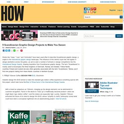
The influence of this distinct style has had ripples in design aesthetics across the globe—as we’ve seen a number of entrants in design competitions like the International Design Awards, drawing inspiration from Scandinavian graphic design. The term “Scandinavia” is mostly used to encompass the three kingdoms of Denmark, Norway and Sweden. Fellow Nordic countries Finland and Iceland are also often generally associated with the term “Scandinavia.”
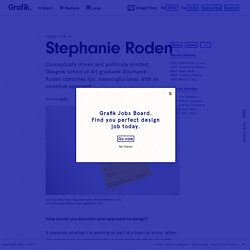
Stephanie Roden. A lot of your work has a strong political element, what responsibilities do you think designers have?
And how does that manifest itself in your work? I’ve been interested in political and social justice discourse for years, but it was only really in my final year that I chose to make work to reflect this. Jonathan Barnbrook was one of the first graphic designers I became interested in when I first went to art school, I remember reading in Barnbrook Bible that graphic design is a ‘culturally valid form of expression’.
This resonated with me and I feel it’s important to consider design in this way; though graphic design can have very commercial functions, it’s important not to underestimate its potential to promote political change. Of course designers shouldn’t feel obligated to only make politically-minded work, but I would say whilst working in industry designers have a responsibility to consider the impact their work has on the audience it targets. 50 Mesmerising Designs That Make The Most Of Negative Space.
Less is more?
Graphic designer matches everyday objects with Pantone colours and the results are unreal. TYPO VS LETTERATURA on Behance. Hey Day. We’ve had our eye on Barcelona-based studio Hey ever since it came to our attention when it signed to illustration agency Handsome Frank last year.
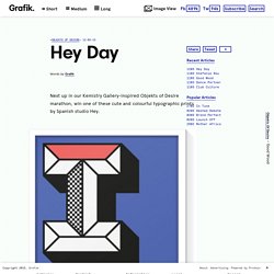
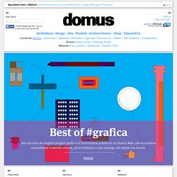
Its portfolio is packed with colourful, fun projects that always manage to raise a smile. In 2014, the studio launched its online shop, from where it sells a range of friendly prints, t-shirts and bags. For the next in our special Objekts of Desire series celebrating the artists involved in Kemistry Gallery’s 100 Years of Graphic Design exhibition, we’ve got one of Hey’s cute typographic prints to give to one lucky reader. Each is a Giclee print on Decor Smooth Art 210gsm and is signature embossed. We’ll be asking the winner to choose which letter they’d like to receive, so get thinking. For a chance to win an unframed 50x70cm print, send an email to giveaway@grafik.net with ‘Hey’ as the subject header and and an answer to this question: In which year was Hey Studio founded? Heystudio.es. On Track. Top Award 2015 - Shortlist. Triangulart. on Behance. Classic Sneakers Collection on Behance. Best of #grafica. La capacità della grafica e dell’illustrazione di veicolare informazioni complesse ne fa un elemento importante della comunicazione, che si tratti di raccontare un’architettura o il cervello umano.
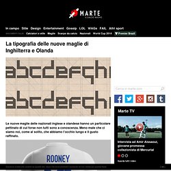
La tipografia delle nuove maglie di Inghilterra e Olanda » Marte. Le nuove maglie delle nazionali inglese e olandese hanno un particolare pettinato di cui forse non tutti sono a conoscenza.
EYE SCREAM SUNDAY. Tiny Objects Perfectly Paired with Matching Pantone Swatch. Architettura e cinema. Labora Coworking - Branding on Behance. - INSTRUCTION OF FRUIT - on Behance. Château de Versailles. Typographic Entomology on Behance.
Packaging. Poster. Gif animate. Loghi. Identità visive. Oggetti grafici. Copertine dischi, cd, dvd. Minimalismo. Type design.