
Creativebloq. It's been 10 years since Evernote hit the scene.
Throughout the last decade, the mobile note-taking app has been there to help us record ideas and remember what we're doing. To celebrate its anniversary, Evernote released a rebrand and new logo design earlier this week, after partnering with DesignStudio to bring its vision to life. This involved a long, hard exploration of what the Evernote brand meant and stood for, to create a design that signalled change – without reducing brand recognition. Concept Design & Graphic Artworks. Behance. Molteplici modi… di riferire la molteplicità delle cose… Advertising giant Ogilvy undergoes global rebrand and “re-founding” by design agency Collins. International advertising agency Ogilvy has rebranded, working with design agency Collins to redesign its logo, fonts, website and entire visual system, as well as “re-founding” in a synchronised global campaign.
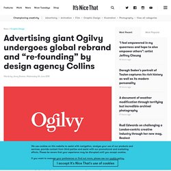
This event launches the advertising giant’s internal restructure, as the company has unified its collection of sub-brands to bring all its agencies under the Ogilvy Group umbrella. Unveiled in The Wall Street Journal, the rebrand is the result of two years work under the company’s chief executive John Siefert, appointed to the role in 2016 having joined in 1979 as a summer intern. Pentagram designed an identity that never stops changing. Apple releases new identity for Apple Music. The new identity debuts in the Apple Music Anthem spot (above).
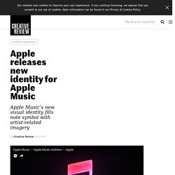
The ad showcases 41 versions of the Note symbol, treating it in multiple graphic styles referencing different musical genres and using it as a container for imagery in the manner of the original MTV logo. According to an Apple spokesperson, “The Note aims to connect music fans to what’s next in music, artist news, and culture, while highlighting the depth and breadth of content that can be found within the platform.”In addition to the film, Apple Music will begin rolling out bespoke Notes around the globe to be featured in OOH, digital and some broadcast advertising.
The first batch features a mixture of established artists such as Bob Dylan and Metallica and more contemporary artists including Drake and Sia. New Logo for dotdot by Wolff Olins. Established in 2002 the zigbee alliance is a global membership organization that works to create and develop universal open standards for smart objects or, in popular parlance, the Internet of Things (IoT).
The alliance has developed the ZigBee protocol used to create small personal area networks that allow objects to communicate with each other instead of using the more energy- and resource-consuming Bluetooth or Wi-Fi and they’ve applied it to a wide range of products. Their latest effort is dotdot, a universal, open source language of the Internet of Things so that smart objects from different brands can work together using the same protocols instead of building walled ecosystems that limit possibilities. Corporate Identity Portal. Moleskine Notebooks Celebrates 100 Years of Coca-Cola Bottle – Fubiz Media.
Pol Pintó - A-creixement. L'Espagne est un des pays en Europe, le plus touché par la crise économique qui sévit depuis quelques années.
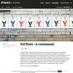
Cette situation extrême pousse à la réflexion et interroge sur la viabilité du capitalisme consumériste. Le projet A-creixement cherche à véhiculer de nouvelles orientations sur nos modes de vie et cherche à établir une nouvelle relation d'équilibre entre l'homme et la nature, à l'opposé de la consommation de masse. Pour diffuser ces idées, le mouvement s'appuie sur le design graphique et c'est le jeune catalan Pol Pintó qui s'est chargé de réaliser les différents supports de communication.
La typographie est largement utilisée sur les items et la lettre A renversée et légèrement inclinée prend le partie d'une décroissance, engendrée par l'action populaire. Source : Ne ratez plus les derniers étapes: Téléchargez l'app du kiosque pour consulter tous les numéros directement sur votre tablette. Leonardo sonnoli. Mohawk. Concept posters for the new Mohawk identity.
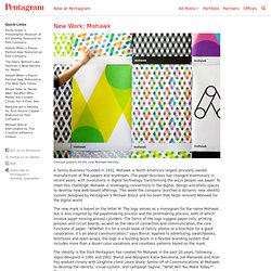
A family business founded in 1931, Mohawk is North America’s largest privately owned manufacturer of fine papers and envelopes. The paper business has changed enormously in recent years, with revolutions in digital technology transforming the ways people use paper. To meet this challenge, Mohawk is leveraging connections in the digital, design and photo spaces to develop new web-based offerings. This week the company launches a dynamic new identity system designed by Pentagram’s Michael Bierut and his team that helps reinvent Mohawk for the digital world. The new mark is based on the letter M. The identity is the third Pentagram has created for Mohawk in the past 20 years, following logos designed in 1991 and 2002.
The new identity functions as a monogram and suggests rolls of paper, presses and connection. The logo accompanies a change of the company’s name to “Mohawk” from Mohawk Fine Papers and can appear with the name or stand alone. A look inside the brand guidelines for the amazing 1970s Nasa "worm" logo. Corporate-Design-Manuals / Styleguides. Styleguides: Von den Einen verhasst, von Anderen zu einer Art Bibel stilisiert, die man unter Androhung von Höllenqualen tunlichst zu befolgen hat.
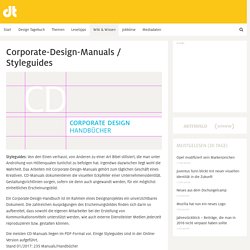
Irgendwo dazwischen liegt wohl die Wahrheit. Das Arbeiten mit Corporate-Design-Manuals gehört zum täglichen Geschäft eines Kreativen. CD-Manuals dokumentieren die visuellen Eckpfeiler einer Unternehmensidentität. Gestaltungsrichtlinien sorgen, sofern sie denn auch angewandt werden, für ein möglichst einheitliches Erscheinungsbild. Styleguides corporate identity portal. LATAM, Südamerikas neue Flugzeugmarke.
A Refreshing Blue and White McDonald’s Rebranding – Fubiz Media. Galleri Jonas Kleerup. corporate identity portal. Branche: Kultur Agentur: Kurppa Hosk Quelle: www.kurppahosk.com 26.7.2015 Galleri Jonas Kleerup.

Jonas Kleerup is one of Sweden’s most renowned art dealers. Best Fit. Corporate identity - inditex.com. A Website about Corporate Identity. Brand identity style guides. This is great!
The University of Connecticut has a nice one designed by Peter Good. Web and link to PDF version. (Get the PDF version!) Peter did a great job of differentiating the three identities a university typically has. – The academic and marketing identity (what most would think of as the main identity). – The athletics or mascot identity. Brand Identity Magazine. Reebok, la società di origine britannica – di proprietà della tedesca Adidas a partire dal 2006 – specializzata nella produzione di abbigliamento e articoli sportivi, cambia il proprio marchio.
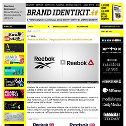
La sua storia ha origine sul finire del diciannovesimo secolo, quando i due fondatori, Joe e Jeff Foster, furono affascinati dalla pronuncia sudafricana dell'antilope: 'rhebok'. Lo storico simbolo, una linea obliqua che si divide in due parti e che viene attraversata trasversalmente da un'altra linea, è stato sostituito da una moderna raffigurazione della lettera greca 'delta'. Brand Identity Magazine. L’Esposizione Universale è una manifestazione di natura non commerciale, mirata a creare una piattaforma per un dialogo internazionale tra i cittadini, i Paesi e le istituzioni intorno a un tema d’attualità e di interesse universale.
Fin dall’inizio è stato il luogo privilegiato in cui rappresentare la creatività e l’ingegno umano attraverso la messa in scena di quanto di meglio ogni Paese potesse presentare al mondo in quel preciso momento storico. La storia delle esposizioni universali inizia nel 1851 quando - in piena era vittoriana - l'impero Britannico decide di ospitare un’esposizione che mostri la sua potenza industriale. Da allora sono in tutto 34 le esposizioni universali riconosciute dal Bureau International des Expositions, (tipicamente abbreviato in BIE) l'organismo internazionale che coordina gli eventi di questo genere. • Frequenza: ogni 5 anni • Durata massima: 6 mesi • Costruzione dei padiglioni da parte dei partecipanti • Dimensioni dell'area non definite • Tema generale. Mall of America. Contributed by Natalie Howell of Roepke PR on behalf of Duffy & Partners. Upon its 20th anniversary, Mall of America was in search of a new identity, something that would better reflect its position as a curator of popular culture.
Duffy’s challenge was to create an identity that reflected the Mall of America’s iconic, bold and unmistakable American image. New design elements include colorful interior branding, brand language, logo, environment, promotional merchandise, website and social media pages. Duffy’s design redefines the true American star, threading together a place where fashion, entertainment, cuisine, thrills and community intersect. The result is a robust brand language that is fresh and full of energy and optimism. Jekyll & hyde - widiba. Visual Identity by Atipus.
Sport. Città e territori. Musei e sedi espositive. Enti culturali. Grapheine. ID. Brand Manuals.