

Le 10 regole fondamentali della progettazione grafica. Progettare un sito web, un catalogo, una pagina pubblicitaria o un logo può essere divertente ma, per certi versi, potrebbe diventare anche stressante.
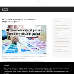
Queste 10 regole di progettazione grafica ti aiuteranno ad avere un’immagine del tuo brand coerente ed in sintonia con il tuo pubblico di riferimento. I 6 principi fondamentali del graphic design. The Basics of Good Design - ThatDay. Accretion of The Principles of Graphics Phase 2 Brief Discussion. This blog post is written by the MAAC Kolkata to educate the readers as well as the aspirants with the various important principles of the Graphics.

This is the main part of a designer who is assigned to best assemble and amass the diverse elements of a web page layout with a view to connect with the overall design and to the other designs. Every one of the standards or principles of design, otherwise called standards of organization, apply to any piece you make. How you apply those standards decides how powerful your outline is in passing on the coveted message and how appealing it shows up.
There is sometimes just a single right approach to apply every rule except check your report to perceive how well you connected every one of these six standards of the outline. Visual adjust originates from orchestrating components on the page so nobody segment is heavier than the other. The Principles of Graphic Design: How to Use Balance Effectively. In this month’s design tutorial we continue to explore the principles of graphic design.
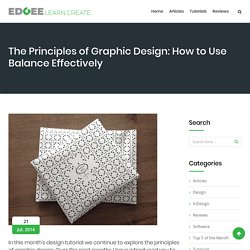
Over the past months I have introduced you to the theories of hierarchy, emphasis and contrast and this month we explore balance. Featured Image: “JAAAAA” by karoline grebe licensed under CC BY-NC 3.0. I principi del Visual Design – Be More, Be Digital. Ci sono molti concetti di base che regolano il campo del design anche se spesso sono classificati in modo diverso a seconda della filosofia o del metodo di insegnamento.
La prima cosa da fare è organizzarli, in modo da avere un quadro di riferimento per questa discussione. Siamo in grado di raggruppare tutti i principi fondamentali della progettazione in due categorie: principi ed elementi. The 4 Basic Principles of Presentation Design. “Good design is thorough down to the last detail.” - Dieter Rams Creating a beautiful presentation requires a symphony of visual elements to work together for a "big picture.
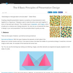
" Designers seek to make the entire vision work together in terms of how each part interacts. Principles of Design: Proximity. Proximity in design simply means that objects near each other are seen as a unit.
It really is that simple and it’s something you see every day. On your web page or your business card, related information is placed closely together and it forms a visual unit. Often when people are getting started with design, there is a temptation to throw everything on the page and fill up every square centimeter of space with type and images. However, it makes information difficult to digest and really doesn’t look good.
Using the principle of proximity, you’ll find as you group those items that have something in common, and separate those items that don’t, a clear visual hierarchy stands out on the page. A practical example is a list, for example a sidebar in a blog. The image below shows two lists of the same items. We can take our list further with the law of proximity and create more logical groupings and put space between the items that shouldn’t be grouped together. Principles Of Design: Contrast. So far in this series, we’ve already looked at how you can improve your design work by applying the principles of Balance and Proximity.
Today we’re continuing with the concept of Contrast. Contrast occurs when two elements on a page are different. For example, it could be different colors between the text and the background color. It could be a heading set in a big, bold, grungy font combined with a sans-serif font (read more about contrast and conflict in typography) for the body text. Principles Of Good Design: Balance. Every layout begins with a blank page or empty space.
When we add an element, its placement can be determine how successful the design will be. Effective design initiates communication and an interest from the viewer whether it’s in print or on the web. In a typical web layout, a designer needs to place a logo, text, photographs or illustration. Principi e basi del Design. 8 Basic Design Principles to Help You Create Better Graphics. 6 principles of visual hierarchy for designers. First there were stone tablets, papyrus scrolls and paper.
Then came computer screens and electronic tablets. As the technology to display a page evolves, it remains the designer’s job to arrange the content clearly. But what’s the best way? It’s an increasingly important question, as responsive frameworks force designers to think about many different pages at once. Faced with dense text and short attention spans, designers developed 6 principles to guide the reader’s eyes to the most important information. These 6 principles of visual hierarchy will help you design everything from brochures to apps, guaranteeing a positive reading experience for the end-user.
Clay tablet: Wikipedia (left); iPad: apple.com (right) 1. All cultures read from the top down and most cultures read from left to right. 5 basic principles of graphic design. The demand for great graphics is huge today for all of the blogs, websites, social media sites and personal brands out there, but not everyone has the cash reserves to hire a professional graphic designer.

With sites like Canva, though, graphic design for the amateur crowd has never been more accessible, yet when you’re just starting out, a little advice can go a long way toward creating powerful and effective DIY designs. Sean Kirkpatrick at Canva provides five basic principles to get you started, then head over to their site to give them a go. 1.
Equilibrio.