MENU AND CO
> Mdemrs
> INTERNET divers
> CSS & CO
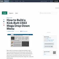
How to Build a Kick-Butt CSS3 Mega Drop-Down Menu. Often used on e-commerce or large scale websites, mega menus are becoming more and more popular, as they offer an effective solution to displaying a lot of content while keeping a clean layout.

Des menus déroulants grâce aux CSS. CSS Menu Generator. Incredible Drop Down Menu Solution With CSS Only. There are plenty of drop-down menus using javascript and CSS already available, but most of them are either too basic (with CSS) or too complicated (with Javascript).

That’s why I publish this drop down menu solution which is using CSS only, but it has a smooth drop effect and the css sprites that changes the toggle icon jQuery-likely. Honestly, this is the most completed menu solution using CSS which comes along with awesome effects. If You want to stay updated and get news regularly consider subscribing to AEXT.NET feed and following on Twitter. This menu solution is compatible with all major web browsers (excepts IE6): Firefox: Perfect support.Chrome: Perfect support.Safari: Yes, it display perfect with rounded corner.Opera: Yes, but with no rounded corner.IE7+: Off course, but no rounded corner The problem with IE6 is she cannot handle the hover event in all HTML element excepts the link:hover.
Web UI Components for Developers. Advanced CSS Menu Trick. CSS really opens the doors to a lot of powerful and rich opportunities.

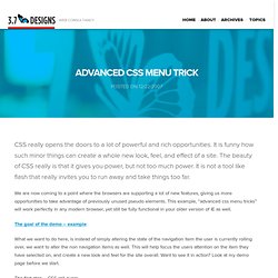
It is funny how such minor things can create a whole new look, feel, and effect of a site. The beauty of CSS really is that it gives you power, but not too much power. It is not a tool like flash that really invites you to run away and take things too far. We are now coming to a point where the browsers are supporting a lot of new features, giving us more opportunities to take advantage of previously unused pseudo elements. This example, “advanced css menu tricks” will work perfectly in any modern browser, yet still be fully functional in your older version of IE as well.
The goal of the demo – example What we want to do here, is instead of simply altering the state of the navigation item the user is currently rolling over, we want to alter the non navigation items as well.
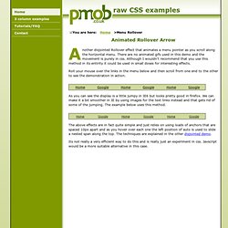
CSS examples - Another Disjointed Rollover. ::You are here: Home >Menu Rollover Another disjointed Rollover effect that animates a menu pointer as you scroll along the horizontal menu.

There are no animated gifs used in this demo and the movement is purely in css. Although I wouldn't recommend that you use this method in its entirity it could be used in small doses for interesting effects. Roll your mouse over the links in the menu below and then scroll from one end to the other to see the demonstration in action. As you can see the display is a little jumpy in IE6 but looks pretty good in firefox. The above effects are in fact quite simple and just relies on using loads of anchors that are spaced 10px apart and as you hover over each one the left position of auto is used to slide a nested span along the top.
Dynamic Drive CSS Library- CSS3 Shadow Block Menu.
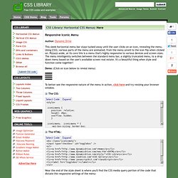
Responsive Iconic Menu Author: Dynamic Drive This sleek horizontal menu bar stays tucked away until the user clicks on an icon, revealing the menu.

Using CSS3, various parts of the menu are animated, from the menu unveil to the icon flip when clicked on.
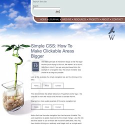
Simple CSS: How To Make Clickable Areas Bigger · The Watchmaker Project. Jump to navigation Apr 19 2005 One basic principle of interaction design is that the larger the link you’re trying to click on, the easier it is to click it.

With this in mind, if you are using text-based links (for example in a navigation bar), the actual ‘clickable’ area should be as large as possible. Look at this example of a simple navigation bar, and try clicking on the links: This demonstrates the default behaviour of hypertext anchor tags – the user has to move the mouse over the text to activate the link.
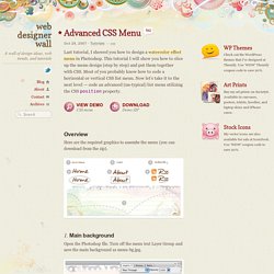
Advanced CSS Menu. Last tutorial, I showed you how to design a watercolor effect menu in Photoshop.

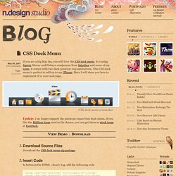
Navigation Tab Menu Generator CSS - Tabs Generator. CSS Dock Menu. May 08, 2007 270 Comments Tags: Javascript If you are a big Mac fan, you will love this CSS dock menu.

It is using Jquery library and Fisheye component from Interface and some of my icons.
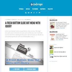
Beautiful Fixed Slide Out Navigation - Codrops. A Fresh Bottom Slide Out Menu with jQuery. In this tutorial we will create a unique bottom slide out menu.

This large menu will contain some title and a description of the menu item. It will slide out from the bottom revealing the description text and some icon. We will use some CSS3 properties for some nice shadow effects and […] View demoDownload source In this tutorial we will create a unique bottom slide out menu. The Luna Grey iconset can be downloaded at DryIcons: In the downloadable ZIP I will not be able to provide them, but I kept the naming, so that you can easily integrate it. Ok, let’s start with the Markup. The Markup. CSS Menu Generator. Blog de Stéphanie Walter, webdesigner, intégrateur web, amoureuse des pixels. N’en avez vous parfois pas marre des coins arrondis uniformes ?

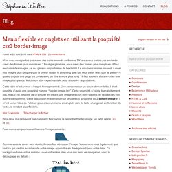
N’avez vous parfois pas envie de créer des formes plus complexes ? En règle générale, pour créer des formes plus complexes il faut recourir à des images, ce qui génère un problème de flexibilité. La solution consiste souvent à créer nos images plus longues que le titres / objets le plus long que l’on veut créer. Mais que se passe-t-il quand un jour une page est créée avec un titre encore plus long ? Il faut souvent alors re-créer une image plus grande. Cette idée m’est venue à l’esprit hier après midi. Voir l’exemple Télécharger le fichier Pour ceux qui ne savent pas comment fonctionne la propriété border-image, un petit rappel ici et ici.
Pour mon exemple nous utiliserons l’image suivante : Comme vous le savez sans doute, il nous faut découper l’image. L’idée de cette technique et d’utiliser les coins de l’image et d’étirer le milieu pour avoir un bord qui s’adapte au pixel près quelque soit la longueur de notre texte.
Webstuffshare.com - Worth Sharing Bo.
As we know, CSS3 has many good features for help us creating more sweet User Interface. One of them is box shadow, it helps us adding shadow effect on each styled element. You must be familiar with drop down menu with shadow effect on it, I usually add the effect using some images but now we’ll create that one using pure CSS. Drop Down Technique To create drop down menu like the demo we can use a div for the menu container and an unordered list for the menu. Wrap the unordered list on the div and hide them, we’ll only show the menu when user hovering the div.
The hoverFlow Plugin - A Solution to Animation Queue Buildup in jQuery. Making an Awesome (and Animated) menu with just CSS!
I do like a good challenge, well, one that isn’t perhaps annoyingly challenging. So I set out today to make a little CSS menu idea that had been floating round in my head. The concept is pretty simple. Each menu would have a 6px border to the left in various colours and on hover the border would grow in size to cover the entire menu item as its background.
An easy way to do this would be to use the :after pseudo element and make a transition between this and the hovered over :after element. Unfortunately Firefox is the only browser that supports psuedo element animations with things like :after.

