
Bob Nilsson sur Twitter : "Nearly all students have access to mobile devs for schoolwork. #infographic @ProjectTomorrow. Project Tomorrow. Create and share visual ideas online. The future of education technology. 6 Social Media Networks to Watch in 2012 plus Infographics. Curiosity is a human trait that makes us want to discover what lies beyond the horizon, over the ocean or what can be seen and experienced from the top of a beckoning mountain.

Educational Technology and Mobile Learning: This is How Students Use eTextbooks. With the advance of mobile technology into our classrooms some new models of instruction have being created with a particular focus on the digital output. 217017275764936077_PQBf3FyH.jpg (300×1433) Sitting Is Killing You (Infographic) Mobile lives of college students [infographic. Getting-in-Bed-with-Gadgets-972px.jpg 972×10,701 pixels.
Get more out of Google: Tips for students doing online research [infographic] How To Turn Your Twitter Feed Into An Infographic. Your Twitter stream is an endless flow of information, insight, and ideas. But you’ve gotta sleep sometime. If only there was some way to quickly understand what your Twitter friends are talking about, what you’re missing, and what’s happening in the world. www.adobe.com/aboutadobe/pressroom/pdfs/Adobe_Creativity_and_Education_Why_It_Matters_infographic.pdf. Visualizing Learning Analytics. Seriously, It's Time To Manage Your Online Reputation [Infographic]
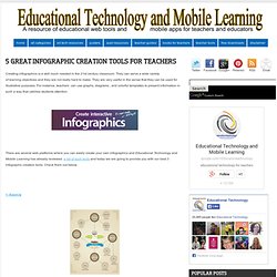
10 Ways To Become A Better Online Learner 9.06K Views 0 Likes There are some quick and easy ways to become a better online learner. Whether you're taking a class or just researching, here are the DOs and DON'Ts. Are books becoming an endangered species? (infographic) Why Invest in Pre-K? 5 Great infographic Creation Tools for Teachers. Creating infographics is a skill much needed in the 21st century classroom.

They can serve a wide variety of learning objectives and they are not really hard to make. They are very useful in the sense that they can be used for illustrative purposes. For instance, teachers can use graphs, diagrams , and colorful templates to present information in such a way that catches students attention. 10 Fun Tools To Easily Make Your Own Infographics.
People love to learn by examining visual representations of data. Teen Social Media Infographic from Common Sense Media. Free infographic app. 5 great ways to use infographics in the classroom. Managing Millennials: Why Gen Y Will Be Running the Country by 2020 [INFOGRAPHIC] In just eight short years, 46% of the U.S. workforce will be comprised of millennials.
![Managing Millennials: Why Gen Y Will Be Running the Country by 2020 [INFOGRAPHIC]](http://cdn.pearltrees.com/s/pic/th/millennials-infographic-33170594)
Whether you're frightened or excited by the prospect, the fact remains that young adults born between 1976 and 2001 will be running this country. UNC's Kenan-Flagler Business School and the YEC have teamed up to compile research and create this infographic, which details the who, how and why of managing millennials. SEE ALSO: How Gen Y Women Fare in Today’s Workplace [INFOGRAPHIC] Aside from their preference for engaging work environments, millennials value jobs that encourage social media activity. One-in-three indicated he would prioritize social media freedom, device flexibility and work mobility over salary when considering a job offer.
After all, millennials switch between devices and forms of media (i.e., laptops, smartphones, tablets and TV) an average of 27 times per hour. If you're a millennial in today's workplace, what are your priorities? Thumbnail image courtesy of iStockphoto, aldomurillo. SchoolTools.jpg 660×1,386 pixels. INFOGRAPHIC: What it takes to get into college. Infographic: How to Extend the Reach of Excellent Teachers. Did you know that only 25 percent of classes are taught by excellent teachers?

We need to find ways to leverage great teachers and extend their talents to more students through the use of technology, new classroom models, and more. OpportunityCulture.org recently published an infographic on Extending the Reach of Excellent Teachers, which takes a look at why excellent teaching matters to student success and the ways that technology can extend the reach of great teachers. Past strategies in recruiting, developing and dismissing teachers won’t cut it today. Technology makes it possible to identify the great teachers and make them available to more students. MAKE YOUR OWN INFOGRAPHIC. The History Of Learning Tools [Infographic] 16 ways educators use Pinterest « Dr. Ray Pastore's Instructional Technology Blog.
Infographic: Write It Down. Infographs. Students-like-social-media.jpg (JPEG Image, 1000 × 1273 pixels) 15 Grammar Goofs That Make You Look Silly. Tablet_adoption_infographic.png 1,400×2,905 pixels. February 2012 - Page 10-11. How Higher Education Uses Social Media [INFOGRAPHIC]
Schools are on a short list of organizations that have been notoriously slow to adopt emerging tech.
![How Higher Education Uses Social Media [INFOGRAPHIC]](http://cdn.pearltrees.com/s/pic/th/higher-education-infographic-132292462)
But within the last few years, as social media becomes more integral to students' lives, educational institutions are finally catching on, and catching up. When it comes to higher ed, there are not only opportunities for digital learning, but digital marketing too. Some schools have taken the reigns on both sides, with mixed results. SEE ALSO: 5 Free Homework Management Tools for the Digital Student The infographic below takes a look at how schools have fared with social media over the last few years — what platforms are best, where they've succeeded, and the challenges that lay ahead. Does your alma mater use social media effectively in the classroom and in the recruitment office? Infographic by onlineuniversities.com.
Image courtesy of iStockphoto, YinYang. Tips, tricks and resources to make your own gorgeous infographics. Infographics (or Information Graphics) are graphic visual representations of data or information, presented in a way to make it easier to consume information.

Infographics gained popularity in the mid-2000′s with the advent of sites like Digg and Reddit, and have quickly become one of the most popular methods to display researched data. There are three main types of infographics – where data is presented in a timeline, where statistical data is presented in graphs or with icons, or where data is presented on a map. In order to create an infographic which will be widely shared, think about your typography, colours, and layout. Make it easy for people to understand the information that’s being provided. Sometimes it’s best to keep things simple. You can also get very creative with how you display your information, and do something completely unconventional.