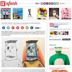

Un père créatif colorise les dessins de ses enfants. Un père créatif colorise les dessins de ses enfants Dans la lignée de l’excellent “Quand une illustratrice collabore avec sa fille de 4 ans“, c’est aujourd’hui au tour d’un papa créatif de dévoiler ses collaborations avec ses enfants sur Reddit.

L’utilisateur Tatsputin s’amuse en effet à coloriser les créations de sa fille de 4 ans et de son fils de 6 ans… Une jolie collaboration créative entre un père et ses enfants ! Images © Tatsputin. Must be printed. Www.dontclick.it. Creative Bloq - Your daily dose of design tips and inspiration.
75 photos du monde comme vous ne l'avez jamais vu ! (le volume 2) Vous avez été des milliers à apprécier et partager notre premier volet, c'est pourquoi je vous propose de repartir pour un tour, avec ces 75 photos du monde incroyable qui est le nôtre.

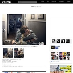
Ces clichés à couper le souffle alimenteront à coup sûr votre imaginaire, vos coeurs,vos envies d’ailleurs. Autant d'instants figés qui prouvent encore une fois que notre Terre est magnifique. Continuez d'explorer, continuez à vivre et à réaliser vos rêves. En attendant, voici de quoi patienter, bon voyages les ami(e)s : Salut Hippo ! (crédit) Blog.SpoonGraphics. Design Inspiration & Tutorials. Art & Design Blog. Take a look at the Trax Magazine “Trax makes you fussy” Ad Campaign by Young & Rubicam.

Advertising Agency: Young & Rubicam, Paris, France Creative Director: les six Art Director: Julien Vallon, Gilles Rivollier Copywriter: Montassar Chlaika Photographer: Marc Paeps Retoucher: BeeFactory Art Buyer: Sylvie Reveillard, Claire Nicaise, Amélie Crinon Browse Timeline Comments ( 2 ) Grafik. Online Portfolios on Behance. Get Expert Website Feedback and Increase Conversions. Eric Karjaluoto discusses design, brands and experience. TechCrunch - The latest technology news and information on startups. SitePoint – Learn HTML, CSS, JavaScript, PHP, Ruby & Responsive Design.
Web Design Blog - Webdesigner Depot. Toute l’actualité des nouveaux médias ! Wallpaper* Magazine: design, interiors, architecture, fashion, art. Creating the “Perfect” Portfolio. Many articles are floating around that tell web professionals exactly how to build an online presence.

Techniques, best practices and all the other “what to do’s” can be great motivation, but that is exactly what this post won’t do. Instead, we’ll go over how to create the “perfect” portfolio, one that suits your individual needs as a web professional and that gets optimal results. By creating a perfect portfolio, you can gain more clients and have a more successful and sustainable career. To start with, we have to differentiate between “perfect” and “the right way” to do something. There is no right way. “Perfect” vs. Let’s stop for a moment and reflect on the title of this post. We hear every day that no one is perfect, that we’re always learning and growing, which is very true. There are only hundreds upon thousands of different ways, each of which is perfect for a particular individual at a particular point in their life. The Profession The Goal Show Off Your Best Show only your best work. Design Watercolor Effect Menu.
This is a two-part tutorial on how to create an artistic and un-typical CSS list menu as seen on Web Designer Wall. In the first part (this article), I will show you how to design a watercolor effect menu in Photoshop. Then in next tutorial, I will show you how to slice the menu and code in CSS. If you need some inspiration on creating an artistic menu, visit our previous post on artistic websites. Ready? Let's begin Part 1. Download Photoshop file Preview. Blog.SpoonGraphics. Smashing Magazine — For Professional Web Designers and Developers.
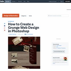
A User Experience Design Publication. Build Internet. A List Apart: For People Who Make Websites. Web Design Ledger - Web Design Blog. How to Create a Grunge Web Design in Photoshop. Photoshop is often the right tool for web design, especially if you're creating a design using numerous images and brush effects.

In this tutorial, I'll show you how to create a complete grunge home page design. We'll design the header, sidebar, body, footer, and style everything to work together in a heavily textured and worn design. Step 1 This time we're going to create a full web design in grunge style using Photoshop and a lot of stock images. As this is a intermediate to advanced level tutorial, I'll skip the explanation of some basic steps. Go to Image > Canvas Size and increase the width and height a lot more, 1200 px by 1000 px is OK, this way we'll be designing for wider screen resolutions.
Let's imagine this design is destined for a Wordpress template, so we'll need a header, a navigation bar inside the header, and a right sidebar. Step 2 Now we're going to create a pattern for the header's background, which is fairly simple. Step 3 Step 4 Step 5 Step 6 Step 7. Tuts+ Code Tutorials. Pompage.net : le web design puisé à la source. Wisdump.