

Architecture de l'information #archinfo. Livre-intro-Crocodoc.docx. Nombre d'or, suite de Fibonacci et autres grilles de mise en page pour le design web. Différence entre popin et popup. Si vous faites du développement web, vous avez probablement entendu parler de popup, de popin et peut-être de popunder également.

Voici une petite explication : Qu'est-ce qu'une popup ? Les aides à la lecture, porteuses de sens et de rythme. Ce billet a été lu 76 fois.

À votre tour? Les aides à la lecture nous permettent de travailler nos informations. Claires, visibles et complémentaires, elles servent le sens et le rythme de la page. Designing for Mobile, Part 2: Interaction Design. My first mobile phone, a Nokia 5110 (purchased in 1998!)
, offered very few features: I could call, text or play Snake. What’s more, these interactions were completely controlled by the manufacturer. With the advent of smartphones, touch screens, and “app stores,” however, the opportunities for designers are now innumerable. It’s incumbent upon us to familiarize ourselves with the conventions of this still-relatively-new medium. Welcome to Designing for Mobile, Part 2: Interaction Design. Part 1 concluded with an exploration of information architecture in the mobile context. The design of interactions Most modern, mobile devices employ touch screens; which provide their own set of opportunities and constraints. Ergonomics Designing for mobile ergonomics requires that we pay attention to device dimensions as well as the pragmatic concerns of touch screens.
Yet there are no hard and fast rules with regards to hit areas. Gestures The table below provides a brief summary: Designing for Mobile, Part 1: Information Architecture. Around 1993, my dad brought home a large, brick-shaped mobile phone.
We were all incredibly excited by the new technology, even though none of us thought it would have a massive impact on our lives. I actually still thought of it as a gimmick, a few years later, when some of my friends decided to purchase them. Today there are six-billion mobile subscribers in the world – meaning if there were one mobile per owner then 87% of the world’s population would have one. And considering that fewer than three billion people use a desktop computer, that’s quite a big difference. Mobile devices are clearly here to stay, and along with them come a whole host of new constraints (and opportunities) for our designs. How is mobile different? The first thing we need to understand about mobile design is that it’s different – and not just with regards to size.
Physicality and specifications How, where and when Because we have constant access to our mobile devices, we tend to use them more frequently. The Difference Between Information Architecture and UX Design. Newsletter Sign Up Original UX articles Curated Resources Never miss an issue!

Information architects form the blueprints of the web Next to explaining what I do for a living, the second question I most frequently hear is: “What’s the difference between Information Architecture and User Experience?” Information Architecture, according to Wikipedia, is “the art and science of organizing and labelling websites … to support usability.“ According to the same source, User Experience is “the way a person feels about using a product, system or service.
Even with regards to its definition, User Experience takes Information Architecture as its foundation and brings it to the next level. Efficiently Simplifying Navigation, Part 1: Information Architecture. Advertisement Navigation, as crucial as it is to the user experience, is merely a means to an end — the end being to consume content.

This is why users have very contrasting expectations about content and navigation. While content is supposed to be unique, surprising and exciting, navigating to it is supposed to be as simple and predictable as possible. This series of articles, divided into two parts, is a four-step guide to efficiently simplifying the navigation experience, by analyzing the type and amount of content as well as choosing and carefully designing the right type of navigation menu. Four Steps To The Ideal Navigation System To build a usable navigation system, a website designer has to answer four questions, in this particular order: How do I best structure the content? The first two questions concern the structuring and labeling of content, which is often referred to as information architecture. 1A site map diagram gives an overview of the navigation structure of a website. Jean-Michel Salaün - Vu su lu aux éditions La D... Complete Beginner’s Guide to Information Architecture.
Timothy Greig structures the information flow of a library website.
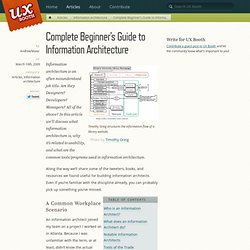
Photo by Timothy Greig Information architecture is an often misunderstood job title. Are they Designers? Developers? Managers? Along the way we’ll share some of the tweeters, books, and resources we found useful for budding information architects. Schémas de classification : thésaurus, taxonomie, ontologie… « Dia-Logos. Au cœur de l’architecture de l’information et du Knowledge Management, les techniques de classification sont particulièrement d’actualité alors que les volumes d’information en ligne augmentent et que ce que nous cherchons est de plus en plus noyé parmi ce que nous ne cherchons pas.
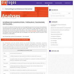
La plupart de ces techniques nous viennent de l’ingénierie documentaire. Avec le Web sémantique, l’ingénierie informatique nous apporte d’autres approches telles que les ontologies et les topic maps, souvent associées à des formalismes et outils définis. Tour d’horizon des schémas de classification… (non exhaustif) La méta-donnée, brique de base de la classification Les méta-données sont des données décrivant les données elles-mêmes (informations, documents, images…). Framing the Practice of Information Architecture. By Nathaniel Davis Published: September 7, 2011 “The practice of information architecture is the effort of organizing and relating information in a way that simplifies how people navigate and use information on the Web.”
—DSIA Research Initiative “The reality of getting things done has resulted in a professional environment where the information architect is less important than the practitioner of information architecture (IA).” Over the past two decades, the volatile evolution of Web applications and services has resulted in organizational uncertainty that has kept our understanding and framing of the information architect in constant flux. While members of the UX community are still debating what we should expect from an information architect—most recently Peter Morville. Architecture de l'information - Architecture de l'information. Architecture de l'information, quelles relations à l'ergonomie? Introduction Architecture de l'information et ergonomie sont des domaines par définition très proches et qui se confondent souvent.
Ils entretiennent en effet des dépendances étroites et leur pratique vise un même objectif global, à savoir prendre en compte l'utilisateur dans la conception d'une interface. Les deux approches se différencient cependant par certains points. L'ergonomie dans la conception d'un formulaire - Ergol. Formulaires. 14 conseils pour créer des onglets ergonomiques et utiles. Les onglets ont longtemps été utilisés pour afficher des vues alternatives du même groupe d’informations dans le logiciel. Menus en onglets. Tri par cartes : l’architecture de l’information construite par les utilisateurs[ Usaddict: Ressources sur l’ergonomie des interfaces (le blog Usabilis)]