

Générateur de palette de couleurs à partir d'une image - Toolki. #825f3c hex color. In a RGB color space, hex #825f3c is composed of 51% red, 37.3% green and 23.5% blue.
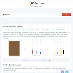
Whereas in a CMYK color space, it is composed of 0% cyan, 26.9% magenta, 53.8% yellow and 49% black. It has a hue angle of 30 degrees, a saturation of 36.8% and a lightness of 37.3%. #825f3c color hex could be obtained by blending #ffbe78 with #050000. Closest websafe color is: #996633. R 51 G 37 B 24 RGB color chart C 0 M 27 Y 54 K 49 CMYK color chart ● #825f3c color description : Dark moderate orange. The hexadecimal color #825f3c has RGB values of R:130, G:95, B:60 and CMYK values of C:0, M:0.27, Y:0.54, K:0.49. Color psychology: The logo color tricks used by top brands & how to DIY – Learn. A good logo is synonymous with the brand it represents.
Think about iconic brands such as McDonald's or Apple. Their logos are like an instantly recognizable shorthand for the business itself. A logo is essentially a symbol used to represent a brand. Dig deeper and you’ll find that many logos have a hidden meaning, often something that relates to the company’s backstory or a clever visual pun. After all, branding is all about storytelling—it’s how humans connect. Color Psychology In Marketing: The Complete Guide [Free Download] In content marketing, color is an emotional cue.
![Color Psychology In Marketing: The Complete Guide [Free Download]](http://cdn.pearltrees.com/s/pic/th/psychology-marketing-complete-152447010)
In an ocean of content marketing, color can help yours stand out. It’s what gets your audience to see what you want them to see, feel what you want them to feel, and to do what you want them to do. Which hues you choose can also affect usability and whether content is readable it or not. This is what makes understanding color psychology so important for the success of your content. However, poor color choice can also negatively change the impact of your message. After reading this post, you’ll understand basic color theory and psychology. Ready to become an expert? Want to use Click to Tweet on your blog? Get Your Color Psychology Marketing Bundle Now Plus, join our email list to stay up-to-date. Success!
Tired of the marketing mess? Awesome news! End the frustration of missed deadlines.Get total visibility into ALL of your marketing in one place.Save 20 hrs this week alone (and every week after). With CoSchedule, you'll: THE SIMPLEST GUIDE TO COLOR PSYCHOLOGY — June Mango® Design. If you know anything about me at all, you know how much I love color.
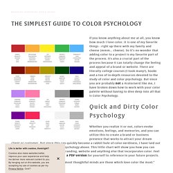
It is one of my favorite things - right up there with my family and cheese (mmm… cheese). So it’s no wonder that adding color to a project is my favorite part of the process. It's also a crucial part of the process because it can totally change the feeling and appeal of a brand or website. There are literally college courses (I took many!)
, books and a ton of in-depth resources devoted to the study of color and color psychology. Whether you realize it or not, colors evoke emotions, feelings, and memories, and you can utilize this to create a brand or business presence that works to attract your dream client or customer. As John Ruskin said, "The purest and most thoughtful minds are those which love color the most.” Color Psychology in Logos and Marketing - Logoworks Blog. The power of color is undeniable.
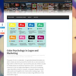
It is generally believed that babies are able to clearly see color by around five months old, so color associations begin within a child’s first year. By around five years old, children are able to verbally express an emotional response to colors. How Colour Influences Our Decision: Colour Psychology in Design - Fifteen. Colour psychology is an interesting subject, and one that influences us as designers every day.
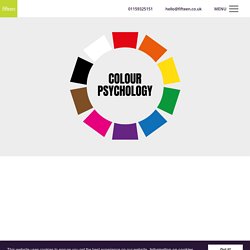
As a designer, there are times where one colour may be more appropriate to choose than another, and a lot of the time this comes down to the emotions evoked by certain colours. What is colour psychology? We can simply describe colour psychology as the affect of different colours on human behaviour. This can apply to all facets of our behaviour, but is most commonly applied to how we interact with brand and marketing. Colour psychology differs from person to person, however there are definitely common themes that appear. How can this be applied to design? In branding especially, we can choose a colour palette that will reflect the emotions we want the customer to feel when they engage with us. Conscious and unconscious decisions As a consumer, when we choose a product, service or brand comes down to making a set of decisions. What colour evoke certain emotions in us? How Colour Influences Our Decision: Colour Psychology in Design - Fifteen.
Comment Associer La Couleur Parme dans sa Déco. Le parme, couleur élégante et calme est la promesse d’une décoration raffinée et tendance.
Subtile, la couleur parme déploie son camaïeu de nuances de peinture sur les murs. De la déco de la chambre au salon en passant par la cuisine, cette couleur s’adapte à tous les styles déco. Violet clair et lumineux, la teinte parme possède la capacité d’agrandir une pièce. Pour renfoncer les atouts déco de la couleur parme, une association avec du blanc, du gris ou de lin à beige pour une déco moderne ou plus audacieux avec du jaune ou vert. Découvrez quelle couleur mettre avec du parme et comment marier cette couleur dans votre décoration maison. Rédigé le 24/03/2015 mise à jour le 14/11/15. #b87333 Schémas de Couleurs Hexadécimal et Peintures.
Colors, Palettes & Hues. My graphic design journey as a student. Peinture bleu : 12 couleurs bleutées pour repeindre son intérieur. Couleur amie des petits espaces, qu'elle permet d'agrandir visuellement, le bleu colore les murs avec style et donne du caractère aux intérieurs.
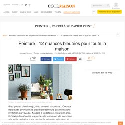
Intemporel et élégant, le bleu inspire les fabricants de peinture, Farrow & Ball, Dulux Valentine ou Tollens, pour créer de nouvelles teintes, toujours plus déco. Plongez dans le grand bleu ! LES PIGMENTS BLEUS - Vente de peinture écologique et pigments naturels à Bordeaux - Color Rare. Bleu majorelle peinture extérieure - Vente de peinture écologique et pigments naturels à Bordeaux - Color Rare. Peinture Bleu Majorelle – de la Couleur.