

Free Wireframe Kit on Behance. The-developers-cheat-sheet-for-iphone-android-app-design-infographic?awesm=readwr. Designing a mobile app can seem simple when you are sketching it out on the whiteboard.
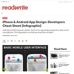
But when you actually sit down in your developer environment and get cracking, turning your ideas into reality is not always so easy. That's only the beginning, of course. What if you need to design your app for both the iPhone and Android? You will very quickly learn that you cannot just cut and paste your design from one platform to the other. Android and iOS frameworks share some basic principles, but when it comes to design, they are as different as ebony and ivory.
For instance, the notification bars in iOS and Android may look similar, but they perform different functions on each platform. Here’s a quick reminder, from StackOverflow: Density-independent Pixels - an abstract unit based on the physical density of the screen. Sometimes you just need an easy chart to remember these kinds of things. Apprenez le UX design en ligne !
Hello.
7 UX design tools for an effective Scrum workflow. As of late we have been running more and more projects using the Agile Scrum method.

In fact, our largest projects are almost all conducted in multidisciplinary Scrum teams. And very successfully! Formerly we primarily worked using the Waterfall project methodology, so we had to adjust our workflow. Gradually we have developed an effective way of working for interaction and visual designers within Scrum projects.
Design workflow tools In order to make the workflow more iterative and effective our two design disciplines at UNITiD – the interaction designer and visual designers, collaborate using our favorite design tools: Sketch, InVision, Keynote, Dropbox, Jira, Confluence and our own Front End Guide. 1. Online tool Jira by Atlassian containing the project backlog with the stories sorted by priority and grouped into the epics. Apprenez le UX design en ligne ! Qu'est-ce que l'expérience utilisateur ? Le terme “Expérience Utilisateur” a été diffusé dans dans les années 90 par Donald Norman (auteur du célèbre “Design of everyday things” et aussi de la méthode de design centrée sur l’utilisateur) et, d’après la norme iso ISO 9241-210, correspond “aux réponses et aux perceptions d’une personne qui résultent de l’usage ou de l’anticipation de l’usage d’un produit, d’un service ou d’un système”.
Why White Space Is Crucial To UX Design. All good visual artists understand the importance of negative space, the empty area that draws attention to, and accentuates, the actual subject.
Negative space (the artistic equivalent of a designer’s white space) is like the supporting cast whose duty is to make the star of the show stand out more by not standing out so much themselves. If you don’t think any part of your design should be intentionally blank, take a look at the World’s Worst Website Ever for an extreme example of the damage caused by too many objects competing for attention. In interaction design, white space isn’t just an aesthetic choice— it serves three essential functions. 1. Improving Comprehension If cluttering your interface overloads your user with too much information, then reducing the clutter will improve comprehension. Medium is a great example of striking a nice balance with all four elements of white space. Beyond improving comprehension, white space also helps create mental maps. 2. 3. Design. Free & Premium Design Resources : Medialoot.
Pasquale D'Silva - Designing with animation. UX paradox. UI/UX projects on Behance. UX Apprentice. Outdated UX patterns and alternatives. Meet North, design and development standards to align and guide your project.
It's a comprehensive guide contributed to the open source community to encourage, "a mobile-first, in-browser, system based approach to design and development. " Check out North on GitHub: The section of the guide that I found most interesting is, Outdated UX Patterns, a collection of examples of what not to do when building a website, which tries to steer designers from borrowing from ineffective practices to solve common problems. Just like how presentations deprecate, so do UX patterns. There are a plethora of outdated UX patterns currently being used that do not suit users or business well and their usage should be ceased.
It may be ambitious to call some of these patterns "outdated" since many of them are still prevalent across the web. Carousels These are everywhere on the web, but largely inefficient when it comes to getting users to engage with content past the first slide. Alternative: Alternatives: Creating a UX design pattern library for Digital Humanities projects.
Recently I posted some thoughts about how emerging trends in the field of user experience (UX) design might be embedded in our project design and development process.

In this post I’m going to discuss this further, concentrating on the UX pattern library the user interface (UI) team are developing. What is a UX pattern library? Designers and developers in the DDH research team work on a number of projects with diverse design and development requirements but in terms of UI design we often find we have similar problems we need to solve. For example, these might include designing tools for surfacing content such as search and browse mechanisms, ways to facilitate collaborative editing of images or documents or managing a user’s workflow.
A pattern library is a way of describing the interaction methods we might use to solve common design problems. UX Tools. UX Myths. Become-ux-designer.jpg (JPEG Image, 650 × 6194 pixels) - Scaled (16%) The Ultimate Guide To iPhone Resolutions. UX Archive.