

Find your palette. #ededed #e8dcca #b08a61 #66503c #6b636a #aba2a4 Find The Palettes You Love seasoned tones. Simple, Practical Color Theory. The mastery of color theory, relations and harmonies is one of the primary steps to uncovering the full beauty and potential of your images (in the realms of art, design and/or photography).
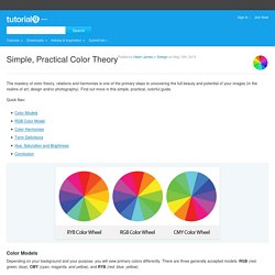
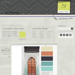
Find out more in this simple, practical, colorful guide. Color Models Depending on your background and your purpose, you will view primary colors differently. Design Seeds®: For All Who Love Color. #f0f0f0 #ebe3e2 #f2decb #bdb3b3 #7485a6 #bac7e8 Find The Palettes You Love a door hues posted 03.14.14 comments 1 street hues posted 03.13.14 comments 0 sponsored links flora palette.
Freebies. Textures In Modern Web Design. Advertisement If you look around at well-designed websites in CSS galleries or any other source of design inspiration, you’ll see that texture is extremely common in modern Web design.
One of the reasons it’s so popular is because of its versatility. Textures can be used in countless different ways and in a wide variety of design styles. As you look around, you’ll see how textures can be used in so many different ways by Web designers. Cool Background Graphics, Free Website Background Patterns For Designers. Color Scheme Designer 3. ColoRotate: Colors come to life in 3D. 17 Web Tools for Working with Colors. This series is supported by Ben & Jerry's Joe, Ben & Jerry's new line-up of Fair Trade and frozen iced coffee drinks.
Learn more about it here. Color is a design tool that sets the tone, theme, and mood of a visual project. The colors you use greatly impacts how your design is perceived by its viewers. Below are some handy web tools to help you choose the perfect colors for your designs. This post follows up on a Mashable post published close to three years ago called "COLORS TOOLBOX: 20+ Tools For Working With Colors," which you should also check out for even more color tools to add to your design arsenal. Developing Color Palettes 1. 2. 3. 4. 5. 6.
Finding and Exploring Colors 7. 0to255 – This intuitive web tool gives you the opportunity to explore variations of certain selected colors. Check My Colours - Analyse the color contrast of your web pages. Color Theory @ ColorJack. Color Hunter. Color Management: Calibration and Profiling – Graphic design tut. Introduction Welcome to the second post in our color management series.
Be sure to check out Part One if you haven’t already done so. Today we’re going to talk about the importance of calibrating and profiling your input & output devices in your color management workflow. This is probably the most important step in the color management process, especially calibrating and profiling your monitor display because you need to trust that the color you see on your monitor is true and correct in order for you to be able to make color and luminosity decisions. Profiling the display When we’re looking at a photo, or anything for that matter, on our monitor display, we’re basically looking at a huge number of pixels, each of which displays a certain color. Furthermore, the monitor display changes the way it interprets color information overtime, so you need to constantly tune your monitor to display color correctly, and this is when calibration and profiling of the monitor display comes into place.
The Science Behind Design Color Theory. Color Theory has been a subject of interest for years in the art community. The rules and guidelines hold true when working on digital projects just as much as physical items. There is a lot to learn in the subject of color so I’m going to cover just some of the key points. Terminology is something many designers get caught up on which really shouldn’t scare you or hold you back.
The science behind color theory is brilliant yet elegant. It should be a topic of interest to every digital artist. Color Terminology Terms are very important when it comes to working as a designer. Hue is one I’m sure most have at least heard of before. Open the Door into the Science of Color Theory. Subtle Patterns.