

Color Theory - Tips and Inspiration By Canva. Remember back to your early school days, when having a 64-count box of Crayola crayons to choose from was the ultimate in creative freedom?
Well, as a designer in the digital era, you certainly don’t have to stick to the colors available from paints, inks, or other pigments, though there’s a lot we can learn from fine art’s approach to color. In fact, the human eye can see millions of different hues — but sometimes, choosing even just two or three to use from those millions can seem like a daunting task. That’s because choosing colors for a design is both highly subjective and, at times, highly scientific. So where does that leave designers who just want a color palette that looks nice or makes a client happy? Like it or not, the most effective color choices go beyond just personal preference — because colors have an extraordinary ability to influence mood, emotions, and perceptions; take on cultural and personal meaning; and attract attention, both consciously and subconsciously. Wild Colours natural dyes. 1) What is Logwood?
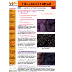
Logwood (Haematoxylon campecianum) is a tree originally found in the forests of Central America.
Flock Artist Diary - Alderac Entertainment Group. Artist Valentina Moscon has kindly provided us with a look into the creation of the illustrations for Flock.
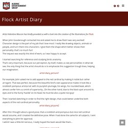
When John Goodenough contacted me and asked me to draw Flock I was very excited! Character design is the part of my job that I love most: I really like drawing objects, animals or people, and turn them into characters. I give them the shape which better shows their personality, that’s so much fun! The request was exactly this kind of work, so I was happy to accept. I started searching for reference and studying birds anatomy.
Our community. Michelangelo Caetani - Wikipedia. Kurt Vonnegut graphed the world’s most popular stories. This post comes via Know More, Wonkblog's social media site.
Kurt Vonnegut claimed that his prettiest contribution to culture wasn’t a popular novel like “Cat’s Cradle” or “Slaughterhouse-Five,” but a largely forgotten master’s thesis he wrote while studying anthropology at the University of Chicago. The thesis argued that a main character has ups and downs that can be graphed to reveal the taxonomy of a story, as well as something about the culture it comes from. “The fundamental idea is that stories have shapes which can be drawn on graph paper, and that the shape of a given society’s stories is at least as interesting as the shape of its pots or spearheads,” Vonnegut said.
In addition to churning out novels, Vonnegut was deeply interested in the practice of writing. The tips he wrote for other writers – including “How to write with style” and “Eight rules for writing fiction” -- are concise, funny, and still very useful. The Six Main Stories, As Identified by a Computer. The Shapes of Stories, a Kurt Vonnegut Infographic — Maya Eilam Art & Design. Graphic Design: The New Basics. Colour Wheel 2 CMYK RGB by SWPryor on DeviantArt. Colour Wheel 2 CMYK RGB by SWPryor on DeviantArt. Reinventing the Wheel: Why Red is not a primary color. Please share if you like it!
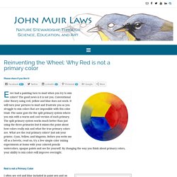
Ever had a painting turn to mud when you try to mix colors? The good news is it is not you. Conventional color theory using red, yellow and blue does not work. It will turn your pictures to mud and frustrate you as you struggle to mix colors that are impossible with this color triad. The same goes for the split primary system where you mix with a warm and cool version of each primary. Red is not a Primary Color. Color Wheels are wrong? How color vision actually works – @ASmartBear - WP Engine.
Color theory is a little obsession of mine. You’re here for startup advice, but this week I’m taking an indulgence. Leave a comment if you want to see more or fewer of these little distractions. Why are artists special? Ask any artist to explain how color works, and they’ll launch into a treatise about how the Three Primary Colors: red, blue, and yellow form a color “wheel:” Color Theory for Designers: A Handbook. Color Theory for Designers: A Handbook. 9 great color resources. Colour is an integral element of design.
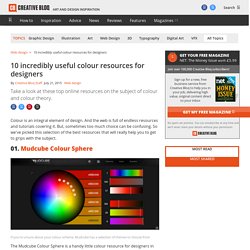
And the web is full of endless resources and tutorials covering it. But, sometimes too much choice can be confusing. So we've picked this selection of the best resources that will really help you to get to grips with the subject. 01. Mudcube Colour Sphere The Mudcube Colour Sphere is a handy little colour resource for designers in that it not only provides the hex numbers for each colour; it also helps you to build up a colour scheme from one chosen shade. 02. Paletton - The Color Scheme Designer. Printable color wheel 3. Artist color wheel chart template 05. ColorWheelEbook ittens color wheel Naomi Ecperigin. The colour book. CSISS Classics - John Snow: The London Cholera Epidemic of 1854. It wasn't until 1854, when Cholera struck England once again, that Snow was able to legitimate his argument that Cholera was spread through contaminated food or water.
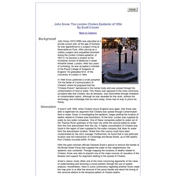
Snow, in investigating the epidemic, began plotting the location of deaths related to Cholera (see illustration). At the time, London was supplied its water by two water companies. One of these companies pulled its water out of the Thames River upstream of the main city while the second pulled its water from the river downstream from the city. 10 Rules of Composition All Designers Live By. You could have the most beautiful graphic elements in the world, but if your composition isn’t up to scratch, all of that goes out the window.
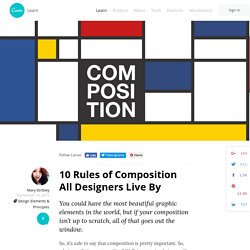
So, it’s safe to say that composition is pretty important. So, what exactly is a composition? Well, in very simple terms, it’s the part where all the separate elements come together to form a whole. When all of your type, your images, your graphics and colors, come together to form one cohesive design. The Role of Sketching in the Design Process.