

DesignStudio creates ‘symbol of belonging’ for Airbnb rebrand. Thu, 17 Jul 2014 | By Angus Montgomery DesignStudio has created a new identity for Airbnb, which centres on a new ‘symbol of belonging’.
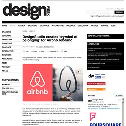
The Airbnb Bélo mark and Community Symbol San Francisco-based Airbnb describes itself as a ‘community marketplace’ that allows people to list and book accommodation around the world. It was set up in 2008 by designers Brian Chesky and Joe Gebbia alongside co-founder Nathan Blecharczyk. Andrew Schapiro, graphic design lead at Airbnb, says the company was looking to rebrand as the existing identity – which had been in place since 2008 – ‘didn’t capture what Airbnb is’.
Airbnb's New Logo Looks Awfully Familiar. Unveiled today in San Francisco, the new Airbnb logo--or Belo, as the home rental service is calling it--looks like a heart bent out of a paper clip.
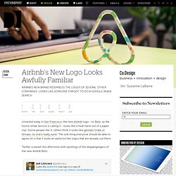
Some people like it; others think it looks like genitals (male or female, no one's really sure). The one thing everyone should be able to agree on is that it looks an awful lot like logos that are already out there. The best (and filthiest) tweets about Airbnb's new logo. It’s barely been a few hours since Airbnb took the wraps off its new logo redesign, and it’s already the butt of all jokes.
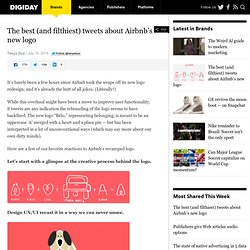
(Literally!) While this overhaul might have been a move to improve user functionality, if tweets are any indication the rebranding of the logo seems to have backfired. The new logo “Bélo,” representing belonging, is meant to be an uppercase ‘A’ merged with a heart and a place pin — but has been interpreted in a lot of unconventional ways (which may say more about our own dirty minds). Here are a few of our favorite reactions to Airbnb’s revamped logo. Let’s start with a glimpse at the creative process behind the logo. Design UX/UI recast it in a way we can never unsee. Though designer Tad Carpenter put more of a scrotal spin on it. Others pointed out that the new logo looks awfully familiar. Funny Tumblr Blog Pokes Fun At Airbnb’s New Logo. When Airbnb announced its new branding identity and logo last week, many people were quick to point out that the company’s new logo looked nothing like its intended design.

Instead, some said it resembled a vagina, while others pointed out that it “looks like balls”. Collecting these humorous descriptions is a new Tumblr blog called ‘Airbnb Logos’. Created just four days ago, you can expect to find some of the funniest and crudest interpretations of the company’s new logo inside. Check some of them out below, or view the entire collection here. [via Airbnb Logos] Receive interesting stories like this one in your inbox. Airbnb Process. No two briefs are ever the same.
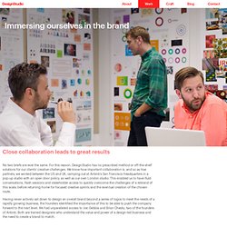
For this reason, DesignStudio has no prescribed method or off-the-shelf solutions for our clients’ creative challenges. We know how important collaboration is, and so as true partners, we worked between the US and UK, camping out at Airbnb’s San Francisco headquarters in a pop-up studio with an open door policy, as well as our own London studio. This enabled us to have fluid conversations, flash sessions and stakeholder access to quickly overcome the challenges of a rebrand of this scale, before returning home for focused creative sprints and the eventual creation of the chosen route. Having never actively sat down to design an overall brand beyond a series of logos to meet the needs of a rapidly growing business, the founders identified the importance of this to be able to push the company forward to the next level. Airbnb Digital. DesignStudio and the Airbnb team set out to create a digital platform to enable community members to truly participate into the visual brand.
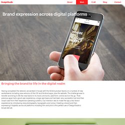
Understanding the importance of the community engagement with the brand, we designed an interactive online tool where any Airbnb user can create their own symbol of belonging, and share their stories about Airbnb. The site, create.airbnb.com, prompts users to answer emotive questions and provide their location before generating a unique version of the symbol specifically for them. Outcomes can be tweaked and adjusted utilising a pallet of over 1000 illustrations and forms, resulting in millions of potential community symbols. DesignStudio. Despite being incredibly engaged with the community globally and having a massively successful product, the brand was rooted in the technology and not the people.
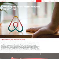
To build a brand and not just a new marque, we began by creating a bespoke colour: ’Rausch’. Named in honour of the street where it all started, it is a colour which delivers the emotion and passion around the brand, without the aggression of pure red. Rausch is supported by a secondary palette, with colours and names drawn from continents and world cities, to create a memorable range to be used by Airbnb’s vast internal design team. For typography, a custom version of Circular by type foundry Lineto was developed to create a wider set covering all uses across print and digital products. And for photography and illustration, we worked with the internal teams to establish principles to guide the commissioning and creation of assets for the brand. DesignStudio. Airbnb Process. Home - Create Airbnb. Airbnb Founder on Vagina Logo: “Go Ahead, Laugh All You Want” Airbnb launched a new corporate logo yesterday, and everyone — including their dinner guests last night — had an opinion.
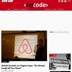
At the Verdi Club in San Francisco’s Potrero Hill neighborhood, many of the guests, chosen for their prominence within the Airbnb hosting community, seemed to think the squat, circular pink shape looked like a female body party, though there was little agreement which one. Dinner was catered by Nopalito, Bi Rite, Delfina, Rice Paper Scissors and Mission Pie. Airbnb co-founder and CTO Nathan Blecharczyk stood up, welcomed everyone and told the story of a young boy becoming ill and his father turning to Airbnb to pay his medical bills. Over his head was a neon sign that glowed: “belonging.” He sat down for pulled pork, guacamole and refried beans.
“It’s just like: Go ahead, laugh all you want, guys,” he said. “If you looked at the Nike swoosh, you might say it’s a check mark, but once you understand the context, it means something else,” he said. “No, no. “Buns?” 0715 airbnb inline01 630. Bnb flyposts 02. Proxy. Screen Shot 2014 07 17 at 00 20 26. Screen Shot 2014 07 17 at 00 20 48. Create.