

Lonely Planet Travel Guides and Travel Information. This is the primary and secondary colour palettes as described in the PSD styleguide and in colour_palette.sass Gray Palette Click to copy Copied!
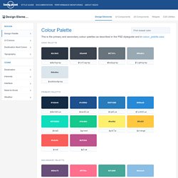
#2c3643 $darkgray #3b444f $titlegray #67747c $bodygray #99a9b3 $lightgray #dbe6ec $subduedgray Primary Palette #142b44 $darkblue #1d508d $navblue $lpblue #288ad6 $linkblue $teal #16c98d $green. Front-end and UI style guides. This round-up focuses on how others are building CSS/UI style guides and some best practices.
Specifically not grouping in pattern libraries in here (besides MailChimp, which is surface-level patterns) to demonstrate the many uses of these documents. Anna Debenham has an excellent round-up of what makes up a front-end style guide in her post on 24 ways and her book — here are some more examples to explore. Clearleft Baselines.
Creating Style Guides. Several years ago, I was working on a large, complex application.
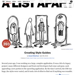
It was a bit of a legacy project: many different designers and front-end developers had come and gone, each appending a new portion to the sprawling application. By the time I arrived, the CSS was huge, the styles were varied, and it took a lot of effort to find out if anything was reusable. Article Continues Below. Front-end-styleguide. Front-end Style Guides. We all know that feeling: some time after we launch a site, new designers and developers come in and make adjustments.
They add styles that don’t fit with the content, use typefaces that make us cringe, or chuck in bloated code. But if we didn’t leave behind any documentation, we can’t really blame them for messing up our hard work. To counter this problem, graphic designers are often commissioned to produce style guides as part of a rebranding project. A style guide provides details such as how much white space should surround a logo, which typefaces and colours a brand uses, along with when and where it is appropriate to use them. Design guidelines Some design guidelines focus on visual branding and identity. Some guidelines go further, encompassing a whole experience, from the visual branding to the messaging, and the icon sets used.
The BBC’s Global Experience Language. Code standards documents We can make a similar argument for code. Front-End Style-Guides: Definition, Requirements, Component Checklist. Front-end Style Guides. Creating and Maintaining Style Guides for Websites Style guides, once the exclusive domain of print designers, are now finding their way onto the web.
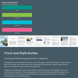
In this book, you'll learn about the style guides that have been created specifically for websites, and how to make and maintain your own. Designers and developers have taken different approaches to putting together their own web-based style guides. This book highlights the various techniques and the projects that have used them. It's packed with practical tips, whether you're starting from scratch or assembling one for an existing site. DHTML Style Guide Working Group – AOL Access. The DHTML Style Guide Working Group (DSGWG) has come together to create a recommendation for keyboard shortcuts to be used in website widgets.
We realize that many keystrokes are already in use by various operating systems, user interfaces, and assistive technology. Therefore our task is to recommend the best, most intuitive, most international friendly shortcut keys possible without regard to their current use. It is hoped that developers, AT vendors, and Browser manufactures will use these as guidelines, but understand it may not be practical or possible given their individual constraints. For more information about Key-navigable custom JavaScript widgets see the Codetalks Wiki [codetalks.org no longer exists. This Mozilla article seems similar.
Accordion See Tab Panel. Alert Example: A message with important information (ARIA Alert). Example: Website Style Guide Resources. Introduction - Material design - Material design guidelines. 50 Meticulous Style Guides Every Startup Should See Before Launching. All good brands have a great style guide.
Creating a simple booklet that catalogues the specific colors, type, logos, imagery, patterns, taglines, etc. of a brand makes sure the brand machine runs smoothly. To prove why you shouldn’t let your style guide go by the wayside, we’re going to take a look at 50 stunning and detailed examples of style guides that are sure to encourage you to begin compiling your own. And when you’re ready to put that style guide to work, trial it the fun way, by designing a branded social media graphic in Canva (click here). 01. Foursquare Check out this brand manual for Foursquare that gives detailed rundowns for the rules and guides to each of the design elements a brand needs to be consistent.
Bosphorus. Contributed by New Zealand-born graphic designer Mike Collinge.
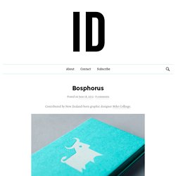
Bosphorus is a business consultancy specialising in customer experience, human resources, IT and small business management with the aim of helping companies become more sustainable, efficient and ultimately profitable. Bosphorus is named after the stretch of water running through the middle of Istanbul dividing Europe from Asia. Roughly translated, it describes an ox fording a river.
A bous (bos) is Greek for ox, and poros (phorus) means to ford or to ferry. Front-end Style Guides by Anna Debenham · Fronteers. [APPLAUSE] So the last talk I gave, though, was the first time I'd spoken on the stage with dry ice.
They had a dry ice machine. And this is the first time I've spoken with a bong on the stage, so two firsts. So this talk is about documentation, but please don't all leave. Documentation may not be as exciting as what you've just seen, but it is vital to a project's success.