

Nike - World Basketball Festival — Might & Wonder. Nike - World Basketball Festival from CypherAudio on Vimeo.
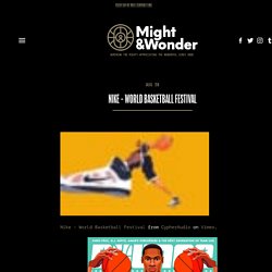
I'm completely taken by the illustrative style that Saiman Chow has created with Nike for the World Basketball Festival. It's a unique style that looks great in its different applications as a large scale banner, sculpture or animation. The sound design by Cypher Audio and the organic nature of the animation by Buck really bring Chow's creation to life. I love the Times Square screen animations that Buck created. I think Sydney should get some big screens like this, not too many just some to showcase some visuals so I can stare into the flashing lights. Via Ventilate. Tech and Design Tips.
Model-Like School Libraries : lishin elementary school. Architecture. Old No.7. Alexanders Print Advantage - Web To Print Experts. Many people may think of print ads as merely ink on paper--something flat and static.
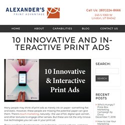
However, these people are missing the potential paper can give them. There's touch marketing, naturally--the use of foil, digital spot varnish, and other textures to engage other senses. But these are not the only innovative technologies you can use in your print ad. These excellent advertisements use technology, special add-ons, and more, making them more than just a piece of paper. Combining with your cell phone or even giving you the ability to customize what you see, they are as interactive as they are eye-catching. Wired and Motorola combined their innovation in this ad celebrating the Moto X's customization. 2) Kontor Records Seeking the attention of the best creative advertising professionals, Kontor Records sent a vinyl record and a paper turntable in their advertisement. Onextrapixel - Web Design and Development Online Magazine. Best Animation Software. Speckyboy Web Design Magazine - Web Design News, Resources & Inspiration.
20 Best Color Palette Generators and Galleries for Designers. Everyone loves colors. Colors are among the most important elements of every design and artwork. As designers, we work with colors every day. However, it’s not an easy task to find the best fitting color palette for a website, application, or other product. Color theory is such a serious thing that even Goethe wrote a book on the subject. If you want to find the perfect color scheme there are a lot of rules and guidelines to follow. Behance. The Secret Psychology Of Restaurant Menus. "Anime Girl XXI" Posters by redhoney. Organic food poster / flyer template. Pin by Chrystelle Geenen on soirée. Food photography, Design and Interiors on Pinterest. Flyer template, Flyers and Autumn on Pinterest.
Design, Murals and Kitchen walls on Pinterest. Branding, Cookie packaging and Marketing on Pinterest. Pinterest. Lan airlines on Pinterest. The 25 Winners of the Print Celebrates Design Competition. Justin Ahrens challenges common ideas of what design success is and discusses how it is achieved by other means.
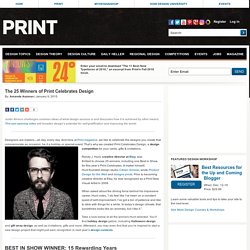
This eye-opening video will broaden design’s potential for self-gratification and improving the world. Designers are makers—all day, every day. And here at Print magazine, we like to celebrate the designs you create that commemorate an occasion, be it a holiday or special event. That’s why we created Print Celebrates Design, a design competition for your cards, gifts & invitations. Randy J. When asked about the driving force behind his impressive career, Hunt notes, “I do feel like I’ve been on a constant quest of self-improvement.
Take a look below at all the winners Hunt selected. Comments from judge Randy J. Firm: RISD Media Group Creative Team: Micah Barrett (art director), Kristin Silva (designer) Description: In recognition of student excellence and to celebrate scholarship recipients, RISD hosts an annual luncheon. Firm: Rural Rooster Creative Team: J.J. Designer Challenges Himself To Create A Movie Poster Every Day For A Year, And They're Pretty Cool. Portafolio Cristian Salinas. Advertising Archive. Commercials database. Search Creative Bloq. نتيجة بحث Google عن الصور حول Creative Bloq - Your daily dose of design tips and inspiration. 23 glorious geometric patterns in design. Lately, we've noticed a lot of designers using geometric patterns, shapes and styles in their logo designs, vector art and more.
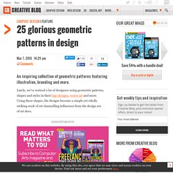
Using these shapes, the designs become a simple yet wholly striking work of art channelling influences from the design era of art deco. Subscription offer We've rounded up our favourite examples of geometric patterns and designs featuring geometric shapes. See what you think... 01. Bringing a city together through branding is no easy task, especially when the city in question is a diverse as Melbourne, Australia. Thanks to a clever geometric design, the chunky 'M' logo is flexible enough to reflect the different aspects and personalities of the city. 02.
Australian designer, printer and podcaster Olivia King created this beautiful collection of concept packaging, which is suitably called Trigonometry. My Art Book (Quick sketch of a bat for a big collaboration...) 30 Creative Pizza Advertisements. Design, Advertising & Creative Inspiration - Digital Synopsis. Pinterest. AdAge Top 15 Campaigns of the 21st Century.
Many ad campaigns over the years have sold soap.

Fewer have tried to change societal notions about beauty. Even fewer have tried to do both. Dove’s “Campaign for Real Beauty” is the campaign that did it. The campaign that had its origins in London and Canada with a billboard asking motorists to vote on whether the women pictured were “fat or fit?” Or “wrinkled or wonderful?” Dove’s “Campaign for Real Beauty” is the only campaign cited by every one of the Advertising Age judges as belonging on this list, and one that was described by the panel as groundbreaking, brave, bold, insightful, transparent and authentic. Last century, Listerine made it on to the list of Advertising Age’s “Top 100 Ad Campaigns of the 20th Century” with its “Always a Bridesmaid, Never a Bride” campaign, an approach tailored and imitated often throughout the century to feed on women’s insecurities and remind them they needed to improve their attractiveness.
Did Dove play a role in those numbers? Ms. Pinterest: Discover and save creative ideas. Coroflot — Design Jobs & Portfolios. Design Inspiration. Dribbble - Show and tell for designers. Designspiration — Design Inspiration. Blue and white, accented with goldenrod; go vertical to maximize use of all availalbe space in a small bathroom. Graphic design pictures on VisualizeUs. Online Portfolios on Behance.