

Online Graduate Certificate in CyberGIS and Geospatial Data Science. For ArcMap users—ArcGIS Pro. Bending Lines. Because they seem to show the world how it “really is,” maps produce a powerful sense of trust and belief.
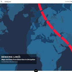
But maps and data visualizations can never communicate a truth without any perspective at all. CesiumJS - Geospatial 3D Mapping and Virtual Globe Platform. UMD NewsStand. World City Populations Interactive Map 1950-2030. The Global Urban Transformation This map visualises the radical transformation that has occurred across the globe in the last 60 years, from a 30% urban world in 1950, to a 54% urban world in 2015 and a predicted 68% urban world in 2050.
In 1950 there were 740m people living in cities; there are now 4 billion, rising to a predicted 6.6b by 2050. The circles on the map are proportional to city populations in 1950, 1990, 2015 and 2035. Move your mouse over cities to explore their detailed dynamics. A Powerful New Mapmaking Tool Fit for Both Pros and Newbies. Geodata is blowing up like crazy.
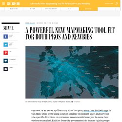
As of last year, more than 680,000 apps in the Apple store were using location services to pinpoint users and serve up site-specific directions or restaurant recommendations (just to name two obvious examples). Entities from city governments to human rights groups are uploading torrents of location data on everything from fruit trees to drone strikes. Wrangling all that geodata and turning into something useful is a huge challenge. New web-based software from Mapbox aims to help. The DC and San Francisco-based company has been working for more than a year to overhaul its Mapbox Studio software. Click to Open Overlay Gallery. Problem loading page. Peeled sky paintings (2000-2006) Problem loading page. Using CartoDB to visualize how far birds migrate in a single night - LifeWatch INBO.
Last week we participated in a very productive workshop in Amsterdam organized by working group 3 of ENRAM.
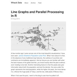
ENRAM is the European Network for the Radar Surveillance of Animal Movement funded by COST and the workshop was a follow-up on the hackathon at which we created the flow visualization last year. One of our goals this year was to visualize forward trajectory model data for bird migration. We were inspired by the fabulous Alcatraz escape simulation made by Dutch researchers in CartoDB to try this ourselves. Long-range surveillance radar. Stadtbilder. Mapping the digital shape of cities. Moritz Stefaner, 2013. Line Graphs and Parallel Processing in R · Whack Data. 04 Aug 2014 A few months ago I came across one of the most beautiful visualizations I have ever seen: James Cheshire's Population Lines Print.
Population Lines Print. I recently produced a map entitled “Population Lines”, which shows population density by latitude.
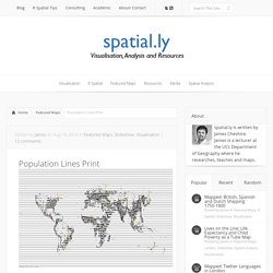
The aim was to achieve a simple and fresh perspective on these well-known data. I have labelled a few key cities for orientation purposes but I’ve left off most of the conventional cartographical adornments. I am really pleased with the end result not least because it resembles Joy Division’s iconic Unknown Pleasures album cover, which in itself is a great example of data visualisation as art. You Can Hang These Legendary American Data Visualizations On Your Walls Visualization Turns America's Rivers Into A Gorgeous Rainbow. Andrew Hill is a PhD-holding biologist and digital cartographer who works for "cloud-based mapping platform" CartoDB.
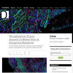
Recently, he has turned his attention to rivers. One of his interactive maps showed which rivers in the U.S. have received rain in the last hour. And now, he has made a beautiful map color-coding every American river according to which of the cardinal directions they flow toward. The map is gorgeous: tiny capillaries of color make up a rainbow of watersheds. Using NYPL MapWarper maps inside CartoDB — CartoDB Blog. Geospatial data lovers know that proximity has its perks- especially in a major city like New York.
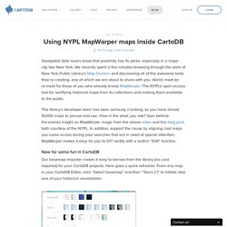
We recently spent a few minutes browsing through the work of New York Public Library’s Map Division and discovering all of the awesome tools they’re creating- one of which we are about to share with you. World, meet (or re-meet for those of you who already know) MapWarper: The NYPL’s open-access tool for rectifying historical maps from its collections and making them available to the public. Storms on the Atlantic and Pacific Coasts. Heavy rain and snow possible over the northeastern states and heavy rain possible over parts of the northern California and Pacific Northwest coasts.
Low pressure over the Ohio Valley will be absorbed by the deepening storm along the Mid-Atlantic and Northeast Coast. The low over the Ohio Valley will produce snow over parts of the Great Lakes and rain over parts of the Ohio Valley on Tuesday morning. As the low along the East Coast deepens, the system will become quasi-stationary near Long Island, New York Tuesday evening through Wednesday evening. The Geospatial Web. Know Center. KTI. FIT-IT Semantic Systems Project. Environmental Online Communication - ECOresearch Network. Mapping the city, statistic by statistic. Jump to navigation Menu 🔊 Listen Tech.

Borderline Reality. For years, economic and social observers have taken to redrawing our borders to better define our situation and to attempt to predict the future. Maybe you thought the global financial meltdown has raised anxiety levels in the United States quite enough. But a Russian professor’s decade old prediction of national disintegration suggests much worse on the way. Prof.