

CSS Grid — The Swiss Army Knife For Website and Application Layouts. The behavior changes but 1fr remains the same regardless whenever different values are used.

Fractional units work similar to % values but they are easier and more intuitive to divide space with: In this example only column-wise behavior is shown for simplicity’s sake. But it works the same for rows too. Simply use grid-template-rows property. Space defined using fractional units changes based on gaps. As you can see, this gives you a pretty good set of properties to space content basically in any way you wish without worrying about pixel values. These new dynamics render pixel-perfect design as a thing of the past. Finally, to give you a better idea of using non-whole fractional units here is a fun grid I created. The future of layout with CSS: Grid Layouts. In this article we’ll take a look at the wonderful world of the CSS Grid Layout, a relatively new W3C specification that has partially started to see the day in some browsers.

But before we dive into what this new CSS technique is all about and how to use it, let’s quickly review grid theory. My really short introduction to grid theory I am not a designer nor did I know much about grid theory before stumbling upon the CSS Grid Layout specification, so don’t take my word for it and go look it up yourself, but if you don’t care to, here’s my pitch: In essence, a grid is a set of invisible vertical and horizontal lines that are used to position the various design and content pieces of a web page, magazine, or newspaper. The goal of a grid is to serve as a base for placing the various pieces of content and to make sure these pieces are aligned and spaced out evenly.
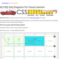
CSS Grid Tutorial – JavaScript Teacher. CSS Grid For Visual Learners – Over 40 Diagrams. Subjects Covered: Align-Self, Justify-Self, Tracks, Gaps, Templates, Min-Max, Implicit and Explicit Cells, Auto Flow, FR Units (fractional units.)
Related article: to also get a good idea of how flex works try flex layout editor on this page. Category "Css Grid" CSS3 Grid Layout. Le module de positionnement "Grid Layout" est une spécification du W3C à l'état de Candidate Recommandation dont les premiers jets datent de 2004.
Sa documentation officielle est actuellement maintenue par trois contributeurs, dont une personne de Microsoft et une personne de Google. Note : ce tutoriel a été initialement rédigé en février 2012. Il a subi une grosse refonte en octobre 2015 pour se mettre à jour. Les anciennes versions de Mozilla Firefox, Chrome et Opera nécessitent d'activer un "flag" dans la configuration du navigateur; les autres navigateurs sont également intéressés et ne devraient pas tarder à implémenter ce module, au regard des vastes possibilités offertes par ce schéma de positionnement. IBM/css-gridish: Automatically build your grid design’s CSS Grid code, CSS Flexbox fallback code, Sketch artboards, and Chrome extension.
CSS Grid Layout Module Level 1. Conformance requirements are expressed with a combination of descriptive assertions and RFC 2119 terminology.
The key words “MUST”, “MUST NOT”, “REQUIRED”, “SHALL”, “SHALL NOT”, “SHOULD”, “SHOULD NOT”, “RECOMMENDED”, “MAY”, and “OPTIONAL” in the normative parts of this document are to be interpreted as described in RFC 2119. However, for readability, these words do not appear in all uppercase letters in this specification. All of the text of this specification is normative except sections explicitly marked as non-normative, examples, and notes. Firefox DevTools PlayGround. Debugging CSS Grid Layouts With Firefox Grid Inspector. Tutoriels et Articles sur CSS Grid Layout. Grid is all about the container. Learn CSS Grid. People are starting to ask: where can I learn about CSS Grid?
There are a lot of fantastic resources out there. When it comes to the technical how-to, most of what’s out there was written by Rachel Andrew. If you don’t know her work, take some time to get to know her and follow her. So here are the links to resources I recommend. I will keep updating this list: There will be much more coming from Rachel, Jing and me this year. I am starting to see a bunch of simple introductions, link-baity false-narratives, and weirdly-wrong ideas to creep into the conversation about CSS Grid. Browser Compatibility for CSS Grid Layouts with Simple Sass Mixins. By Farley Reynolds On grid, Sass According to an article from A List Apart about CSS Grid, a "new era in digital design is dawning right now.
" With Flexbox and Grid, we have the ability to create layouts that used to be extremely difficult to implement, if not impossible. There's an entirely new system available for creating layouts, especially with Grid. However, as with most web technologies, browser support is always something of an issue. Let's look at how we can make the fundamental aspects of Grid work across the browsers that support it, including older versions of Internet Explorer that supported an older and slightly different version of Grid. Browser Support for CSS Grid Layout. Grid by Example A collection of usage examples for the CSS Grid Layout specification.

Current Browser/Rendering Engine Information You can view data across different browsers at Can I Use. Grid “fallbacks” and overrides - rachelandrew.co.uk. Using Feature Queries in CSS – Mozilla Hacks – the Web developer blog. There’s a tool in CSS that you might not have heard of yet.
It’s powerful. It’s been there for a while. And it’ll likely become one of your favorite new things about CSS. Behold, the @supports rule. Also known as Feature Queries. With @supports, you can write a small test in your CSS to see whether or not a particular “feature” (CSS property or value) is supported, and apply a block of code (or not) based on the answer.
Rachelandrew/gridbugs: A curated list of Grid interop issues. A Complete Guide to Grid. CSS Grid Layout is the most powerful layout system available in CSS. It is a 2-dimensional system, meaning it can handle both columns and rows, unlike flexbox which is largely a 1-dimensional system. Rachelandrew/cssgrid-ama: Ask me anything about CSS Grid Layout. Media objects with fit-content. Want to learn CSS Grid? Here’s my free full-length course. Merry Christmas! The last few weeks I’ve been digging my head into CSS Grid and created a full course on the subject.

And the more I learn, the more I’m convinced that this is the future of creating website layouts. The course is free, but you’ll have to authenticate with email or GitHub so that you can you can save notes and ask questions throughout the course. And speaking of questions:Throughout December I’ll be answering every single question that students ask inside the course. Now let’s have a look at what you’ll learn and how you’ll learn it. The course structure The course is built around three sections. The third one is a bonus section, in which you’ll learn concepts that didn’t make it into the first two sections plus see a couple of examples of things you can build with CSS Grid. Section 1 — The basics. Debugging CSS Grid Layouts With Firefox Grid Inspector. You may have heard quite a bit of talk about a CSS feature called Grid this year.
If you are someone who cringes when you hear the words CSS and grid in the same sentence, then I highly suggest you check out this new CSS module called CSS Grid. Browsers render HTML elements as boxes according to the CSS box model and CSS grid is a new layout model that provides authors the ability to control the size and position of these boxes and their contents. The module introduces a series of properties that allow us to create grid structures and control the placement and sizing of grid items using CSS.
Flexbox and Grids, your layout’s best friends. It took more than six years to have CSS Grids implemented across all browsers. Throughout its history, the spec has always been surrounded by controversy. In 2011, it was met with skepticism as the Microsoft Developer Team announced prefixed support for IE10. The lack of information about the W3C proposal made some developers wonder whether there was an actual need for another layout system, since we already had floats, tables, and some Flexbox working in browsers back then. However, thanks to the effort of developers and CSS Working Group members such as Rachel Andrew and Jen Simmons, the Grids hype started to grow and, with that, the behind-flag and nightly implementations.
As of March 2017, Grids has been implemented in every major browser, but there are still a few myths and rumors surrounding the specification. The notion that “Grids has arrived to kill Flexbox” or that now that Grids is ready for production we should use “Flexbox as Grid’s fallback” could prove harmful. Resources. Using CSS Grid: Supporting Browsers Without Grid. Advertisement Many of us have started to approach design in a more modular way recently. We experiment with pattern libraries and style guides. And yet, only some succeed, most of us fail. That’s why we’ve teamed up with Alla Kholmatova to find out what makes a design system effective and what works and what doesn’t work in real-life products. Get the book now → When using any new CSS, the question of browser support has to be addressed. In this article, I explore approaches to dealing with browser support today. CSS3 Grid Layout. Sans titre. CSS3 Layout Modules.
This book is now somewhat out of date due to the rapid change in CSS since publication. In particular the section on CSS Grid Layout does not cover a large number of changes to the specification. Learn about the new ways to do layout in CSS Since writing the first edition of this book there have been huge changes to some of the emerging specifications detailed. In the revised and expanded 2nd edition, learn about those changes and see more practical examples of these modules in use. Buy the book, or the book and video package. What's in the book?
The second edition of CSS3 Layout Modules provides a concise and practical guide to the new modules in CSS for layout. GitHub - afonsopacifer/learning-css-grid-layout: List of resources to learn CSS Grid Layout Module or only CSS Grid. CSS Grid Gotchas And Stumbling Blocks. Advertisement Many companies try to create a great experience for customers.
But few are willing to make the changes required to deliver on that promise. In fact most don’t even realize just how bad their experience can be. This is why we made a new book called “User Experience Revolution,” a practical battle plan for placing the user at the heart of your company. Get the book now! In March this year, CSS Grid shipped into production versions of Chrome, Firefox and Safari within weeks of each other. CSS Grid PlayGround. CSS Grid Layout Crash Course. Designer’s Guide to Flexbox and Grid – Jon Yablonski – Medium. CSS has come a long way since it’s introduction in 1996, but the tools we have available for layout haven’t changed much. Table layouts were incredibly too rigid, float-based layouts were basically a hack, positioning-based layouts were not adaptable, and none could handle a great deal of complexity in an efficient way.
Don’t get me wrong — these methods got us really far, but none were really intended for layout purposes. The short-comings of these old methods for layout have become even more apparent with responsive web design, in which embracing the fluidity of the Web is fundamental. With flexbox and grid, we finally have tools intended specifically for layout that are more efficient and void of hacks necessary with previous layout methods. They unlock new possibilities to old problems, enable things that weren’t possible before, and solve real problems we face with responsive web design.
Flexbox Improved Wrapping Improved Spacing & Alignment Source Order. Grilles CSS (CSS Grid) Le module CSS Grid layout (modèle de disposition en grille) est un module de la spécification CSS qui permet de créer des mises en page en divisant l'espace d'affichage en régions utilisables par une application ou en définissant des relations de taille, position et d'empilement entre les éléments HTML. Comme les tableaux, la grille permet d'aligner des éléments sous forme de colonnes et de lignes mais à la différence des tableaux, la grille n'a pas de structure de contenu.
Ainsi, on peut créer de nombreuses mises en page qui n'auraient pas été possibles avec les tableaux. Ainsi, les éléments fils d'un conteneur en grille peuvent être positionnés afin qu'ils se chevauchent ou qu'ils se comportent comme des éléments positionnés. A Complete Guide to CSS Grid. CSS Grid and Grid Inspector in Firefox. Grid by Example. Is it really safe to start using CSS Grid Layout? Designing with CSS Grid Layout - SitePoint Premium. Published July 2017 Layout in CSS has always been a tricky task: hacking solutions using positioning, floats, and the one-dimensional flexbox has never been very satisfactory.
Glue Cross-Browser Responsive Irregular Images with Sticky Tape. By Ana Tudor On SVG. Using Feature Queries in CSS. CSS Grid Layout and Progressive Enhancement. In Spring of 2017, we are seeing for the first time a major specification like Grid being being shipped into browsers almost simultaneously, and we should shortly have CSS Grid Layout support in the public versions of Firefox, Chrome, Opera and Safari. However, while evergreen browsers mean that many of us are going to see the majority of users having Grid Layout support very quickly, there are also old or non-supporting browsers to contend with. In this guide we will walk through a variety of strategies for support. The supporting browsers Other than in Internet Explorer/Edge, CSS Grid Layout is unprefixed in Safari, Chrome, Opera, and Firefox. Support for all the properties and values detailed in these guides is interoperable across browsers.
Practical CSS Grid: Adding Grid to an Existing Design · An A List Apart Article. Understanding and using Grid is easier than you might expect. The day Grid support shipped in Firefox 52, I decided on the spur of the moment to convert the basic layout of my personal site to use Grid. And it was a fairly simple process—five minutes to write the grid styles, then 15-20 spent troubleshooting.
A Complete Guide to Grid. Jen Simmons. Learn CSS Grid. CSS Grid – Table layout is back. Be there and be square. Things I've Learned About CSS Grid Layout. Grid layout, vers la grille parfaite – La Tête dans le Flux. CSS Grid et le Saint Graal. Introducing the CSS Grid Layout spec. CSS Grid Layout Module Level 1.
CSS Grid et le Saint Graal. Utiliser Grid ou Flexbox ? CSS Grid Layout, guide complet. Grid by Example.