

Tutos Adobe. Comment créer une moodboard + 4 modèles à télécharger! Sur Pinterest, créez un nouveau tableau, publique ou secret. Vous le remplirez avec des visuels, des typographies, des couleurs qui vous parlent. Mettez-y des visuels de graphismes qui vous plaisent, que ce soit des logos, des couleurs ou des typographies, mais incluez aussi des choses qui ne sont pas du domaine du graphisme : cela permet de se libérer des images des autres marques pour éviter de les copier.
N’ayez pas peur d’être large, au contraire : vous pouvez inclure des photos de vêtements, de paysage, de plantes, d’œuvres d’art… En bref, des images qui correspondent à l’esthétique, au style et à l’ambiance que vous souhaitez que votre marque dégage. Ainsi, vous pourrez déterminer l’atmosphère de votre marque et créer ensuite une identité unique et qui correspond vraiment à votre vision. Etape 2 : Analyser chaque image Pour chaque image, demandez-vous pourquoi elle vous plaît : est-ce la couleur, la structure, les formes, l’atmosphère générale ? Etape 4 : Créer votre moodboard. Making Stylesheets in Sketch – UX Power Tools. 1.
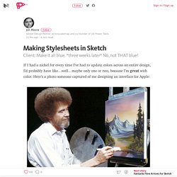
Stacking Let’s call this the “pancake method” because I’m currently on the Whole30 Diet and all I can think about is pancakes. (help, I’m starving) Step 1 to this whole process is creating saved styles for text and color. It’s pretty easy, but can be a bit tedious. Faire une image responsive. Whenever there are elements, that can be found on multiple versions, I recommend to use symbols in Sketch.
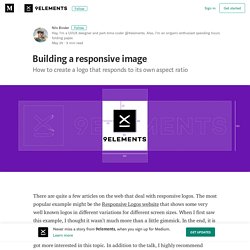
This is going to make it easier for you in the future, and the SVG that we’re going to build is going to use the same symbols. (If you’re not familiar with symbols in Sketch I highly recommend this Medium Story by Jon Moore.) As you can see, the logo consists of a visual element and the company name. Only in the square version, I chose not to display the name.
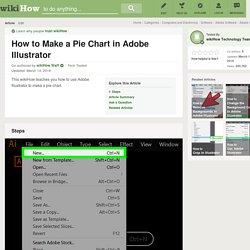
The reason for this is, that I wanted it to be recognizable, even when used as a tiny thumbnail by maybe only about 32px x 32px. 2. Before we export any images, we have to create a new SVG file. Photoshop — Tuto cinémagraphe (EN) Photoshop — Effet duotone. Photoshop — Tuto cinémagraphe (EN) How to Make a Pie Chart in Adobe Illustrator: 9 Steps. This article was co-authored by our trained team of editors and researchers who validated it for accuracy and comprehensiveness. wikiHow's Content Management Team carefully monitors the work from our editorial staff to ensure that each article meets our high standards.
Illustrator — Textures. Illustrator — Courbes de Bézier. Have you ever seen Illustrator progress shots from your favourite designers and wondered how and why their bezier handles are so obsessively arranged?
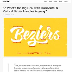
We’re hoping to shed a little light on this seemingly unnecessary process. Note: this tutorial assumes a solid grasp of Illustrator & the pen tool. Until recently, I definitely belonged to the What’s the point of that? Club —and perhaps secretly the How did they do that? Club. Illustrator tutorials: The best lessons to sharpen your skills. The best Illustrator tutorials will help you get more from Adobe's flagship vector art programme.
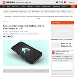
Whether you’re designing a simple icon set or a complex illustration, Illustrator has a feature set to help you. We've rounded up the best Illustrator tutorials to guide you through different use cases and help you expand your skills. Illustrator remains the industry's favourite tool for vector-based design, despite increasingly strong competition from the likes of Sketch and Affinity Designer.
Illustrator — Créer une grille isométrique. How to create isometric illustrations in the simplest way possible - IsoFlat. You can draw impressive and complex isometric designs effortlessly once you learn the trick. The “Geometric Technique” is a method preferred by many, to create astonishing isometric illustrations. But first, let’s see several basic concepts, like what a plane means. As a follow-up, you’ll understand what are the three distinct geometric plane structures you need to know before drawing an isometric illustration.
A Plane is a two-dimensional (2D) flat surface which extends to the infinity. All the isometric artworks are created by using 3D Geometry composed of three distinct geometric plane structures: XY, YZ, and ZX. In XY, the object is placed in X and Y planes. In YZ, the object is placed in Y and Z planes. In ZX, the object is placed in Z and X planes. You can draw impressive and complex isometric designs effortlessly once you learn the trick. How to Duplicate Objects Around a Circle. Illustrator — Motifs. This week, we’re keeping things quick and easy with 3 simple pattern hacks applied to stationery borders in Adobe Illustrator: striped, chevron and polka dot.
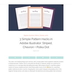
Borders in stationery design are a great tool to create focus on a message while still adding personality. With simpler projects, a seamless pattern swatch isn’t always needed and that’s where these pattern hacks come in Ideas for using these pattern stationery borders could be: shopping lists, memo pads/notepads and greeting cards. In this beginner friendly tutorial, we’ll utilize an offset path, the blend tool and stroke palette. See it all below! InDesign — Exemples/tutos. Adobe XD — Exporter éléments. Adobe XD tutorials: The best ones for UI/UX designers. Adobe XD tutorials are very helpful for designers who want to work in UI or UX or just want to get better at their craft.

Adobe XD was created in 2016 and provides designers with a helpful toolkit for prototype creations. Adobe XD makes an incredible tool for designers looking to make prototypes of websites or mobile applications. Adobe XD has made many different updates as well as added features which enhance the design experience.
As a result, it makes a great choice for designers working on wire frames, layouts and prototypes. Effets de survol sur les boutons.