

The Anatomy of an Experience Map. Experience maps have become more prominent over the past few years, largely because companies are realizing the interconnectedness of the cross-channel experience.
It’s becoming increasingly useful to gain insight in order to orchestrate service touchpoints over time and space. But I still see a dearth of quality references. Beyond Wireframing: The Real-Life UX Design Process. We all know basic tenets of user-centered design.
We recognize different research methods, the prototyping stage, as well as the process of documenting techniques in our rich methodological environment. The question you probably often ask yourself, though, is how it all works in practice? What do real-life UX design processes actually look like? Illustrating the Big Picture. Experience designers use a wide variety of techniques to represent the interactions between individuals, organizations, and systems.

Stuck in the Details? Mind Map User Tasks. Working in a team of brilliant creatives is a double-edged sword.
Sure, passion and expertise facilitate great discussions, but focusing too much on your own craft can be counter-productive. Sometimes, being a UX practitioner in a team of technology experts inspires new tools for the job. Discussing features before design may seem like a problem solely afforded to clients but we, fellow creative types, are not immune.
We get excited by making a solution happen and, before we know it, an interface is born. This was certainly true on my product team. A bird’s eye view Getting stuck in the details is dangerous. Mind maps aid visual thinking. Enter mind maps. My team uses them to depict every user task an application supports. Mind the map While most people on a team focus on a single aspect of the project, mind maps bring us all together. How To Design Mental Models That Create a Superior User Experience. “Much of this article is adapted or excerpted from the book Mental Models: Aligning Design Strategy with User Behavior by Indi Young (Rosenfeld Media, 2008).”
Designing something right requires that you completely understand what a person wants to get done. You need to understand how a person uses something if you’re going to get the design right for them. Conceptual Models in a Nutshell. This article explains what conceptual models are and describes the value of developing a conceptual model of a software application before designing its user interface.
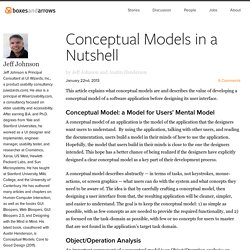
Conceptual Model: a Model for Users’ Mental Model A conceptual model of an application is the model of the application that the designers want users to understand. By using the application, talking with other users, and reading the documentation, users build a model in their minds of how to use the application. Hopefully, the model that users build in their minds is close to the one the designers intended. Writing for Cognitive Ease. In his new book, Thinking, Fast and Slow, Nobel Prize Winner Daniel Kahneman takes us on a fascinating tour of the brain, exploring two theoretical systems that drive the way we think and make choices: “System 1” is fast, intuitive, and emotional; “System 2” is slower, more deliberative and more logical.
As experience designers, we want to appeal to both. Daniel Kahneman won the 2002 Nobel Prize in Economics for illuminating the motivations behind risky decision-making. Before Gladwell and Levitt made it fashionable, Kahneman was enthralling readers with insight into the biases that drive human decision-making. In his new book, Kahneman summarises these cognitive biases and their effect on our view of the world. He highlights the difference between our experience and our memory of events, and the real components of happiness. Designing Screens Using Cores and Paths. Imagine you’re on one side of a grass lawn and you want to reach the bus stop on the opposite side.
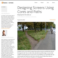
Do you walk on the sidewalk around the edges or cross in the middle? Assuming the grass is dry and it’s not prohibited, you’d probably take the shortest path and walk across the lawn to the bus stop. If others have done so before, you may see a beaten path that you could follow. Such unplanned paths connect the shortest distance between two points, and we can find them everywhere in our surroundings.
There is No Spoon: The Construct of Channels. As products become services, and services become more thoughtfully and holistically designed, we are breaking out of our digital silos and endeavoring to support a more seamless cross-channel customer experience spanning every touchpoint between the customer and company.
But what constitutes the channel in cross-channel? And what implication does this have on the customers’ experience when interacting with your product or service? When we are trying to gain an experiential view of the customer journey, channels aren’t the best lens to view the experience. Cross-channel, as a concept, makes sense for information architecture. Through the lens of making content objects persistently findable, consistent, and connected, it makes sense to think in terms of that information across channels. Onboarding: A Sidebar in “Designing Social Interfaces” Last May I was given the great privilege to write a sidebar in Christian Crumlish and Erin Malone‘s fabulous new book, Designing Social Interfaces.
The topic I was asked to write about is “onboarding” — designing welcoming experiences for new users by easing them in. You might have seen a couple blog posts that I’ve previously written about how Plurk and Yahoo! Shine handled the onboarding process. The authors have given me the permission to republish the sidebar here in full. I hope you enjoy it and find it valuable. Why Persuasive Design Should Be Your Next Skill Set. BJ Fogg's Behavior Model. Stanford's School Of Persuasion: BJ Fogg On How To Win Users And Influence Behavior. Warm Gun: How to Win Users & Influence Behavior. In his How to Win Users & Influence Behavior presentation at the Warm Gun Design conference in San Francisco, CA BJ Fogg walked through how behavior can be systematically understood and used for design.
Here’s my notes from his talk. Behavior is systematic. It’s only complicated if you don’t understand how behavior works.Behavior can be designed for: pick the right behaviors to target, design specifically for them, and test your solutions quickly.The behavior equation: b= mat. Behavior happens when motivation, ability, and triggers come together at the same time. Know the Behavior You Want Get clear on the behavior you are trying to target. Think in Terms of the Behavior Model. Behavior Design with BJ Fogg. Creating An Adaptive System To Enhance UX. Mirror, Mirror, on the Screen.