

The New Rules of Form Design. 10 principles for smooth web animations. There are dozens of ways to achieve animations on the web.
For example, the filmstrip is an approach has been around since before the internet, with slightly different hand-drawn frame being swapped out many times a second to create the illusion of motion. Twitter recently used this simple approach for their new heart animation, flipping through a sprite of frames. This effect could’ve been done with a ton of tiny elements individually animating, or perhaps as an SVG, but that would be unnecessarily complex and probably not be as smooth. In many cases, you’ll want to use the CSS transition property to automatically animate an element as it changes. UI/UX tools. Web Cursor: The Forgotten Property. There are many aspects of CSS that we regularly talk about such as positioning, color, media queries, and typography.
Yet one part of a humble CSS specification rarely gets a mention and it plays a huge part in the way we interact with sites. It can be affected by the hardware we use, the OS we pick and if coded correctly, can be as powerful as a call to action. Make Those Web Apps Run Fast! (Or At Least Fake It) - ReadWriteS. Back in February at the Future of Web Apps (FOWA) conference in Miami, Union Square Ventures' Fred Wilson presented on his 10 Golden Principles of Successful Web Apps.
For those not fortunate enough to attend the conference, a video and transcript of the talk and subsequent Q&A session with Wilson is now available online for the general public to learn what one of the leading east coast investors advises startups do to succeed on the Web. So what does Wilson say is the single most important feature of the Web apps that win? Speed. UI research – speed matters and 10s+ page load is a killer. Earlier this week usability expert Jakob Nielsen (famous for his eyetracker studies) published the results of some research into the importance of page response times to user experience and perceptions of brand.

In his words “users really care about speed”. In Jakob’s assessment speed matters for two reasons: human limitations, espescially in the areas of memory and limitation human aspirations – fast interfaces make us feel like we control the computer (a feeling we like) whilst slow interfaces make us feel like it is the computer that is controlling us (not so good…) In interviews Jakob has found that slow site speed is something which sticks in the minds of users when thinking about services they have used in the past. Why most UX is shite. I was invited to speak at the event this week where getting a little sweary and ranty is kind of encouraged (it goes well with the craft beer consumption that is an integral part of the conference mix).

This was my contribution. Slides: Designing Screens Using Cores and Paths. Imagine you’re on one side of a grass lawn and you want to reach the bus stop on the opposite side.
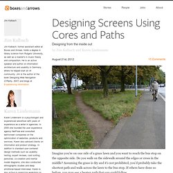
Do you walk on the sidewalk around the edges or cross in the middle? Assuming the grass is dry and it’s not prohibited, you’d probably take the shortest path and walk across the lawn to the bus stop. If others have done so before, you may see a beaten path that you could follow. Such unplanned paths connect the shortest distance between two points, and we can find them everywhere in our surroundings. What are some top strategies for conversion optimization. Your Facebook Account has Three Passwords.
Brand as Context in Interaction Design. I’m sure I was swearing allegiance to one brand over another as soon as I began to develop the capacity for critical thought.
Reebok vs. Nike, Coke vs. Pepsi, SEGA vs. Nintendo, Apple vs. Microsoft—these warring companies were more than just brands to me, they were almost systems of belief. Why Rounded Corners are Easier on the Eyes. By anthony on 08/17/11 at 10:17 pm Designers use rounded corners so much today that they’re more of an industry standard than a design trend.
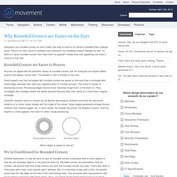
They’re not only found on software user interfaces, but hardware product designs as well. 5 Essential Product Design Books That Aren’t About Product Design. "What are some good books about product management?

" is a frequent question for designers and engineers, especially those who are first-time founders. While there are any number of volumes you can peruse about agile development, team building, roadmaps or whatever skill you want to acquire, the art of product design is more elusive. If you're really going for 9th level blackbelt Caine kung-fu, you need to head off the beaten path and find not tips, tricks and tactics, but inspiration and anthropology.
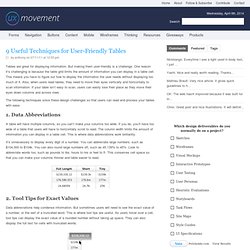
Absorb truths about science and people to identify needs based on the human condition, not a market analysis. Functionnal design. 9 Useful Techniques for User-Friendly Tables. By anthony on 07/11/11 at 12:33 pm Tables are great for displaying information.
When to Use White Text on a Dark Background. By anthony on 04/28/11 at 11:11 am Many websites use black text on a light background to display their content because it’s easy to read. Why Users Fill Out Forms Faster with Top Aligned Labels. By anthony on 09/01/10 at 3:48 pm Imagine a user who is really excited about your product or service. They’re ready to sign up, so they go to your form page and start filling out their information. The way you align your labels with your form fields can affect how easy it is for users to fill out the form. 12 Useful Techniques For Good User Interface Design - Smashing Magazine. Advertisement Last week, we presented 10 Useful Web Application Interface Techniques471, the first part of our review of useful design trends in modern Web applications. Among other things, we highlighted embedded video blocks, specialized controls and context-sensitive navigation.
Design. Mobile. 10 UI Ideas to Learn from Gumroad) 10 UI Ideas to Learn from Gumroad Gumroad is an exciting new startup that lets anyone sell digital content with just a link. It was founded by the prolific Sahil Lavingia. Sahil has designed a number of useful apps, ranging from Pinterest in the early days, to Turntable, to Crate, to Caltrainer, etc.