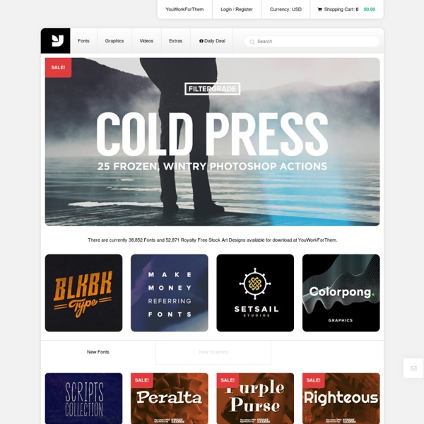


http://www.youworkforthem.com/
font standard & discretionary ligatures bariol offers a further number of standard & discretionary ligatures. a ligature is a single glyph created from the fusion of two or more letterforms. standard ligatures purpose is to make certain letter parts that tend to knock up against each other more attractive or less confused. discretionary ligatures are more decorative and heir calligraphic appearance can make them feel ornamental. stylistic alternates
ReTypes Weblog Richard Wolfstrome is an award-winning graphic designer based on Brighton (UK). He has used our Kade family to design a set of very effective posters for “The Dowsing Sound Collective” – a dynamic 120-voice choir and band. You can also take a look to his Behance, it’s full of gorgeous works. 19 top fonts in 19 top combinations Sign up and download immediately to take your typography to the next level! This classic contains some great stuff: An exceptional glossary of typography terms Killer tips on establishing typographic color Choosing and using the right typefaces 20 Action-packed info-dense pages!
Minneapolis Advertising and Design It’s Artcrank Time! It’s Artcrank time you guys! Get pumped and mark your calendar. I’m in it this year and if you’re interested, you can follow along with my progress on dribbble or by searching the hashtag #badgesonthebus Saturday, May 31 | 4:00pm – 10:00pm | Shelter Studios | 721 Harding St. The 30 best free fonts for designers In this freshly updated free fonts for designers post, we bring you the world's best free fonts. We've filtered out the diamonds from the thousands of less perfectly designed free fonts available online, for you to use in your designs and illustrations. Get Adobe Creative Cloud now This list represents the 55 best free fonts we've found in eight categories. You can use the drop-down menu at the top of the page, or the boxout, right, to jump to the section you want.
14 Articles Showcasing Excellent Typography Typography has always been a fascination of mine. The simple changes that designers are able to make to spice up a font into something totally different is magical. In this post, Designussion showcases several articles that really show off what other designers have been able to achieve. If you enjoyed any of the pieces or articles posted, please leave the author or designer some feedback.
25 Fresh Examples of Beautiful Typeface Combinations in Web Design Typography is a very important part of design and choosing the right type for your design can be very challenging. From print to web layouts, typography is the center piece of a good design and today we gathered a few examples of beautiful typeface combinations in web design to inspire you. In web design, typography can be used in different forms, big bold headers, simple and clean menus, explanatory text and so on. Finding a good combination of typeface is more than only good taste, it's an art Typography is a very important part of design and choosing the right type for your design can be very challenging. From print to web layouts, typography is the center piece of a good design and today we gathered a few examples of beautiful typeface combinations in web design to inspire you.
10 Essential Books on Typography by Maria Popova What Arab culture has to do with industrial ideals, midcentury design and Victorian hand-lettering. Whether you’re a professional designer, recreational type-nerd, or casual lover of the fine letterform, typography is one of design’s most delightful frontiers, an odd medley of timeless traditions and timely evolution in the face of technological progress. Today, we turn to 10 essential books on typography, ranging from the practical to the philosophical to the plain pretty. In 1967, iconic typography pioneer Emil Ruder penned Typographie: A Manual of Design — a bold deviation from the conventions of his discipline and a visionary guide to the rules of his new typography.
Butterick’s Practical Typography This is a bold claim, but I stand behind it: if you learn and follow these five typography rules, you will be a better typographer than 95% of professional writers and 70% of professional designers. (The rest of this book will raise you to the 99th percentile in both categories.) All it takes is ten minutes—five minutes to read these rules once, then five minutes to read them again. Ready? Go. The typographic quality of your document is determined largely by how the body text looks.
LETTERSTREAM INSPIRATION AND IMAGES collected from around the internet. If you know who created an image, or if you’d like to submit something, contact us. Stuart Brown, Hamburger Fonts Sterre Verbokkem Best 20 webfonts from Google Web Fonts and @font-face embedding At the moment there are several ways to use non-system fonts on a website. We will focus on the two least complicated, least expensive systems, Google Web Fonts and the @font-face rule. Fear not, we have not ruled out other paid methods such as Typekit, Fonts.com Web Fonts, Fontdeck, Webtype, WebINK or Fontspring for future posts as they certainly offer high quality typefaces and deserve to be considered. It’s important to be aware that web fonts can generate inadequate visualizations on operating systems which have subpixel rendering turned off in the case of Windows XP. They can also be represented differently depending on the browser used to visualize them. The aim of this post is to facilitate the choice of a series of fonts (out of the hundreds available) whose technical and visual characteristics make them more readable and compatible with a wide variety of devices, browsers and operating systems.
10 New Free Fonts for Your Designs Here at WDL, we love to keep our readers posted on fresh resources, especially when it comes to fonts. Today we gathered a new round of free fonts to spice up your libraries. So feel free to check out all of them and download the ones you like most. Idealist Sans