
Whatsapp lance son app web : Chrome only ! Understand color theory with these 7 facts - = Designer Blog Color is everywhere – in nature, in cities, in stores, online. We’re so used to it we often don’t notice it’s even there, until we suddenly come across a black and white movie on TV. Then we remember how good it is that we have such a colorful world. For that reason alone, if not for improving your design skill set, knowing how color works is a good thing to do. So let’s dive in! 1. Might sound strange but it’s true. Color is created only when our brain tries to make sense from light signals it receives from the outer world. Deprived of color, our world would probably look like a scene from Matrix. Without that, our world is a monochromatic place bathing in electromagnetic radiation of varied intensity and wavelengths. The key takeout? 2. If you ever thought RGB color model is a recent discovery from Silicon Valley, you’d be three centuries off target. We are able to see colors because of red, green and blue receptor cells in our retina. 3. 4. 5. The RGB model The HSB model (or HSL / HSV) 6. 7.
Color Palette Generator Color Palette Generator #ffeeff #ffccdd #eeaaaa dull #33aa77 #ffeeee #ffbbdd #ff7799 vibrant URL of image: Make color schemes. If you like this you might also like my logo maker All Tools Biorhythms Business Card Generator Calendars, Printable Swiss Style Color Hunter Color Palette Generator Color Picker Comic Strip Maker Crapola Translator Drawmigo Favicon Generator Flickr RSS Feed Generator Free PDF Cards IMG2TXT Invent-a-Word Landscape Art Bot Logline Library Logoshi Logo Maker Pixel Art Generator Rainbow Words ROT13 Subwords! Reference ASCII Table Current Stamp Price Filler Text & One Liners Jedi Robe Pattern Recipes Special Characters URL Encoded Chars © 1999 - 2024 DeGraeve.com
Kano model The Kano model is a theory of product development and customer satisfaction developed in the 1980s by Professor Noriaki Kano, which classifies customer preferences into five categories. Categories[edit] These categories have been translated into English using various names (delighters/exciters, satisfiers, dissatisfiers, etc.), but all refer to the original articles written by Kano. Must-be Quality These attributes are taken for granted when fulfilled but result in dissatisfaction when not fulfilled. One-dimensional Quality These attributes result in satisfaction when fulfilled and dissatisfaction when not fulfilled. Attractive Quality These attributes provide satisfaction when achieved fully, but do not cause dissatisfaction when not fulfilled. Indifferent Quality These attributes refer to aspects that are neither good nor bad, and they do not result in either customer satisfaction or customer dissatisfaction. Reverse Quality Must-be Quality[edit] One-dimensional Quality[edit] Uses[edit]
Octalysis: Complete Gamification Framework - Yu-kai Chou (This is the Gamification Framework that I am most known for. Within a year, it was translated into 9 different languages and became classic teaching literature in the gamification space in the US, Europe, Australia and South America.) Octalysis: Complete Gamification Framework Gamification is design that places the most emphasis on human motivation in the process. In essence, it is Human-Focused Design (as opposed to “function-focused design”). Gamification is the craft of deriving all the fun and engaging elements found in games and applying them to real-world or productive activities. Most systems are “function-focused,” designed to get the job done quickly. The reason we call it gamification is because the gaming industry was the first to master Human-Focused Design. Games have no other purpose than to please the individual playing them. I saw that almost every game is fun because it appeals to certain Core Drives within us that motivate us towards certain activities. Octalysis Score
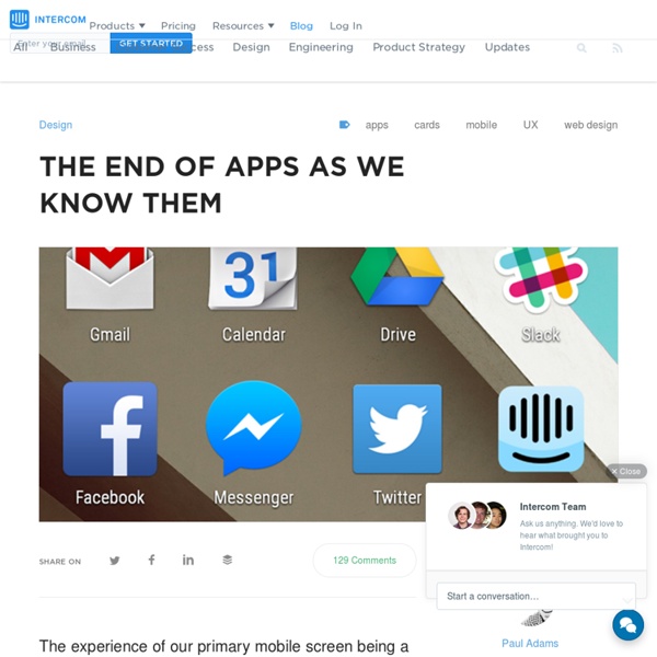
Why cards are the future of the web Cards are fast becoming the best design pattern for mobile devices. We are currently witnessing a re-architecture of the web, away from pages and destinations, towards completely personalised experiences built on an aggregation of many individual pieces of content. Content being broken down into individual components and re-aggregated is the result of the rise of mobile technologies, billions of screens of all shapes and sizes, and unprecedented access to data from all kinds of sources through APIs and SDKs. The aggregation depends on: The person consuming the content and their interests, preferences, behaviour.Their location and environmental context.Their friends’ interests, preferences and behaviour.The targeting advertising eco-system. If the predominant medium of our time is set to be the portable screen (think phones and tablets), then the predominant design pattern is set to be cards. Twitter is moving to cards Google is moving to cards Everyone is moving to cards The list goes on.
Fonts have feelings too — ooomf labs I’ve noticed how seemingly small things like font and the spacing between letters can impact how I feel when reading online. The right font choice along with the absence of sidebars and popups makes everything feel easier and better to read. Websites like Medium, Signal vs. Noise, and Zen Habits are like yoga studios for content. Their presentation of content puts me at peace while reading, allowing me to fully focus on the stories without distraction. Just look at the difference between Medium and Cracked: Exhibit A) Medium Exhibit B) Cracked When you compare the two, it’s obvious which one makes you feel like crud. The Cracked layout is painful to look at. After experimenting with how we display our writing on the Crew blog, I discovered there’s an element of science behind why we feel this way toward certain typefaces and layouts. How we read When we read, our eyes follow a natural pattern called a Scan Path. We break sentences up into scans (saccades) and pauses (fixations). 1. 2. 3. 4.
How Technology Hijacks People’s Minds — from a Magician and Google’s Design Ethicist How Technology Hijacks People’s Minds — from a Magician and Google’s Design Ethicist Estimated reading time: 12 minutes. I’m an expert on how technology hijacks our psychological vulnerabilities. When using technology, we often focus optimistically on all the things it does for us. Where does technology exploit our minds’ weaknesses? I learned to think this way when I was a magician. And this is exactly what product designers do to your mind. I want to show you how they do it. Hijack #1: If You Control the Menu, You Control the Choices Western Culture is built around ideals of individual choice and freedom. This is exactly what magicians do. When people are given a menu of choices, they rarely ask: “what’s not on the menu?” For example, imagine you’re out with friends on a Tuesday night and want to keep the conversation going. It’s not that bars aren’t a good choice, it’s that Yelp substituted the group’s original question (“where can we go to keep talking?”) We don’t miss what we don’t see.
How to Get a Professional Look With Color What makes a design look coordinated, planned and professional? The answer is: ‘color’. Not every project needs bland corporate blue to look professional. Planning color means creating a framework that describes which colors to use and how to use them. Color is the slipperiest design element. “Good” color is so closely tied to elusive things like personal taste and intuition, as well as technical considerations such as contrast and monitor calibration. But color is vital to content. In this article we’ll review some techniques to achieve beautiful color palletes for your web designs. The best way to make a website look unplanned is to choose its colors at random. Even when visitors skim a website’s home page for the first time, the colors influence their attitude towards the content. Color affects how people interpret what they see as much as typography. Finding the right colors isn’t easy, but the process can be systematic. Let’s say you’ve been asked to design a professional website. Tips
UX Myths Gestures as a New Dimension in Mobile Design Something clicked in my head while writing my most recent article. While looking at the various paradigms that have grown from Twitter’s UI, I noticed an aspect of design that is oft overlooked. That aspect is gestures. Gestures are something we use on a daily basis, but despite this, few people look at them as an element of an applications UI. Since the creation of touch screens, gestures have reigned in an entirely new aspect as to how we interact with our devices. Gestures allow users to perform specific tasks in an extremely efficient and more dynamic manner. Three applications that I have used and stick out to me most are Clear, Pair, and Paper. Clear Clear is unique in the fact that essentially every piece of the app is based around gestures. From creating a new todo, to deleting one, all it takes is a swipe. Pair Pair doesn’t use gestures in the sense that Clear does. To Thumb Kiss, both you and your partner have to have the app open. Paper The opportunities
Instagram Finally Breaks Free Of Its Mobile-Only Confines Instagram is slowly shedding the "mobile-only" label it gained when it launched almost exactly two years ago. Users of the wildly popular, Facebook-owned photo app are getting Web-based profiles, it was announced on Monday. This sensible, overdue move for Instagram stands to benefits its users, but it doesn't quite go all the way. Instagram has been moving toward Web app territory for several months, but this is the service's biggest step in that direction. In July, the Instagram added the ability to like and comment on photos from the Web version that gets pushed out via Twitter and Facebook. That update also included the ability to follow users when logged into your existing Instagram account in a Web browser. How Instagram Users Will Benefit Starting this week, users will start getting Facebook Timeline-style profiles that display their entire photo stream in the browser. There's Still A Wall Between Mobile And Web