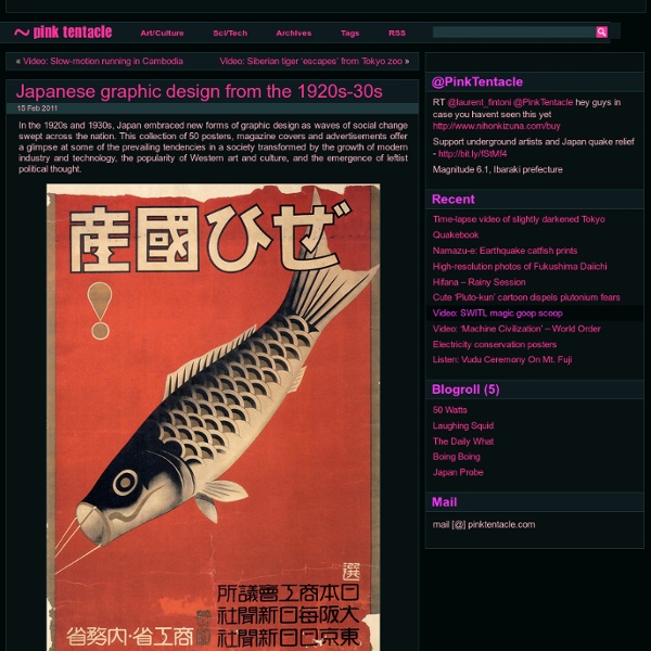
Japanese graphic design from the 1920s-30s

http://pinktentacle.com/2011/02/japanese-graphic-design-from-the-1920s-30s/
Surrealistic paintings by Tetsuya Ishida
07 Jun 2010 The surrealistic paintings of Tetsuya Ishida (1973-2005) explore the dark side of modern life. [Link]
Crazy Illustrations By Chow Hon Lam
Chow Hon Lam is a t-shirt designer and a humorous illustrator from Malaysia. He has been completed this crazy project called Flying Mouse 365, which is create 1 design per day. I hope his illustrations can bring some smile and entertainment to the world. About the author
THE SEETHING GENIUS OF &GET YOUR WAR ON&
ANGER + CLIP ART = CATHARSIS | October 13th 2008 Ever since October 2001, America's "War on Terror" has had a venomous critic in David Rees. He has used a comic strip to lambaste the absurd air-punching sloganeering of it all, writes Robert Lane Greene... Special to MORE INTELLIGENT LIFE In September 2001 everyone wanted a fight.
Screwy Portraits
Andrew Myers uses common screws - up to 10,000 of them at a time, to creates these wonderful three-dimensional portraits.
Portfolio : Pac23
PORTFOLIOPersonal pieces showcase. Grail - Frenchie Minion Ghost Spy VS Spy
Vinyl cover with analog light animation
Photography for ROSA•BRYNDIS Autumn/Winther 2014 collection. Fashion Design: ROSA•BRYNDIS Photography: Michael Hansen Make-up: Sebastian Simon Jewellery: Ruby Baby Model: Marie Louise Wedel Model: Rasmus Alexander www.rosabryndis.comFashion, Graphic Design, Photography2014 The project is about exploring transparency in architecture. An attempt to translate graphic shapes to futuristic architecture. The graphic shapes are based on paperfolding, digitized and printed in very high quality.Architecture, Graphic Design, Illustration2013 Visual identity for the 2012 fashion graduate show at The Royal Danish Academy of Fine Arts, School of Design. I looked at photography as the key inspiration for the identity. I found it interesting to set focus on the fashion industry’s dependency on photography as media.
The Science of Word Recognition
About fonts > ClearType The Science of Word Recognition or how I learned to stop worrying and love the bouma Kevin LarsonAdvanced Reading Technology, Microsoft CorporationJuly 2004
Awesome chainsaw wooden art
Wow!!! How Awesome is THIS! Amazing chainsaw art by Randy Boni… Comments
Related:
diseño2
•
Ilustración
•
Inspiration


