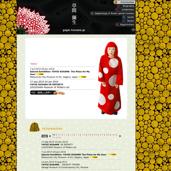


http://www.yayoi-kusama.jp/e/information/index.html
Related: Artistdesignboom oct 26, 2012 mirrored room of infinite reflections by thilo frank ‘the phoenix is closer than it appears’ by thilo frankinstallation view, kunsten, museum of modern art, aalborg, denmark, 2011image © studio thilo frank german artist thilo frank has sent designboom images of his project ’the phoenix is closer than it appears’, a large mirror installation that appears to merge into the surrounding space. by revealing a perfectly euclidical core, the visitor becomes the spatial focal point by moving on a swing through the vivid conceived environment. despite its large dimensionality (4 x 4 x 8 m), it creates a disorientating moment where the surrounding room translates a physical reflection, translating the viewer’s body into an imaginary reflection.
New York by Subway Case study images for Interband's Singapore's redesign and branding of Banco De Oro's branches in Manila.Photography, Digital Photography2012 Dale May : X-Ray Lego Stormtrooper Yep. This is an X-Ray of a Lego Star Wars Stormtrooper… Dale May knows how to please us, even if it is a little thing that will cost you thousands of dollars to hang on your wall. But how awesome my wall would be… More pics in the full article. Oui, oui. C’ets bien un Lego Stortrooper passé au rayon X. designboom oct 26, 2012 k architectures: théâtre of saint nazaire ‘théâtre of saint-nazaire’ by k-architectures, saint-nazaire, france image © patrick miara all images courtesy of k-architectures paris-based k-architectures have recently completed the ‘théâtre of saint-nazaire’ in saint-nazaire, france, adjacent to remnants of a neoclassical train station destroyed in world war II. the monolithic forms takes cues from a nearby bunker and the concrete surface is stamped with a perforated floral pattern derived from motifs of 17th century silk textiles. at night, a soft glow emanates through the 11.5 meter tall walls, breaking down the appearance of the exterior’s massing. a main auditorium is placed within the concrete building and flanked by the hall, rehearsal area, dressing room. the facades enclosing these spaces are chestnut planks which evoke the stacks of racking found on industrial sites and processes.
Signs for the Homeless We have begun to accept submissions. If you have any we’d love to see them, please email at homelesssignstumblr@gmail.com - Chris H. (*Person has requested to not use his face online) November 2013, Park Street, Boston, MA 1. What is your Name? Illusions of the Body — Gracie Hagen This series was made to tackle the norms of what we think our bodies are supposed to look like. Most of us realize that the media displays only the prettiest photos of people, yet we compare ourselves to those images. We never get to see those photos juxtaposed against a picture of that same person looking unflattering. That contrast would help a lot of body image issues we as a culture have. Imagery in the media is an illusion built upon lighting, angles & photoshop. Stranger Visions - Sample Locations 6. 1/6/13 12:25pm Wilson ave. and Stanhope St. Brooklyn, NY MtDNA Haplogroup: D1 (Likely ancestry 25% Native American, South American) SRY Gene: present Gender: Male rs12913832: AA Eye Color: Brown rs4648379: CC Typical nose size rs6548238: CC Typical odds for obesity
It May Seem Completely Mad, But I Paint Bumps! I paint bumps! It may seem completely mad to some people, in fact some even go as far to describe it as vulgar. I personally see it as beautiful. Painting a pregnant bump allows you to freely express yourself, it’s fun and relaxing. A bump painting session takes about 2 hours to complete and the soon-mum-to-be can sit and relax while the cooling sponges and brush strokes create her chosen design. designboom jan 18, 2013 performance architecture construction with clothes by dantiope performance architecture – construction with clothes by dantiopeintervention 01 ‘performance architecture‘ is conceived as an international ideas competition aimed at choosing proposals for five temporary urban interventions in public spaces featured as controversial by the citizens. the installations intend to draw up architectural and urban strategies that, by reviving performance art approaches, provide new directions as to the roles of architects, artists and designers – while promoting alternative urban practices to the construction of monuments and other traditional structures by facilities, activities and happenings. the 2012 exhibition in guimaraes, portugal includes ‘construction with clothes’ by dantiope, ‘bodyphonic’ by DOSE collective, ‘fountain hacks’ by like architects, ‘agricultural mountain’ by IUT and ‘unidade’ by pedrita studio + ricardo jacinto. garment installation detailimage © julien gouiric
Andy Gilmore personal cargo Andy Gilmore’s favorites Recently commented on Andy Gilmore’s project Polytopia The human species is rapidly and indisputably moving towards the technological singularity. The cadence of the flow of information and innovation in...Now playing Adorably Awkward Greeting Cards By Emily McDowell We’ve all probably found ourselves, at one point or another, standing in front of a wall of greeting cards and finding that none of them are capable of expressing your actual feelings in simple sentences. Emily McDowell, a designer and illustrator, has a perfect solution to this problems. She designs “Awkward Cards,” which are awkward, truthful and sincere ways of saying something meaningful and beautiful when you just can’t figure out how. All of the awkward greeting cards have quotations that reflect the messiness and weirdness of relationships in a funny way. “I love making anything that helps people feel understood – it means a lot to me when people pick one up and think, ‘So I’m NOT the only person who feels this way?
Roy Lichtenstein Roy Fox Lichtenstein (pronounced /ˈlɪktənˌstaɪn/; October 27, 1923 – September 29, 1997) was an American pop artist. During the 1960s, along with Andy Warhol, Jasper Johns, and James Rosenquist among others, he became a leading figure in the new art movement. His work defined the basic premise of pop art through parody.[2] Favoring the comic strip as his main inspiration, Lichtenstein produced hard-edged, precise compositions that documented while it parodied often in a tongue-in-cheek humorous manner.